
HENOLA

Branding for a German pet food brand that views chickens not as farm animals, but as feathered companions

(Overview)

Crunchy Muesli for Chickens

Chickens are more than just farm animals. They are beloved household and backyard pets that seek companionship, enjoy human attention, and need space to scratch, peck, and flutter. This is the philosophy behind HENOLA: The premium feed brand focuses on ensuring a happy life for chickens and enhances the daily lives of these feathered companions with high-quality feed mixes.

As a standalone product line from the bird feed manufacturer Werner Tiernahrung, HENOLA was born out of a desire to provide optimal nutrition not only for wild birds but also for chickens—accessible, high-quality, and a shift away from plain feed buckets toward a lifestyle product.

Our task was to develop a comprehensive visual design system for HENOLA that presents the product line in a striking, high-quality, and consistent manner across all touchpoints. This scope includes the logo, typography, packaging, social media, and other communication materials, which we are continuously overseeing as part of the rollout.

The result: An expressive brand that brings joy and makes keeping chickens seem less like a chore and more like a modern lifestyle choice.
(Company)
Henola
(industry)
Animal Feed Industry
(year)
2026
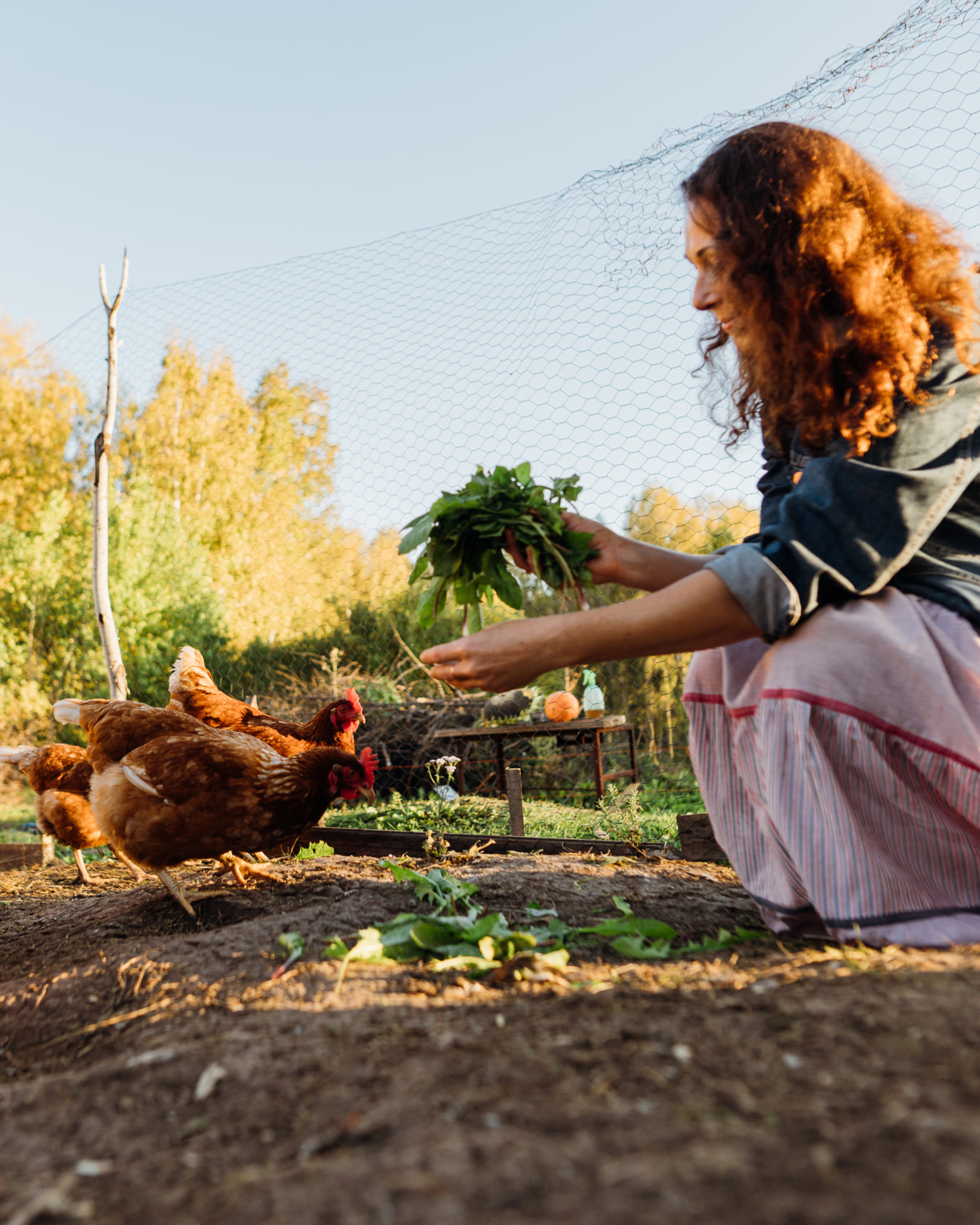
Frau füttert glückliche braune Hühner im Garten mit frischem Grünfutter, HENOLA Marken-Emotion.
Slogan „Hen’s Favourite Granola“ in der Schrift Blona vor dunkelblauem Federmuster-Hintergrund von HENOLA.
HENOLA Social Media Case Study: Mockup einer Instagram-Profilkarte neben einem emotionalen Foto einer Frau, die ein Huhn hält.

(Brand Design)

Iconic Traces:
Chicken Feet as a Trademark

Chicken feet are at the heart of the word-and-design mark. This iconic detail makes the product instantly recognizable and gives the brand a distinctive character. Whether as a full logo or a simplified design mark, this element is consistently used across all formats, serving as a visual thread that ties all communication efforts together.

Typographically, the system relies on two typefaces: Blona, a bold and distinctive all-caps typeface, defines both headlines and the logo. Barlow complements the design for body text and functional content: modern, highly legible, and versatile.
Muster aus stilisierten blauen Federn auf dunkelblauem Hintergrund als HENOLA Key Visual.
Headline “HAPPY FEATHERS START WITH WHOLESOME FLAVORS.” in the Blona font on a dark blue background.

(Brand Design)

Light as a Feather: Patterns and Illustrations

The feather pattern serves as the central key visual throughout the entire brand design—from packaging to social media to digital platforms. Applied in the respective product color, it subtly and harmoniously ties all touchpoints together. The visual identity is complemented by detailed illustrations of chickens and chicks in a handcrafted linocut style, which lend the design an added sense of quality.
Person hält liebevoll ein weißes Huhn im Arm, Detailaufnahme der HENOLA Bildsprache für Premium-Hühnerfutter.
HENOLA Faltschachtel Packaging „Immune Bite“ mit Granola Balls auf einer Rasenfläche vor Hühnern.

(Brand Design)

Focus on Appreciation:
The Chicken and the Human

Through our visual language, we highlight the loving relationship between humans and animals: Authentic, candid moments outdoors show chickens as cherished pets. Warm, natural light creates a peaceful atmosphere and emphasizes the connection to nature.
Farbpalette der Marke HENOLA mit Primärfarben Henola Royal Blue, Lilac, White und produktspezifischen Farbduos.
Hand füttert braune Hühner aus der Nähe mit frischem Grünfutter, HENOLA Lifestyle Bildsprache.

(Brand Design)

From Content to Color

At HENOLA, we’ve chosen an elegant, regal blue as our primary color, combined with two shades of purple. This color trio lends the brand a sense of visual sophistication that clearly sets it apart from products on the standard pet food shelf.

The secondary colors provide intuitive guidance within the product range: Each product is assigned a unique color duo consisting of a dark and a light shade, derived directly from its ingredients. This color system organizes the portfolio at a glance without losing the visual connection to the overall brand.
HENOLA 3-kg-Futtereimer „Power Grain“ im blauen Federmuster-Design auf einer Wiese mit Huhn.

(Employee Testimonial)

“Henola’s design reflects the joy and appreciation that chicken lovers have for their birds. A brand that simply brings joy.”

Carla Johann
Junior Art Director, Brand
HENOLA 5-kg-Futtersack „Immune Bite“ im lila Federmuster-Design auf einer Wiese mit Hühnern.
HENOLA Großpackung Karton „Immune Bite“ (50 Granola Balls) im Studio mit Huhn und Zutaten.
HENOLA Großpackung Karton „Gut Feeling“ (50 Granola Balls) in Orangerot im Studio mit Huhn.
HENOLA 500g-Block „Gut Feeling“ in der transparenten Schale auf einer Wiese mit Hühnern.
HENOLA Faltschachtel „Power Grain“ mit Sichtfenster im hellblauen Federmuster-Design auf Holz im Hühnerstall.
HENOLA 5-kg-Futtersack „Power Grain“ in Hellblau im Studio neben einem weißen Huhn und getrockneten Insekten.

(Brand Implementation)

Packaging Design:
6 products, 5 formats,
one system

For HENOLA, we scaled the design across six products and six different packaging formats: from the 5-kilogram bag to the 3-kilogram bucket to the delicate folding box. Each product features a unique color scheme while remaining integrated into the design system. All formats comply with international packaging guidelines to support market expansion.
HENOLA 5-kg-Futtersack „Feather Glow“ in Grün im Studio neben einem braunen Huhn und Körnerfutter.
HENOLA 3-kg-Futtereimer „Feather Glow“ im grünen Federmuster-Design auf einer Wiese im Sonnenlicht.
HENOLA 900g-Schachtel „Calcium Power“ im violetten Federmuster-Design auf einer Wiese vor einem dunklen Huhn.

(Brand Experience)

The “Feather Gang” in the Feed: The Online Brand Experience

For the social media presence, we created posts that consistently bring the brand to life in the feed. The content is divided into three areas: product line communication, everyday moments and emotional moments, and corporate content. Headlines like “Healthy hens are happy hens” or “Keep your feather gang happy” succinctly and catchily capture the brand’s ethos. Product-related posts consistently incorporate the respective product colors, making the color scheme instantly recognizable in the feed.
Drei Social-Media-Posts von HENOLA mit Typografie "KEEP YOUR FEATHER GANG HAPPY", Fotografie und Illustrationen.

(Customer Testimonial)

“The result is impressive across the board: The high-quality design and clean, functional lines convey the brand’s premium appeal—and thus make an impact both at the point of sale and with the chickens.”

Paul Giesebrecht
Managing Director
HENOLA

(New Business)

Contact Person

André Schirmer
Founder and Managing Partner