
aagon

Rebranding for an established UEM specialist that builds software for everyday heroes and is becoming a brand in its own right

(Overview)

Order in a Complex IT Universe:

If IT infrastructure is the backbone of modern businesses, then it needs a brand that is just as reliable as the software behind it.

For nearly 30 years, aagon has been offering solutions that give IT departments real control over their networks—independent, practical, and “made in Germany.” With its core solution, acmp, the Soest-based software company enables centralized management of all devices and the automation of IT processes: a product by IT professionals, for IT professionals.

Over the years, an inconsistent color scheme, a lack of structure, and an unclear product architecture had diluted the brand. acmp and aagon existed side by side without a clear relationship between them. The rebranding was intended to highlight the company’s strengths and bring vitality, lightness, and structure to a complex IT environment.

As part of a comprehensive rebranding effort, we developed a brand architecture that clearly positions aagon and acmp, visually revitalizes and unifies them, and makes the company scalable. The Aagonaut, the existing logo mascot, was also modernized and more closely integrated into the narrative of security and structure.
(Company)
aagon
(industry)
IT and Software
(year)
2025
B2B-Markendesign-Layout von aagon mit IT-Expertin am Laptop und Marken-Slogan
Bühnenpräsentation im aagon Markendesign mit Purpose und Aagonaut-Illustration

(brand strategy)

IT as a Hero

In an extensive brand workshop with representatives from all areas of the company—supplemented by interviews with executives and customers, as well as an employee survey—we refined the aagon brand. The result: aagon stands for continuous improvement, a pragmatic approach, and real relief in day-to-day IT operations.

This gave rise to the new brand essence and purpose: “Always one step ahead. So IT never stands still.”—supported by four pairs of values that combine reliability, honesty, independent thinking, and personal connection. The vision is to empower people to shape IT securely.

The story of security and progress is brought to life by the Aagonaut—the brand’s astronaut mascot—who actively elevates IT professionals to hero status and brings their invisible work behind the scenes into the spotlight.
Grafische Darstellung von Markenkern und Purpose für das B2B-Rebranding von aagon
Drei B2B-Marketing-Banner im neuen aagon Corporate Design mit Farbwelt und Claim

(Brand Strategy)

Every feature has a reason

The newly developed brand claim, “Every feature has a reason,” sums up how aagon develops software and the added value this brings to the community: It’s about substance, not noise.

Because at aagon, no feature is created just for the sake of it—and certainly not just for the next release. Every feature is designed to meet the real-world needs of IT teams in their day-to-day work. And every feature serves a purpose: to lighten the load, simplify workflows, and ensure stability. The result is software that thinks for itself. And a tagline that delivers on its promise.
Markenarchitektur mit acmp Wort-Bild-Marke und Endorsed Brand Logo aagon | acmp
Farbpalette der Sekundärfarbe Crimson Rot für das Rebranding der Marke aagon

(Brand Architecture)

acmp powered by aagon

Interviews and surveys revealed a key challenge: employees and customers did not perceive the main product, acmp, as a standalone brand. The umbrella brand aagon remained largely invisible in this context.

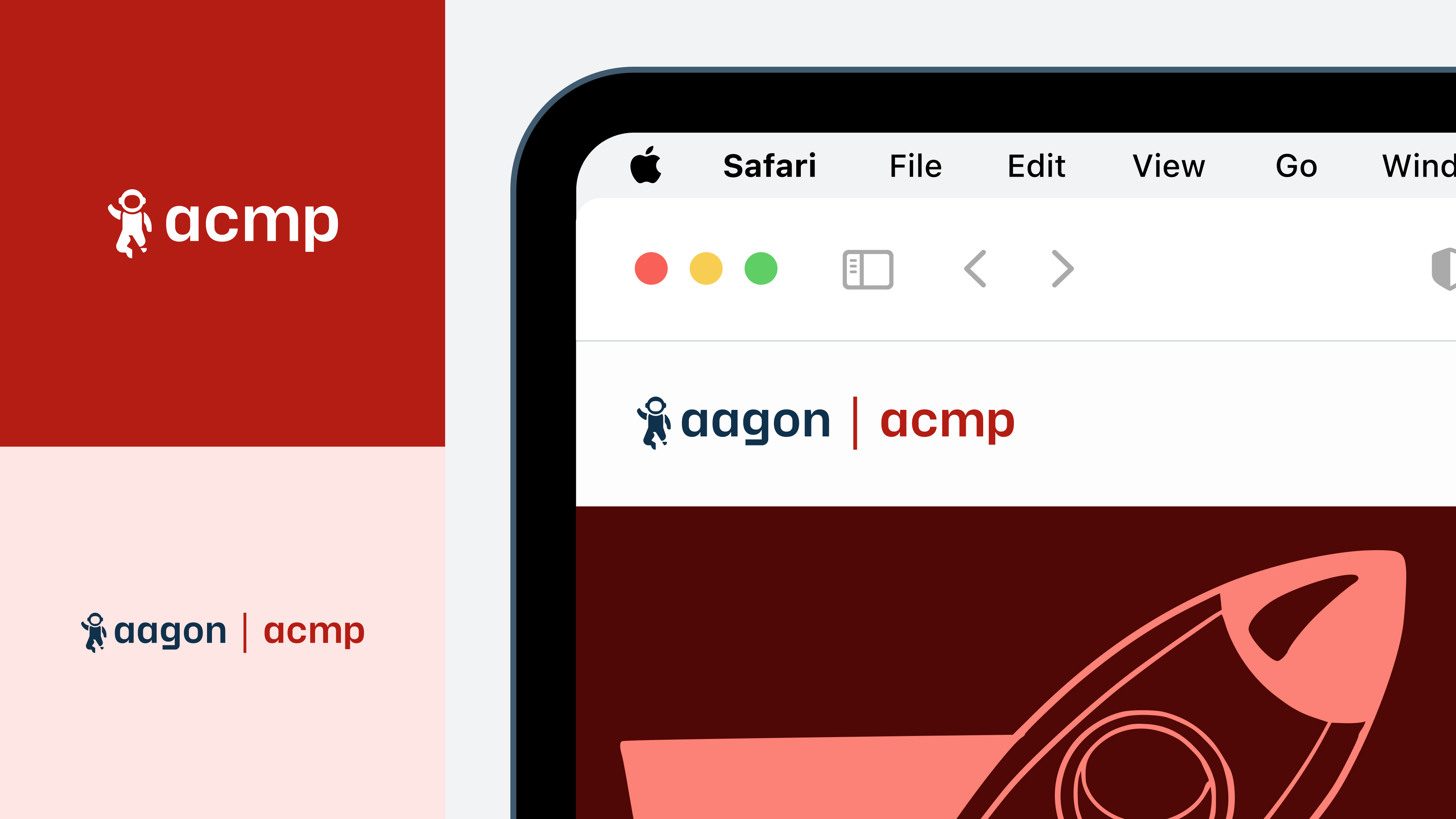
Our solution: Using the Endorsed Brand model, aagon clearly emerges as the umbrella brand in communications, while acmp retains its established identity. Visually, we implemented this through a cohesive color palette and a consistent word-and-logo brand that makes the connection immediately apparent.
Systematische Logo-Varianten von aagon als Favicon, Bildmarke und Wort-Bild-Marke
Social media infographic in the Aagon brand design, featuring an Aagonaut illustration and statistics

(Brand Design)

From Mascot to Brand

The Aagonaut—the astronaut in the logo and the brand’s mascot—has been completely reimagined and given a new design. He is the visual centerpiece of the brand and symbolizes heroism, progress, and curiosity. The concept is complemented by a unique illustrative universe centered on the theme of space travel. It lends aagon’s technical universe a lively, approachable, and personal touch.
Farbmatrix des neuen Corporate Designs von aagon mit Primär- und Sekundärfarben
Dynamische Farbverläufe der Sekundärfarben Violett, Crimson und Lime für aagon

(Brand Design)

The aagon Color Palette

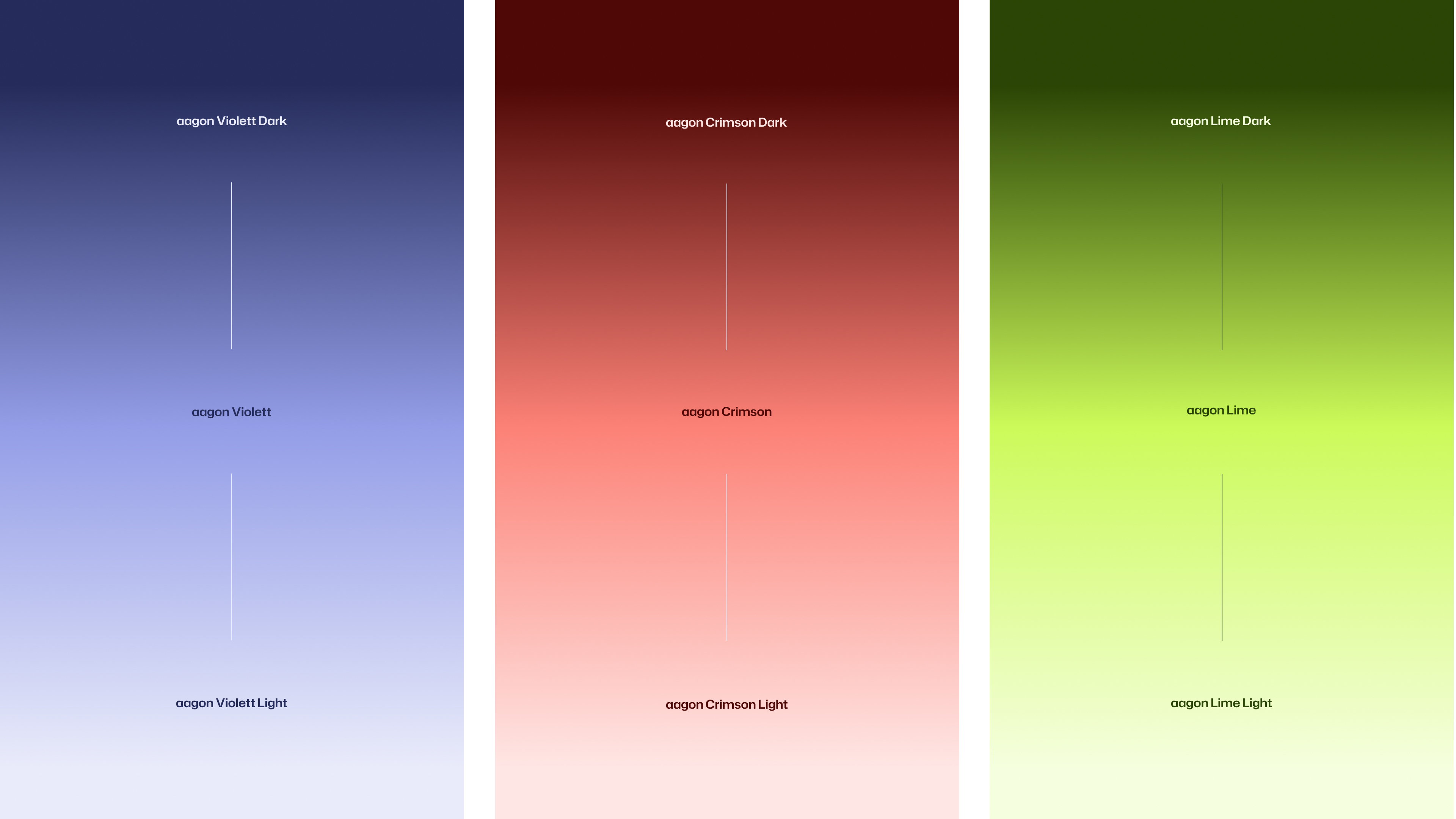
The new color concept combines technological precision with visual guidance. The primary colors—aagon Space Grey, aagon Cyan, and aagon Cyan Light—form the technical foundation. The three secondary shades provide accents, layouts, and dynamic color gradients: Violet conveys structure and expertise in rational topics such as security or features. Crimson red draws attention to engaging formats and is visually closely linked to the acmp product brand. Lime vividly highlights results, value propositions, and growth.
B2B-Markenelemente von aagon mit IT-Iconset, Typografie-Layout und Datenvisualisierung

(Employee Testimonial)

“Bringing the Aagonauts to life in a vivid space-age world and visually developing the themes of heroism and progress was one of the highlights of the project. And it brings just the right touch of lightheartedness to the IT world.”

Jannis Falk
Head of Brand Design

(Brand Design)

A Brand in Motion

A strong brand isn’t limited to static design. For aagon, we expanded the branding to include motion guidelines that translate IT precision and approachability into a clear language of movement. True to the motto “Every feature has a reason,” no detail is merely for effect: controlled easing, structured sequences, and clearly defined motion principles ensure that every animation supports aagon’s positioning.

(Brand Experience)

One brand,
—countless touchpoints

As a long-standing partner, we support aagon on a retainer basis. Our focus is on transitioning existing formats to the new design to ensure that the refined brand promise is consistently experienced across all touchpoints. Whether it’s social media templates, merchandise, newsletters, business stationery, or digital publications: We reinforce the new visual identity and create clear guidelines for future-proof brand management.
Produktstruktur und Editions-Übersicht für acmp im aagon Brand Design
Corporate Presentation Master-Templates im neuen Branding-Design für aagon
Social-Media-Post-Templates im aagon Brand Design für Events, News und Artikel

(Customer Testimonial)

“The new brand essence captures exactly what aagon is all about, and that’s reflected in every visual detail. Schwarz+Matt® didn’t just revamp our design—they understood who we truly are as a brand.”

Henning Schlieper
Head of Marketing
aagon

(New Business)

Contact Person

André Schirmer
Founder & Managing Director