BASIC
Facility Management
Branding for a leading company in the facility management sector.
(Overview)
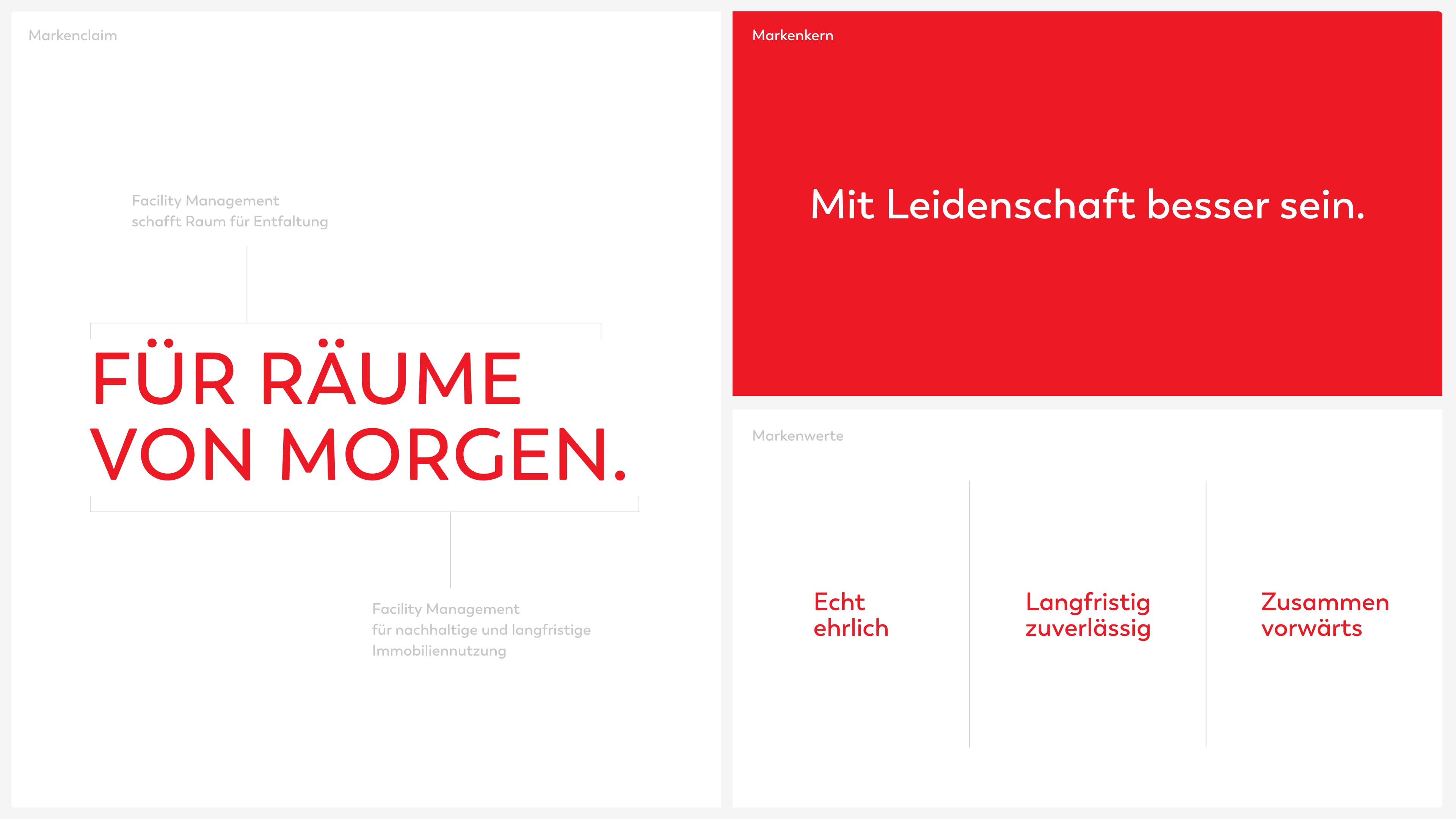
For the rooms of tomorrow.
BASIC Facility Management is one of the leading companies in the facility management sector and has been offering smart solutions for increasing efficiency and maintaining the value of real estate for two decades.
The company has grown considerably in recent years, but the design system was not initially the top priority. The desire for differentiation from the competition and a common identity that could speak for itself led to a strategic and visual repositioning: a clear identity and a powerful external form that is as future-oriented and functional as the brand itself.
The company has grown considerably in recent years, but the design system was not initially the top priority. The desire for differentiation from the competition and a common identity that could speak for itself led to a strategic and visual repositioning: a clear identity and a powerful external form that is as future-oriented and functional as the brand itself.
(Company)
BASIC Facility Management
(industry)
Facility Management
(year)
2025
(services)
(brand strategy)
BASIC sees facility management not as a service, but as a responsibility for the future of buildings.
We have brought the brand identity to the point. The brand stands for an active will to create: not to manage, but to improve.
With a spirit of discovery and curiosity, BASIC develops sustainable solutions at an early stage – always one step ahead. This thinking drives the brand and shapes its promise: Designing the spaces of tomorrow.
With a spirit of discovery and curiosity, BASIC develops sustainable solutions at an early stage – always one step ahead. This thinking drives the brand and shapes its promise: Designing the spaces of tomorrow.
(brand identity)
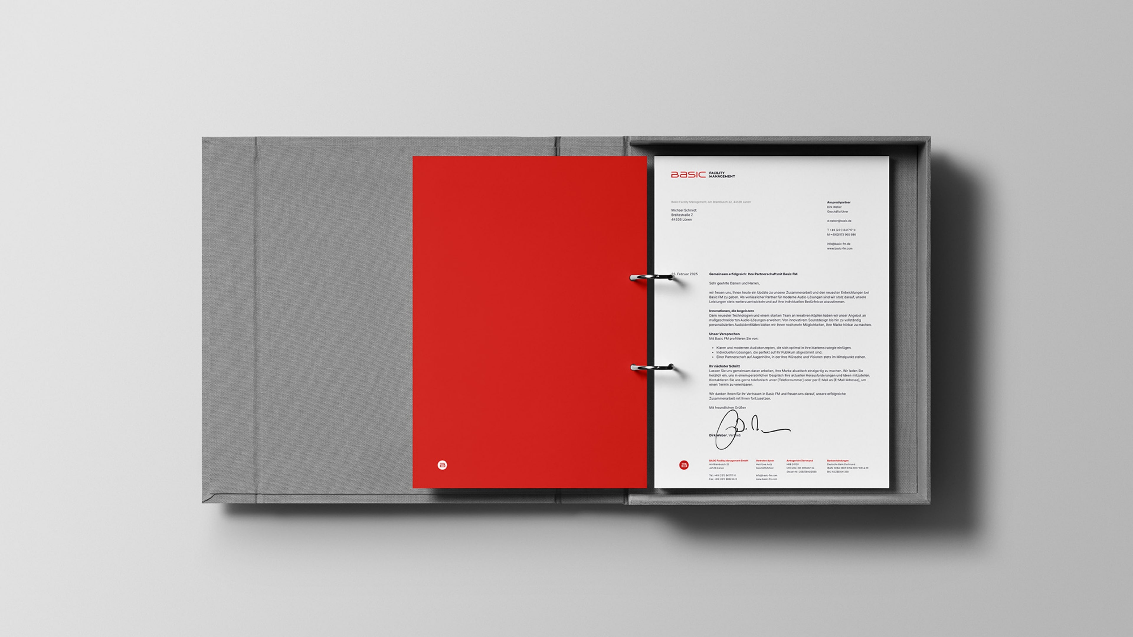
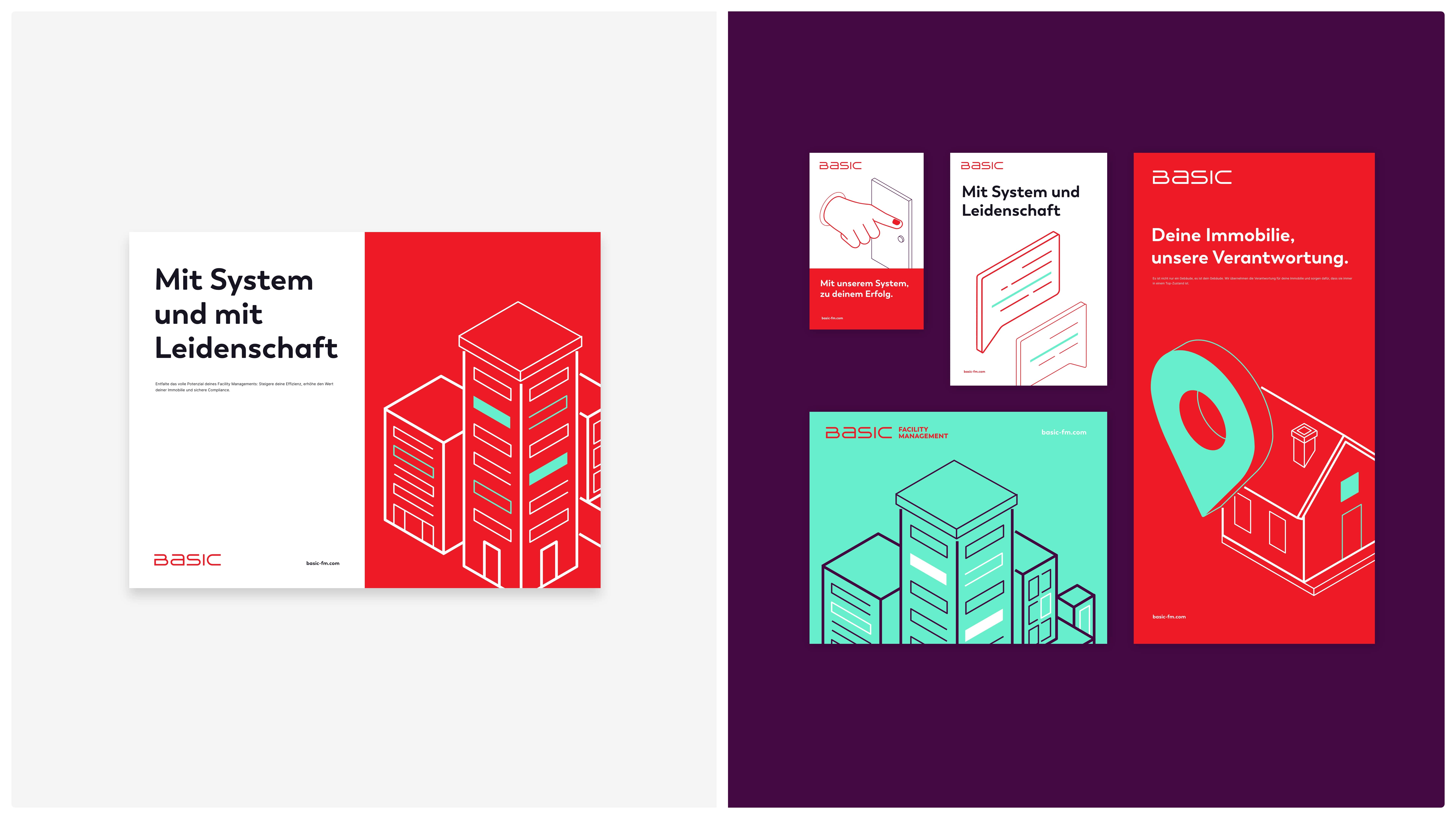
Conceptual stringency in the logo
The wordmark we developed is based on a clear, technical typeface – striking, straightforward and stable. At the same time, the carefully balanced typography with its harmonious spacing and fine details ensures transparency and accessibility. The logo is complemented by various secondary variants that work flexibly on different formats.
The line ends are no longer completely rounded, but only about 30 %. This results in a much more precise, sharper typeface that stands for digital clarity and technical conciseness. In addition, the proportions of all the letters have been rasterized and mathematically balanced. The result is a design that can be traced cleanly in a square grid. An expression of careful craftsmanship and conceptual stringency.
The line ends are no longer completely rounded, but only about 30 %. This results in a much more precise, sharper typeface that stands for digital clarity and technical conciseness. In addition, the proportions of all the letters have been rasterized and mathematically balanced. The result is a design that can be traced cleanly in a square grid. An expression of careful craftsmanship and conceptual stringency.
(brand identity)
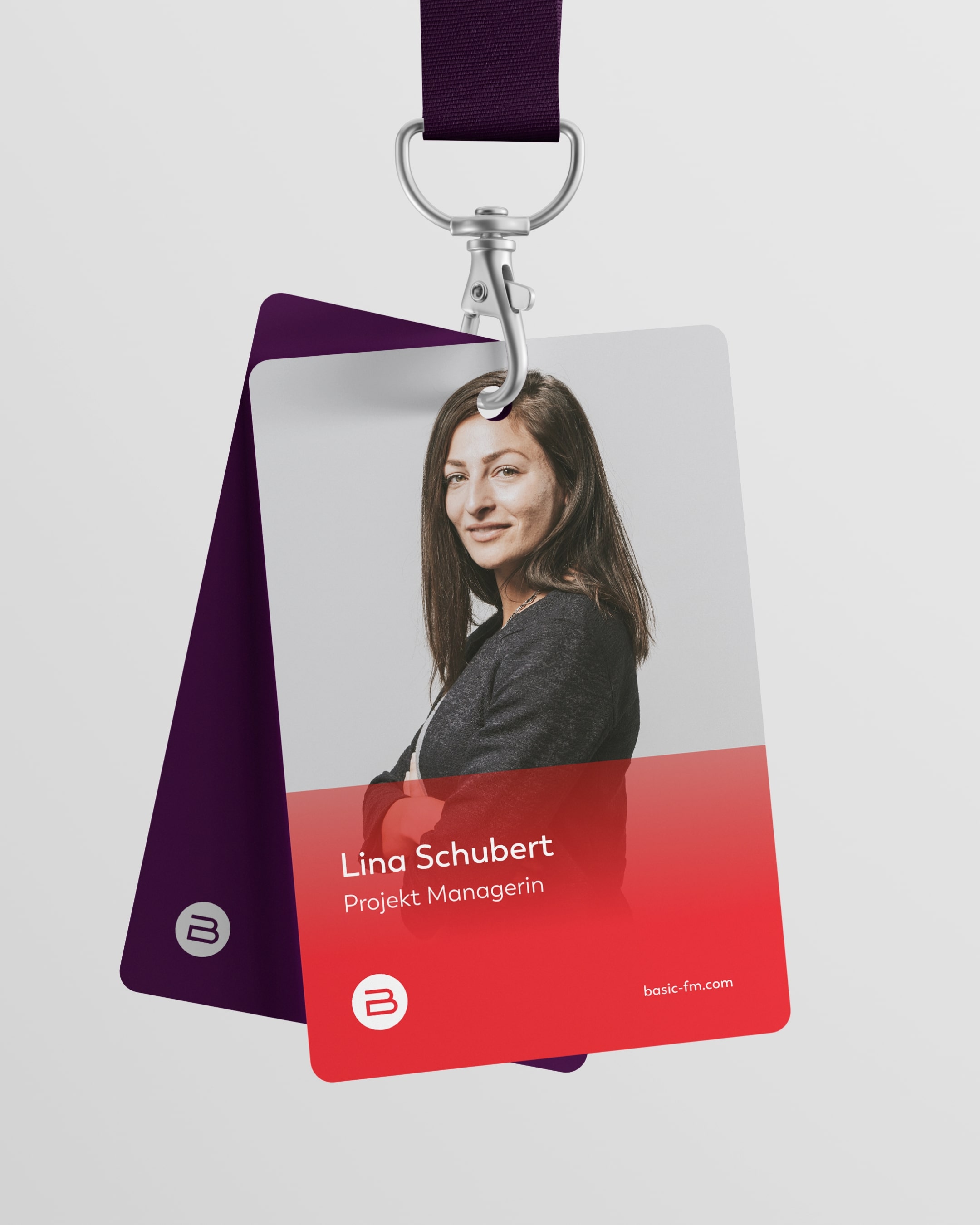
A tailor-made world of color and images
The color scheme also shows balance: crimson, as the carrier of the brand essence and dominant primary color, expresses energy and passion. It radiates self-confidence and makes a visual statement about the determination with which BASIC Facility Management has been working for two decades.
Graphite, as a dark counterweight, lends the brand depth and seriousness and symbolizes stability and trust. The spectrum is complemented by fresh, modern tones such as aquamarine and amethyst, which stand for a certain creative lightness.
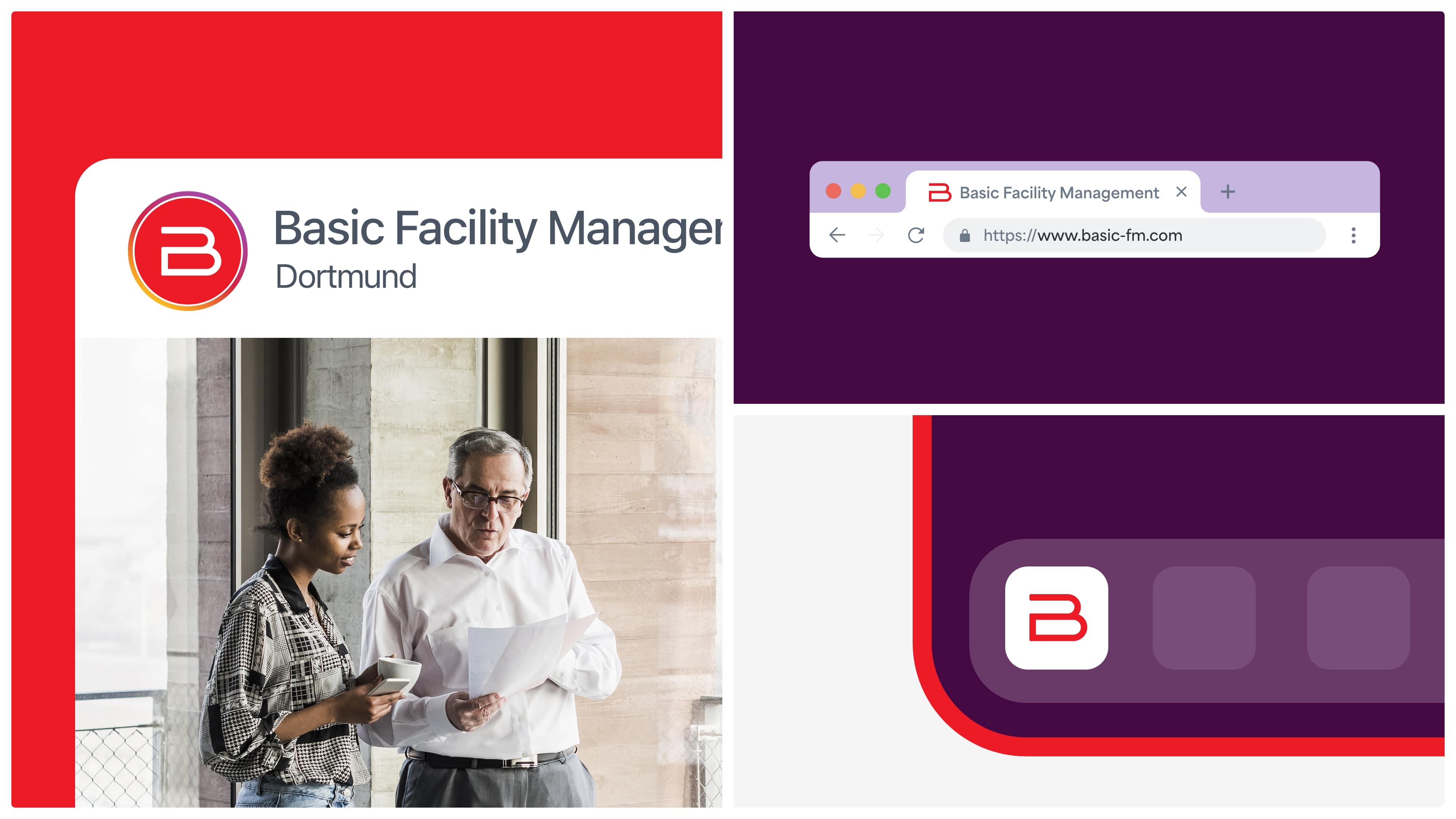
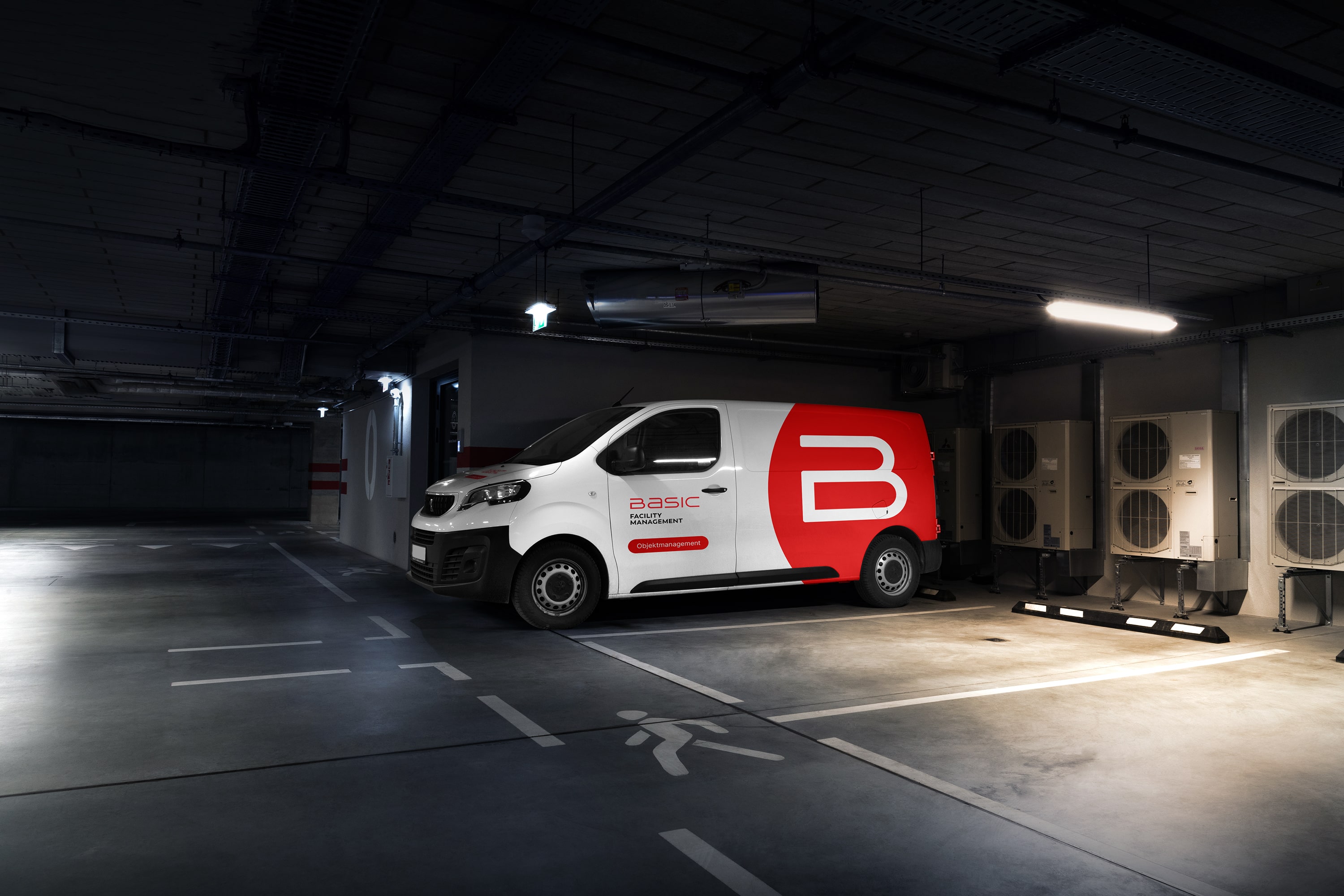
The imagery puts employees in the spotlight without staging them. It is not about stock-like perfection, but about honest closeness and the connection between service and humanity.
The architecture in the background is bright, uncluttered, with plenty of daylight and calm colors. The surroundings thus serve as a stage, not as the protagonist. The result is a focus on the essentials, while the surroundings maintain a clear link to the sector and the range of services.
Graphite, as a dark counterweight, lends the brand depth and seriousness and symbolizes stability and trust. The spectrum is complemented by fresh, modern tones such as aquamarine and amethyst, which stand for a certain creative lightness.
The imagery puts employees in the spotlight without staging them. It is not about stock-like perfection, but about honest closeness and the connection between service and humanity.
The architecture in the background is bright, uncluttered, with plenty of daylight and calm colors. The surroundings thus serve as a stage, not as the protagonist. The result is a focus on the essentials, while the surroundings maintain a clear link to the sector and the range of services.
(brand identity)
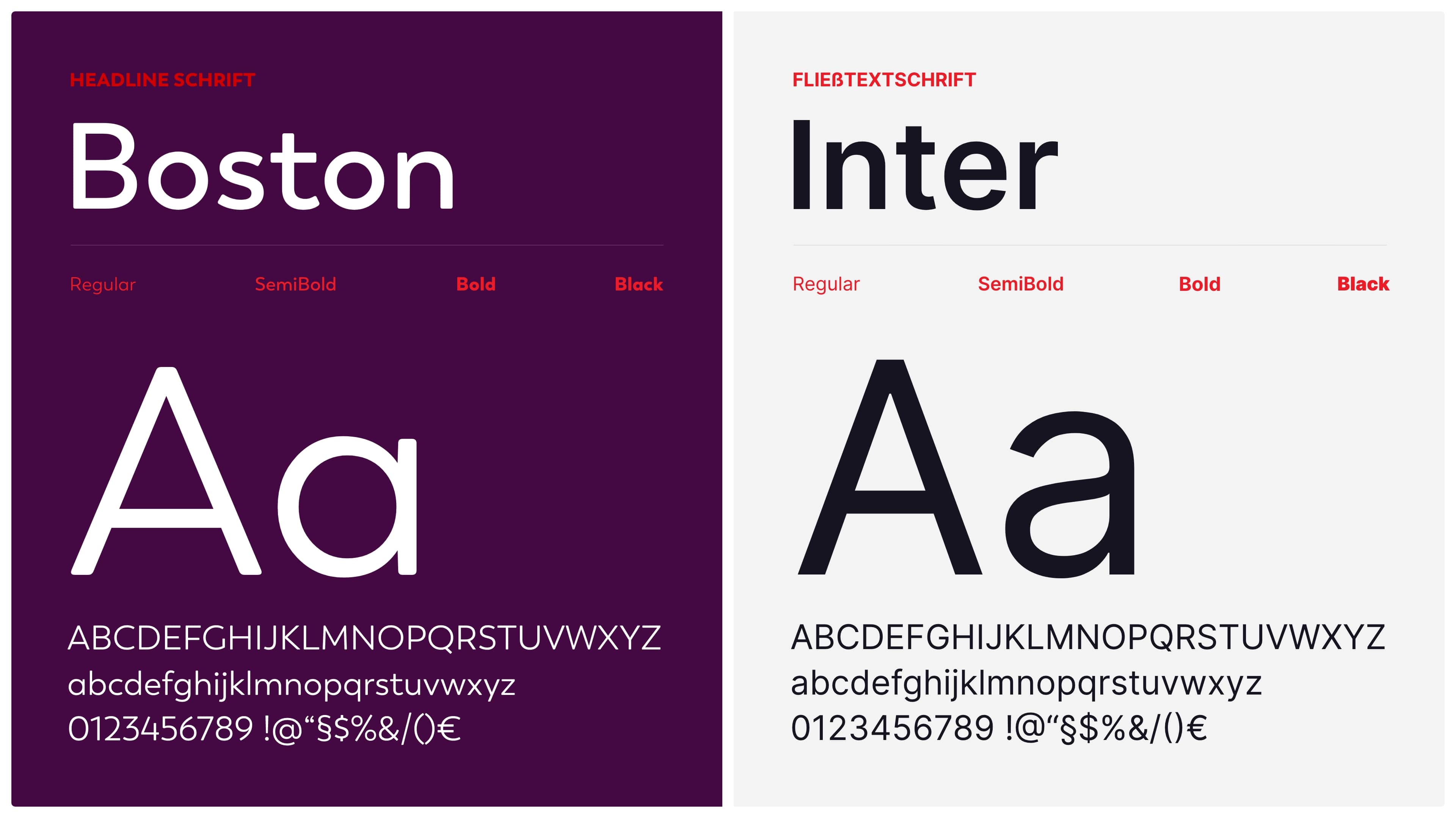
A typographic field of tension: between technical demands and human appeal
With the combination of Boston and Inter, we have created a clear typographic hierarchy that carries both character and function.
Boston, the font for headlines, brings a subtle humanity into play with its slightly rounded edges – it blends seamlessly with the logo, icons and graphic elements.
Inter, on the other hand, stands for legibility, structure and digital precision. It works just as well on large surfaces as in continuous text, both analog and digital.
Together, the two writings create a harmonious field of tension: between technical demands and human appeal.
(Employee voice)
"In the brand design, we have translated the clarity and core of the brand into a visual language that is both authentic and striking."

Jannis Falk
Art director
(brand identity)
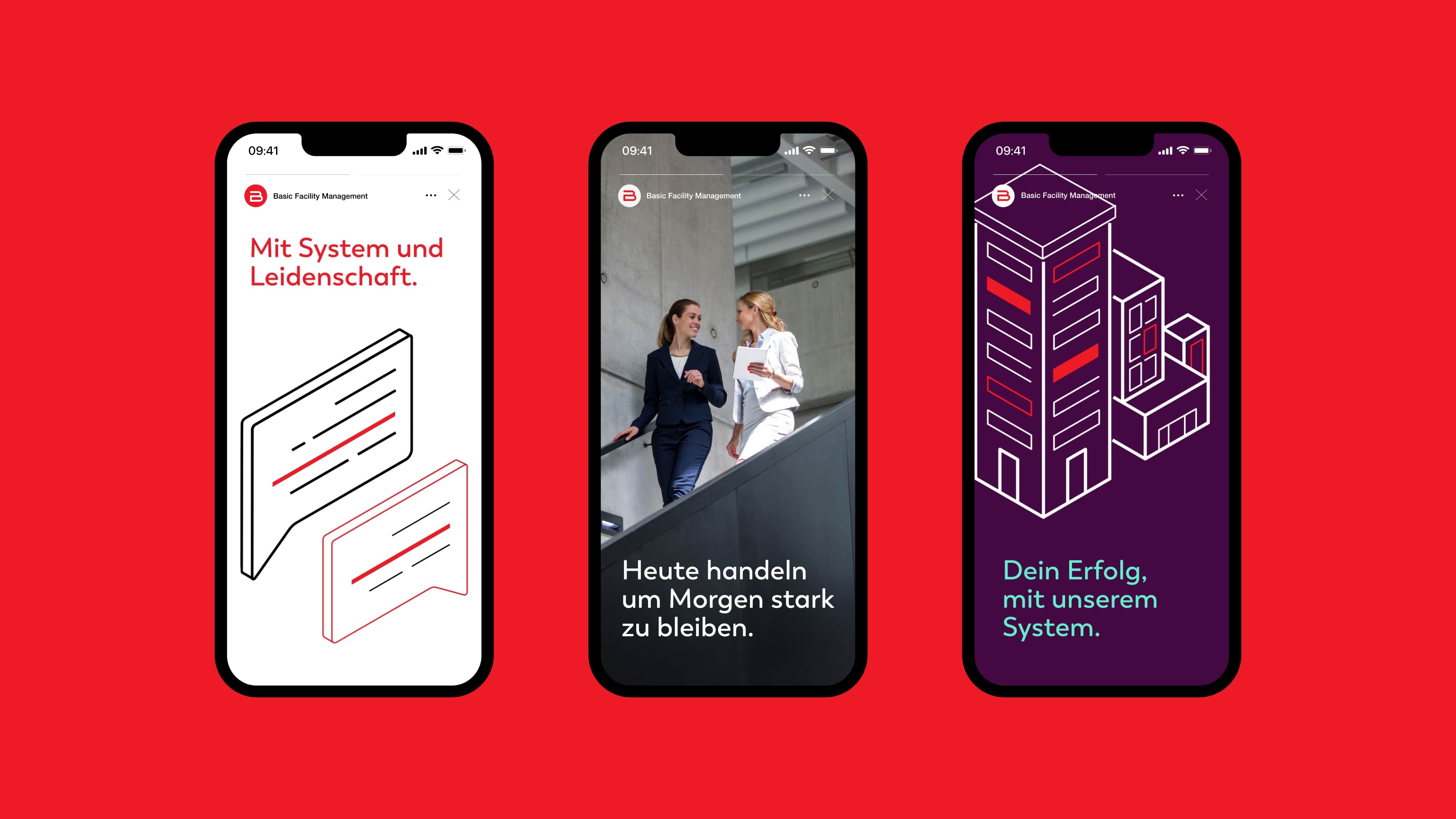
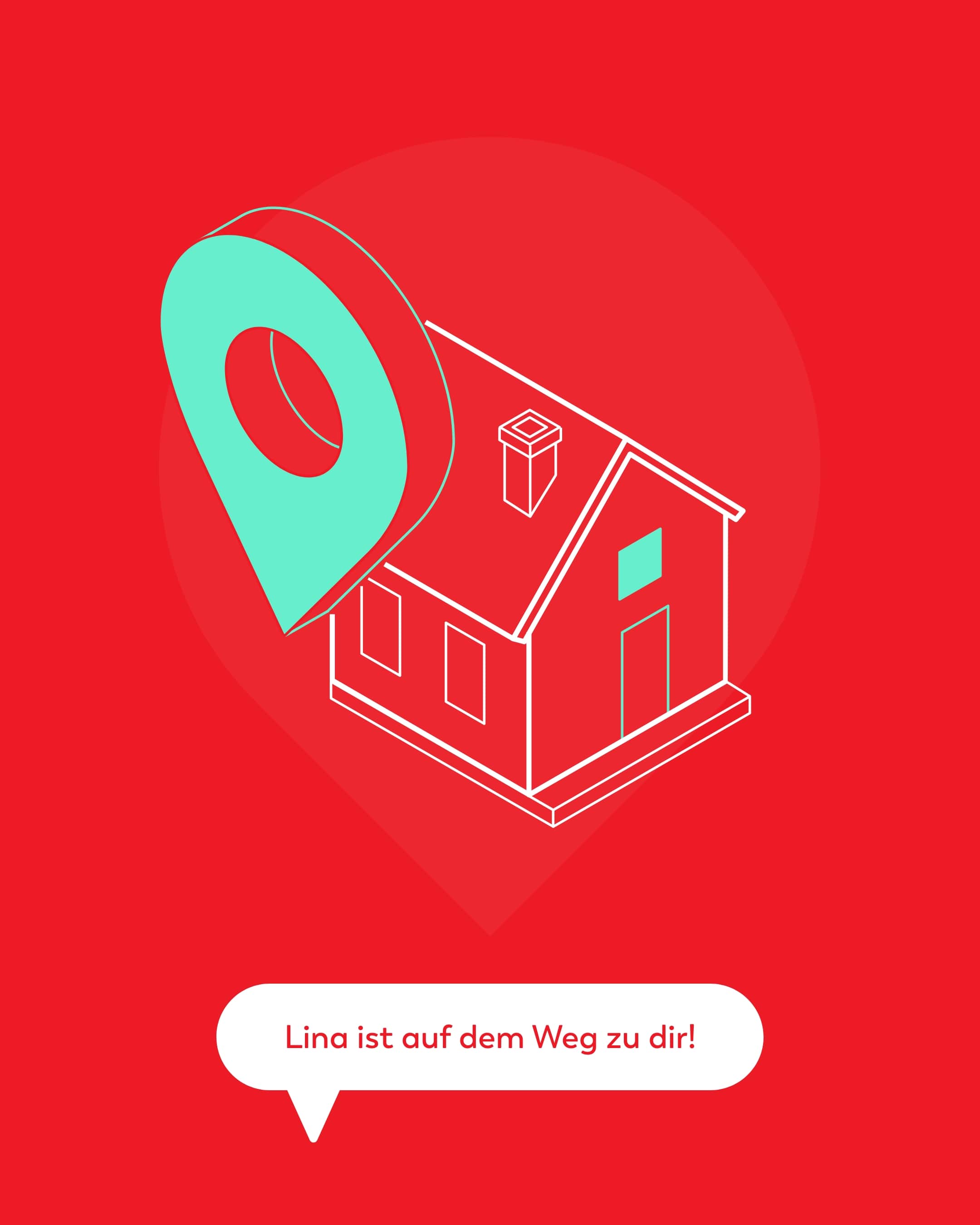
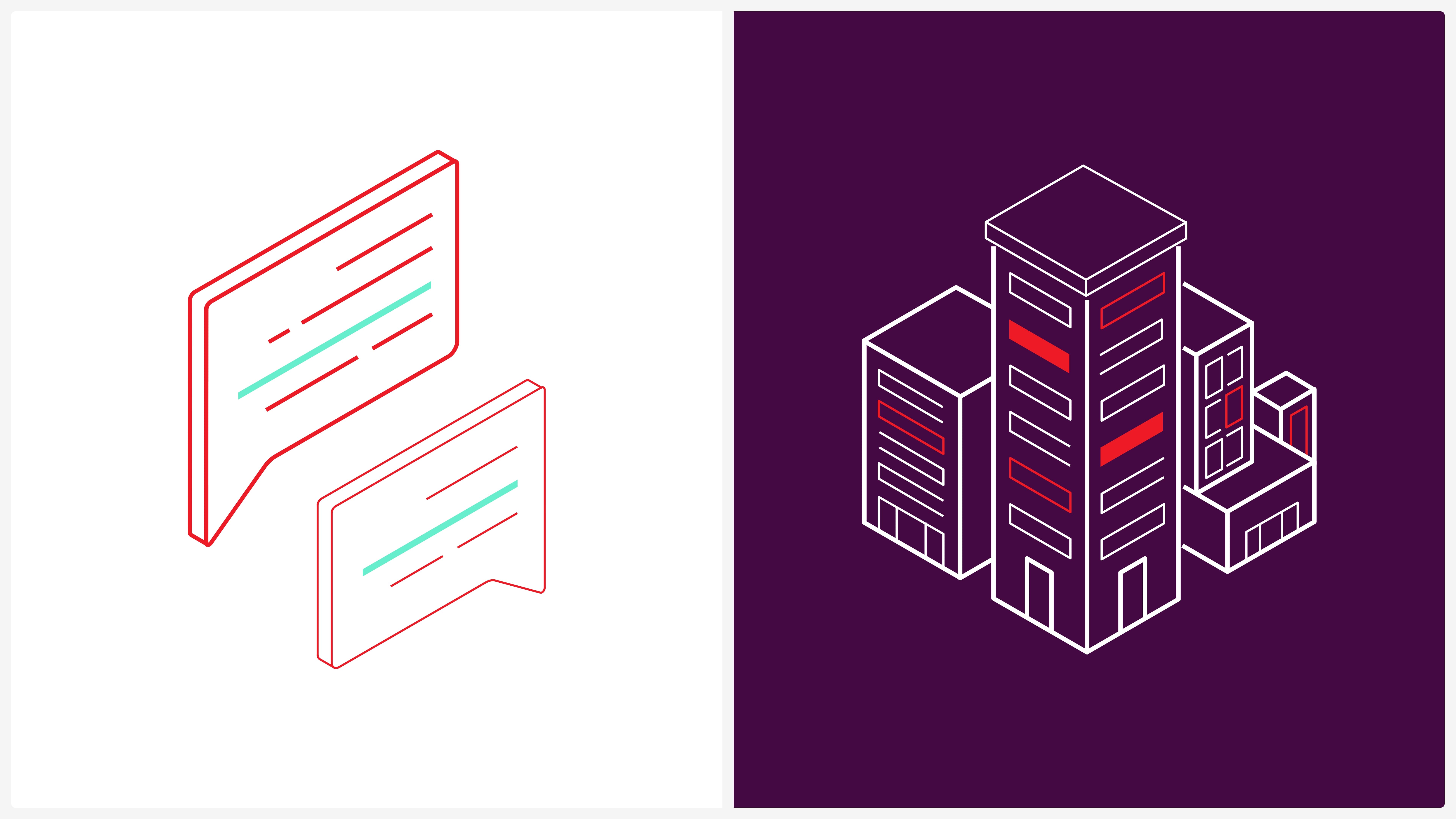
Posture and self-image - conveyed through isometric illustrations
Whether in the form of abstract building complexes, which stand for the range of services offered by BASIC Facility Management, or as dialog-oriented speech bubbles that illustrate communication and service: Each graphic conveys attitude and tells something about the company’s self-image.
The lines are technically precise, the perspective deliberately chosen – often in isometric representation. The colors crimson, aquamarine and graphite set specific accents, guide the eye and anchor the graphics firmly in the corporate design.
The lines are technically precise, the perspective deliberately chosen – often in isometric representation. The colors crimson, aquamarine and graphite set specific accents, guide the eye and anchor the graphics firmly in the corporate design.
(Customer testimonial)
"Schwarz+Matt didn't just develop a new design for us - they understood us [...]. The collaboration was professional, personal and [...] like a well-rehearsed team."
Marleen Antz
Head of Digital Marketing
BASIC Facility Management
(New business)

Contact person
André Schirmer
Founder & Managing Director