



2R software

Brand relaunch for the digitalization of waste processes. Making waste management work processes more efficient, sustainable and automated.

(Overview)

Don't waste time: branding for digital efficiency

For 20 years, 2R software has specialized in digitalization solutions for waste processes. They offer smart software that helps waste management companies to make their workflows more efficient, sustainable and automated.

The brand essence of 2R software can be clearly derived: Digitizing and sustainably optimizing processes. This was translated into a modern, visually progressive design that demonstrates the company’s visionary innovative strength.
(Company)
2R software
(industry)
Waste management
(year)
2024
2R software Farbkonzept mit Blautönen und feinem Rauschen zur konsistenten visuellen Verbindung von Dach- und Produktmarken.

(brand identity)

2R software in the word mark: Circular
economy made visible

The updated logo, now with the number 2 instead of the full “two”, was a defining feature of the branding.

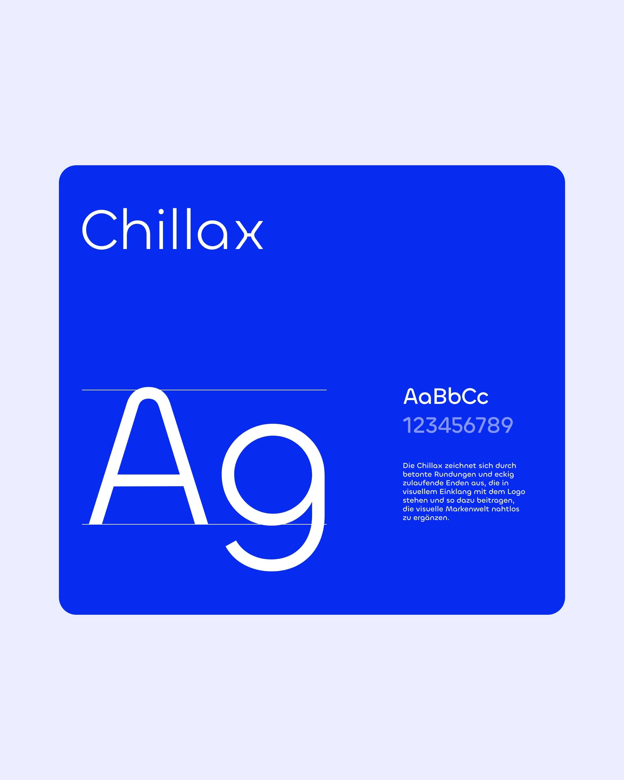
The adapted word mark and the corporate typeface with its circular curves symbolize the circular economy that 2R software stands for.
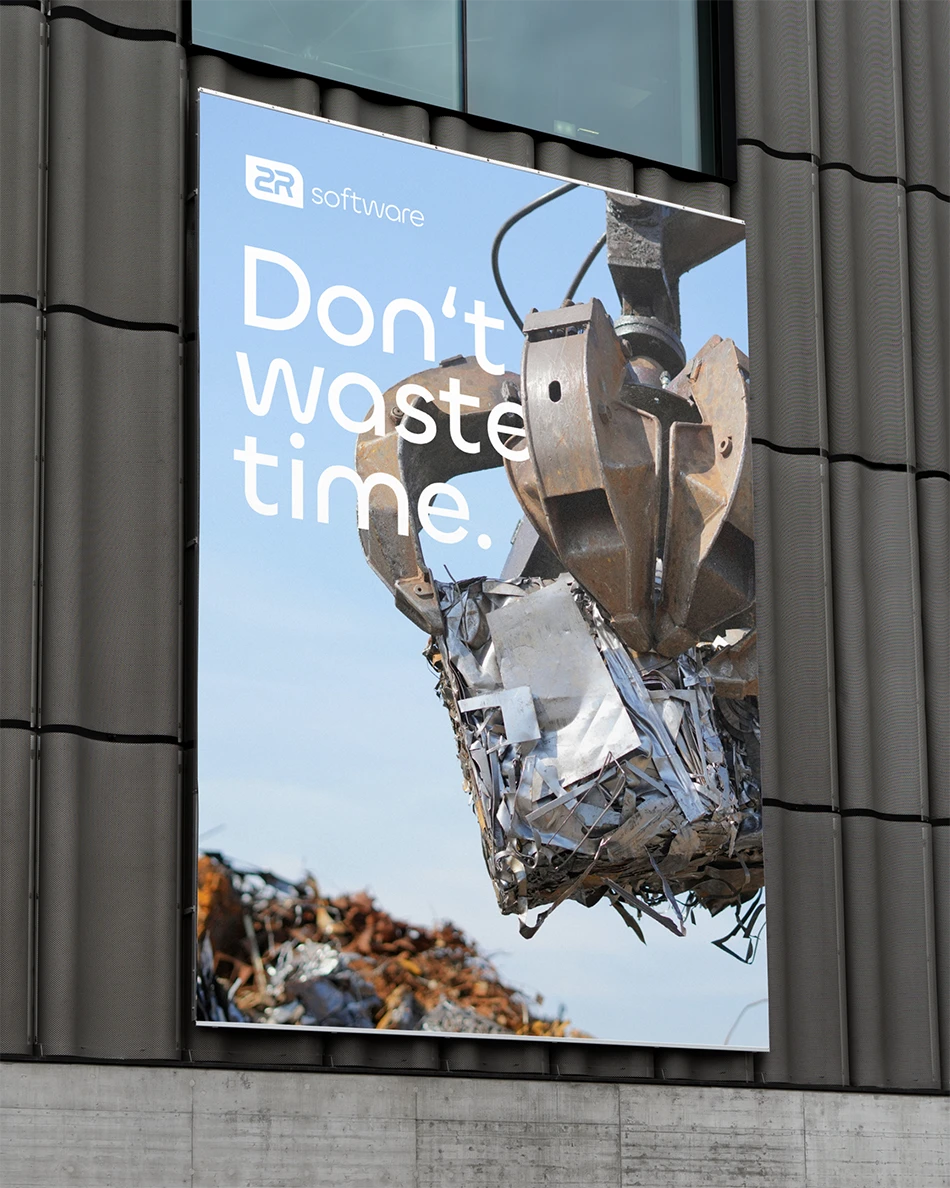
2R software Werbebanner an einer Fassade mit dem Claim Don’t waste time und einer Greifkran-Szene aus der Abfallwirtschaft.
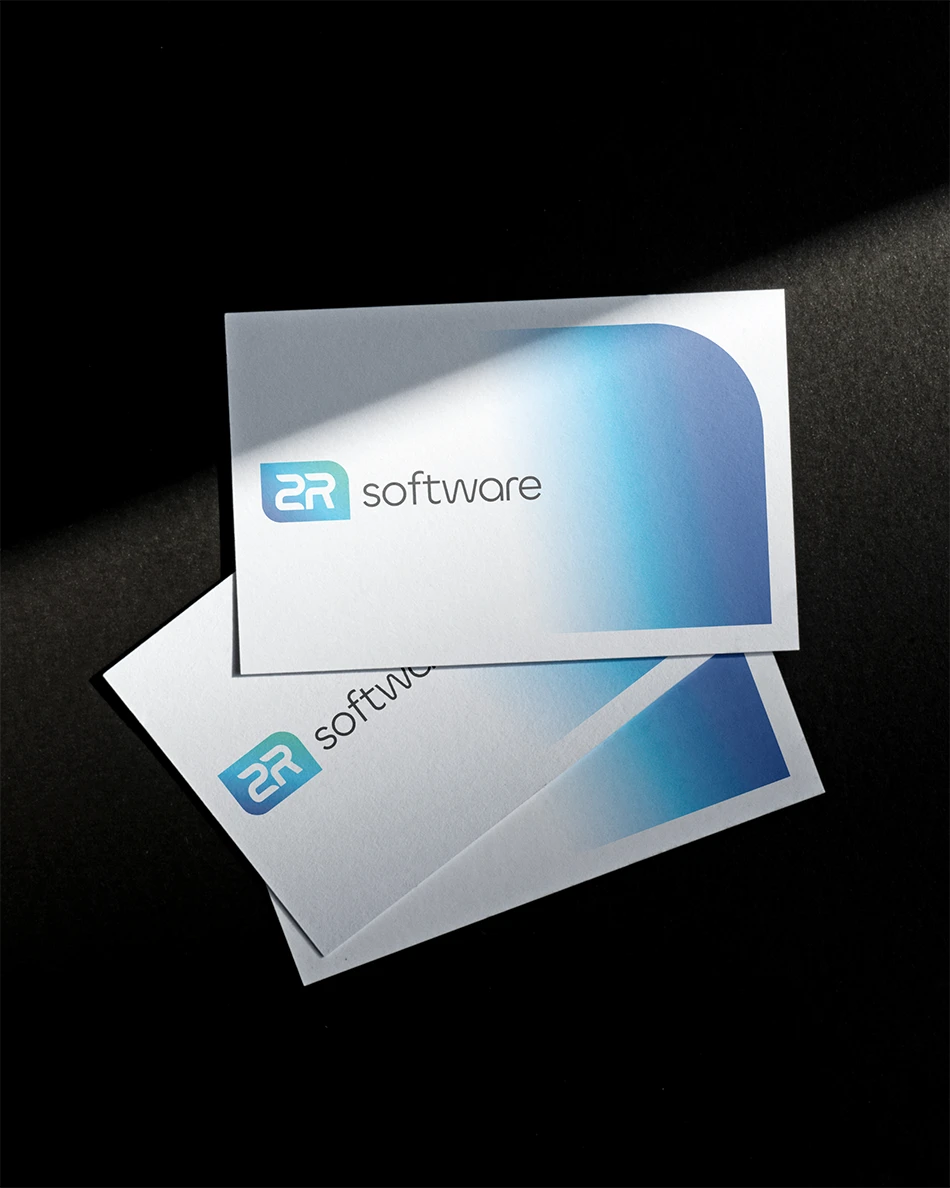
Visitenkarten-Set von 2R software mit dem neuen Logo und blauem Farbverlauf auf hochwertigem Papier vor dunklem Hintergrund.

(brand identity)

Don't waste time -
Efficiency and sustainability in the brand promise

The claim puts it in a nutshell: “Don’t waste time” highlights the focus on efficiency, innovation and environmental awareness and also underlines the product promise.

With the word “waste”, the claim contains a playful ambiguity (in German “Verschwendung” but also “Abfall”).
2R software Keyvisual mit dem Claim Don’t waste time und dem blauen Farbverlauf mit feinem Rauschen im modernen Branding-Design.

(brand identity)

Colors connect product brands visibly
and consistently

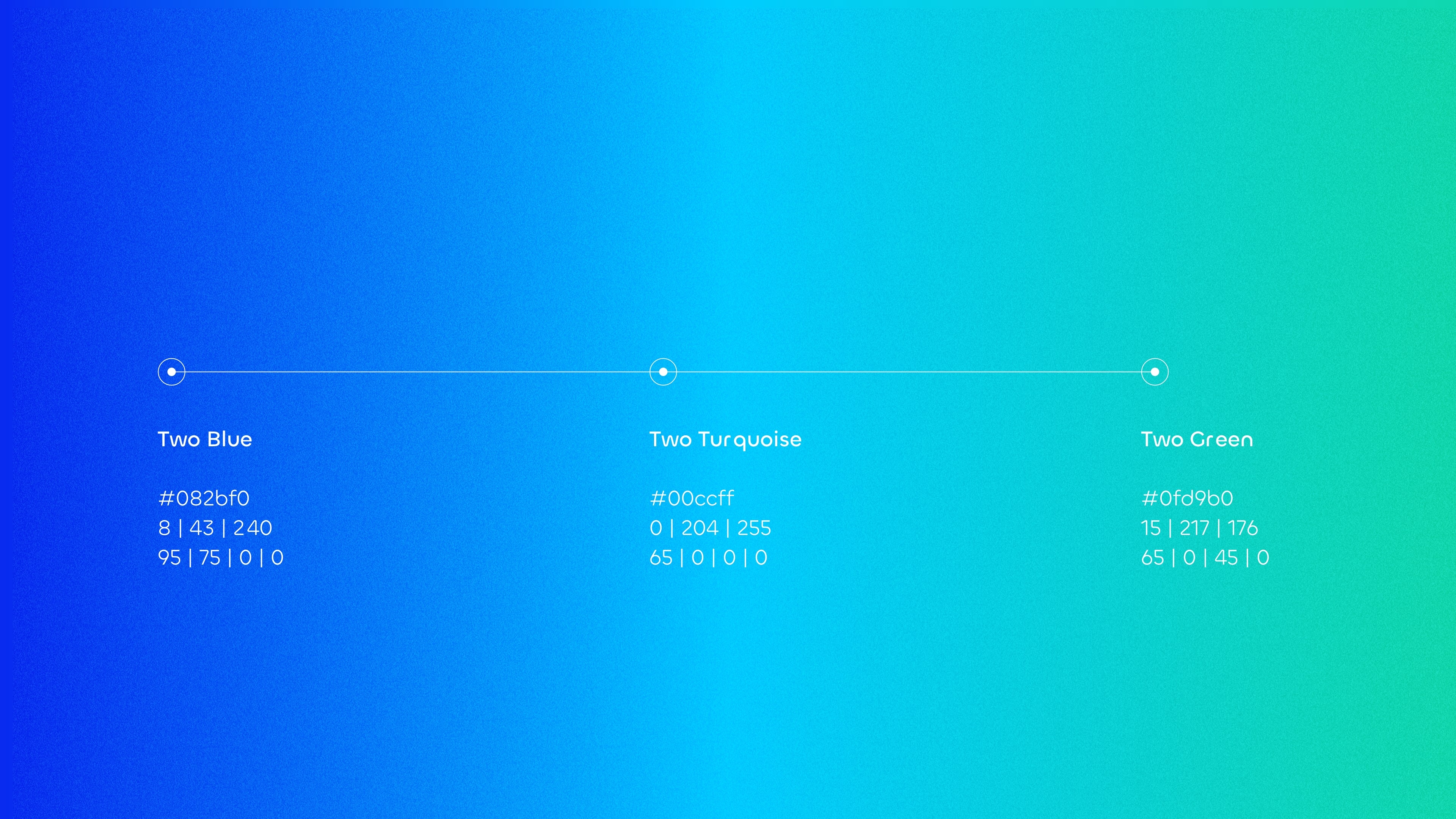
The 2R software color gradient is deliberately provided with fine noise in all applications – whether logo or key visual – which creates a structured and high-quality look, while the colors represent the product brands david and clearo.

The progressive, digital brand identity was united in a consistent branding, so that the product brands merge visually but remain clearly distinguishable thematically.
Icon-Set von 2R software mit blauen Piktogrammen in abgerundeten Kacheln zur visuellen Erklärung von Abfallprozessen.
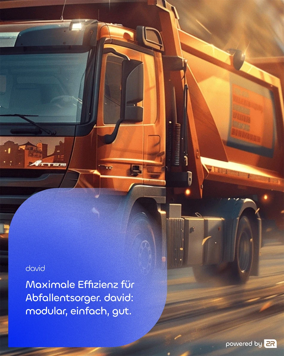
2R software Submarke david Keyvisual mit einem Müllfahrzeug im Einsatz und dem Claim Maximale Effizienz für Abfallentsorger.
2R software Submarke david Logo mit weißer Wortmarke auf blauem Hintergrund im Corporate Design.

(brand identity)

david sub-brand - independent, but part of the
2R software brand world

david makes business processes in waste management easier for waste disposal companies. The software offers an integrated financial accounting
interface, add-ons such as a scales connection and driver apps.

The website highlights the individual benefits and added value of the complete digital solution. Graphics illustrate the functions in an understandable way.
2R software Submarke clearo Logo mit weißer Wortmarke auf türkisblauem Hintergrund im Corporate Design.
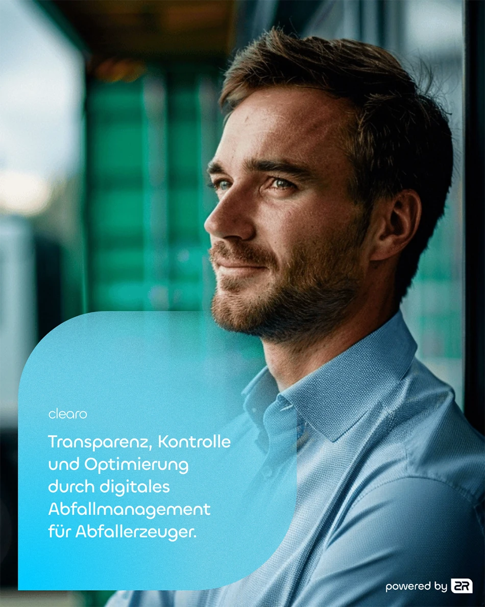
2R software Submarke clearo Keyvisual mit einem Geschäftsmann und dem Claim für digitales Abfallmanagement.
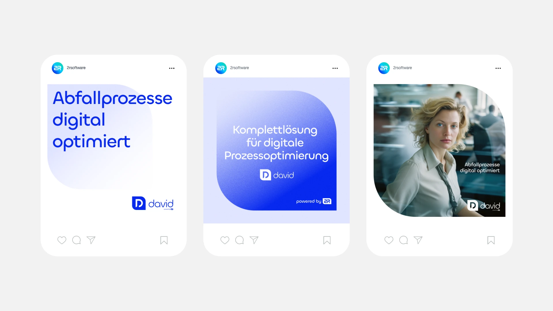
Drei Social-Media-Mockups für die 2R software Submarke david mit Aussagen zur Digitalisierung von Abfallprozessen.

(brand identity)

The clearo sub-brand - transparency and efficiency for waste producers

clearo digitizes and optimizes waste management for waste producers as a holistic software solution. The app-based functions create transparency for production companies.

clearo specifically addresses the target group of waste producers through the color and word mark, which implies that waste produced must also be “disposed of” again – thus closing the circle.
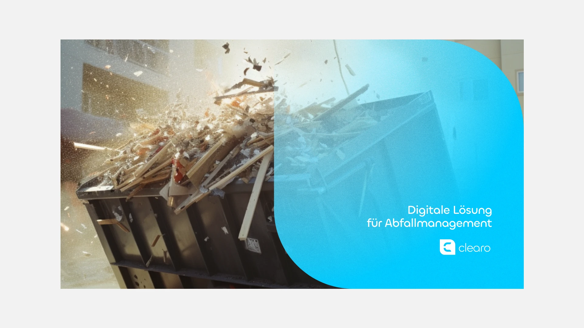
2R software Submarke clearo Keyvisual mit einem entleerenden Container und dem Claim für digitales Abfallmanagement.
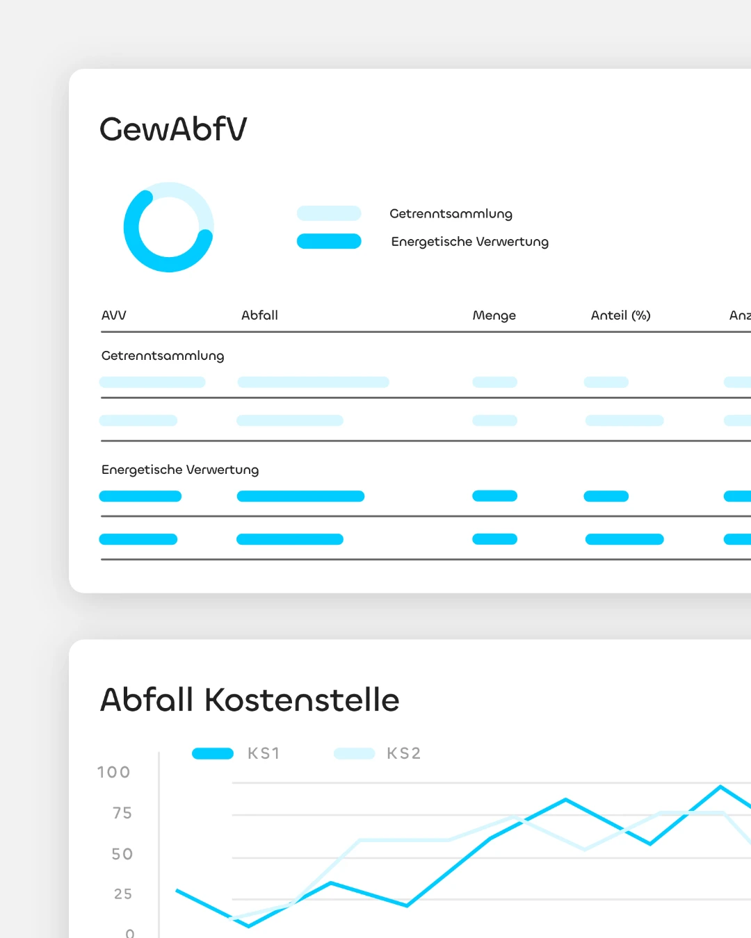
2R software Dashboard-Ansicht mit Grafiken zur GewAbfV und zu Abfall-Kostenstellen für das digitale Abfallmanagement.
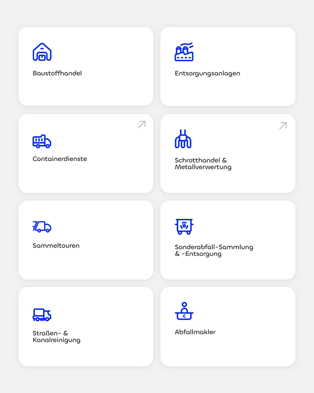
2R software Kachel-Navigation mit Icons für Branchen wie Baustoffhandel, Entsorgungsanlagen und Containerdienste.

(brand identity)

Complex software,
clear messages -
for every user group

The different target groups of both software products are deliberately addressed with informative graphics and the complex content of the product solutions is communicated as simply as possible. To achieve this, we took a close look at 2R software’s range of services and had employees explain the products in detail in order to prepare and design them for specific target groups.
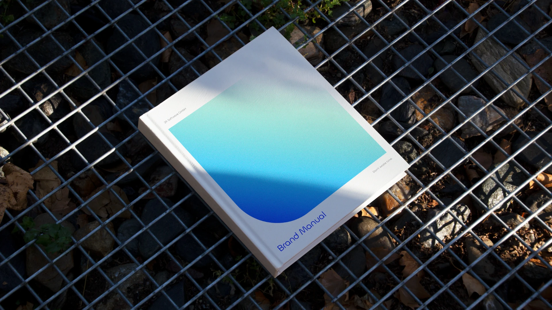
2R software Brand Manual als gedrucktes Buch mit dem blauen Farbverlauf und dem neuen Corporate Design auf einem Metallgitter.

(Employee voice)

"2R software creates a central interface in the circular economy [...]. The cooperation and the direct environmental reference gave the project a strong sense of purpose."

Niklas Beab
Brand Strategist
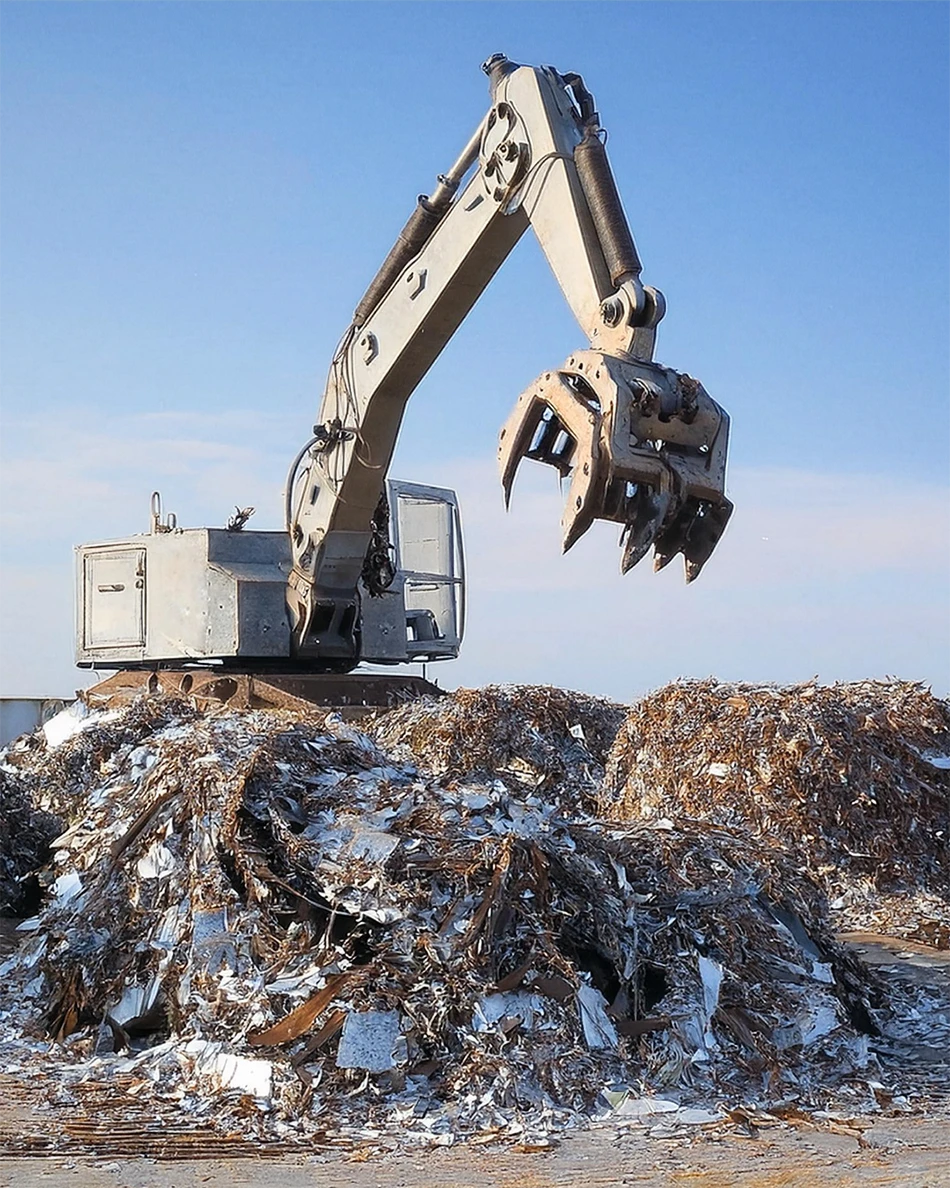
Ein industrieller Greifkran arbeitet auf einem Schrottplatz mit großen Metallhaufen vor blauem Himmel.
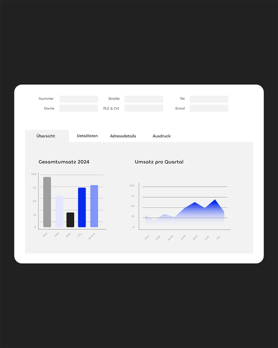
Ein Software-Dashboard auf einem Bildschirm mit Auswertungen zu Gesamtumsatz 2024 und Quartalszahlen im Corporate Design.

(brand experience)

Color coding connects david and clearo under one brand website

The merger of the previously separate david and clearo product pages into a joint homepage was implemented using different color schemes.

By assigning the different shades of blue to the respective product brands, the areas are clearly differentiated from one another, while the uniform design preserves the brand identity and the affiliation to the umbrella brand.
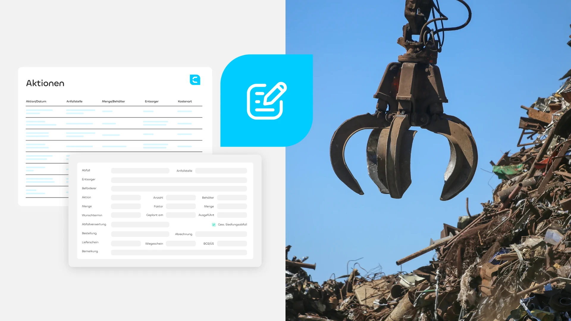
Zweigeteilte Komposition von 2R software, bestehend aus Software-UI-Ansichten links und einem Foto eines Greifkrans auf einem Schrottplatz rechts, verbunden durch ein zentrales Icon im Corporate Design.

(Employee voice)

"The 2R software website presents complex products in a user-friendly and technically profound way [...]. Clear functions and structured navigation make it possible to find information quickly."

Katharina Nolte
Web Designer
Grafik zur Corporate-Design-Schriftart Chillax mit den Buchstaben Ag und Zeichensatzbeispielen auf blauem Hintergrund.
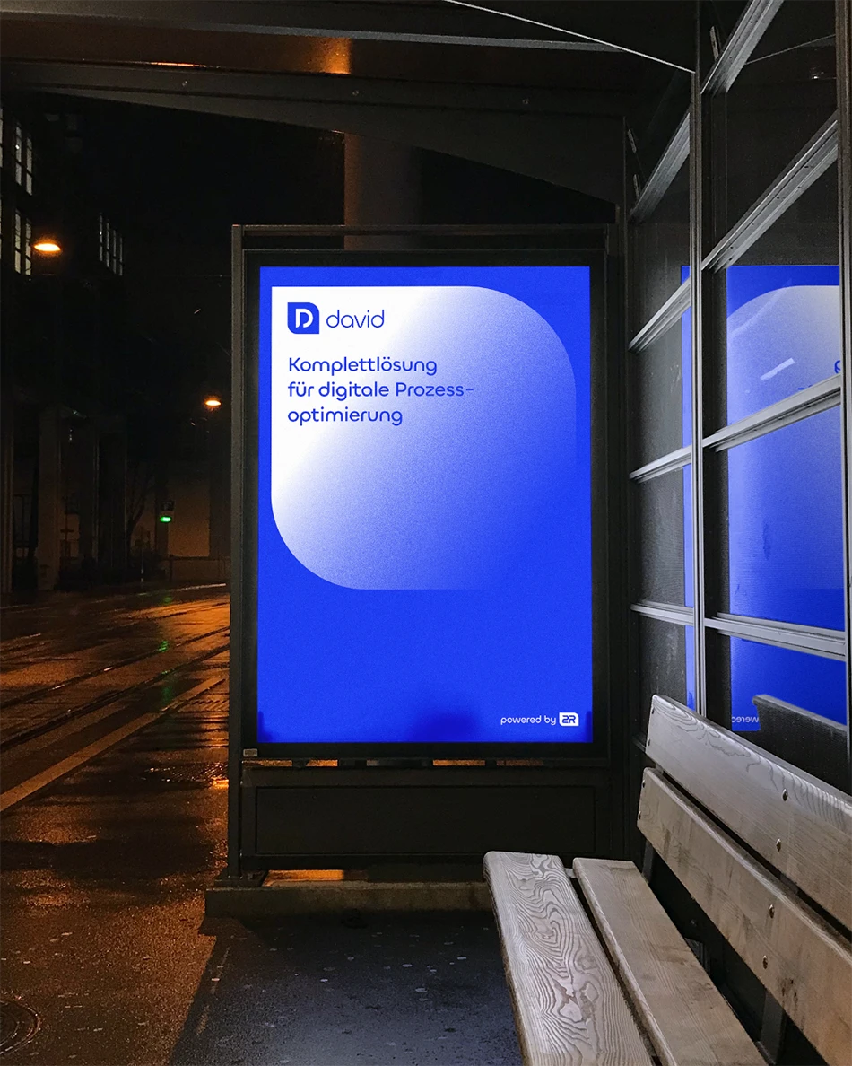
Ein beleuchtetes Werbeplakat (Out-of-Home) an einer Bushaltestelle bei Nacht mit dem Submarken-Design von david.
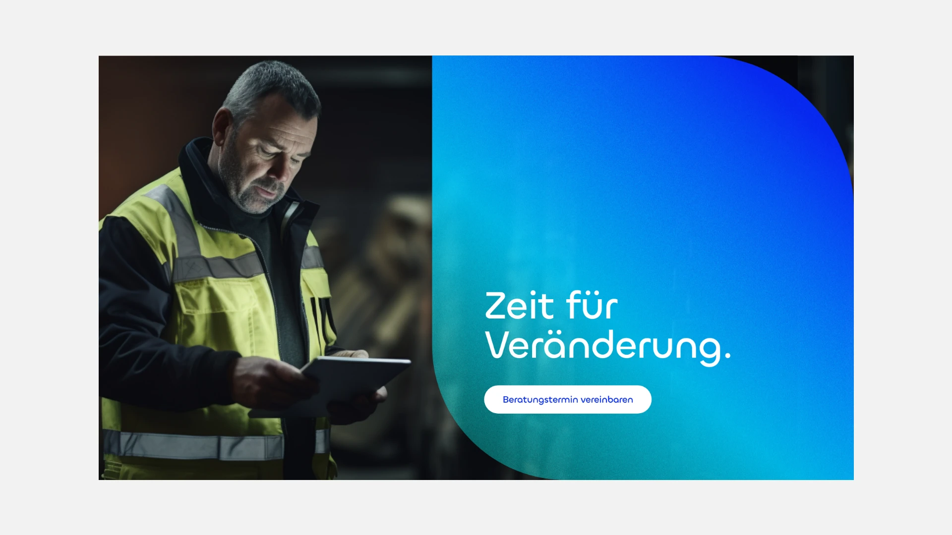
Zweigeteilte Komposition von 2R software mit einem Arbeiter in Warnkleidung mit Tablet links und einem blauen Farbverlauf-Feld mit dem Claim „Zeit für Veränderung.“ und Call-to-Action rechts.

(Customer testimonial)

"When I see our current brand identity, it makes me really happy! [...] The collaboration with the Schwarz+Matt® team was super productive and successful [...]."

Sandra Gemein
Marketing management
2R Software

(New business)