Quartz Healthcare
Branding for a European healthcare network - rethinking medical care.
(Overview)
A new era of networked healthcare
Quartz Healthcare is one of the leading and fastest growing European networks in the fields of radiology, radiotherapy and nuclear medicine. As a pioneer in the industry, Quartz Healthcare combines medical care with digital efficiency and patient-centered thinking with a holistic approach.
For the Europe-wide rollout of the growing healthcare network, we developed a new branding that is scalable and makes the brand a differentiating factor in the growth process.
For the Europe-wide rollout of the growing healthcare network, we developed a new branding that is scalable and makes the brand a differentiating factor in the growth process.
(Company)
Quartz Healthcare
(industry)
Health
(year)
2025
(services)
(brand strategy)
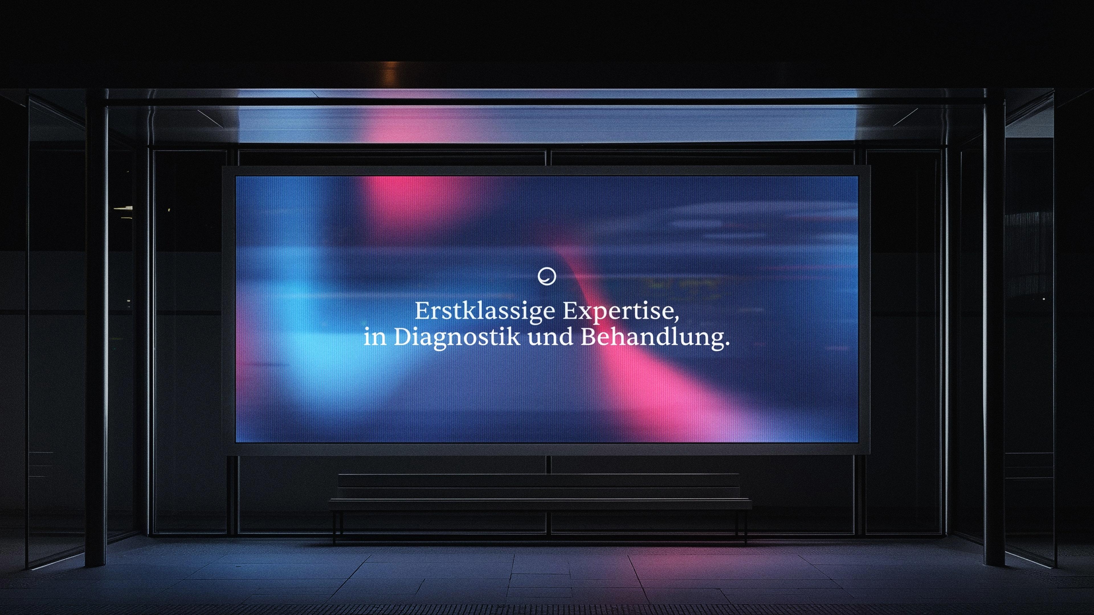
Medical excellence meets humanity and precision
The brand essence is based on the idea of rethinking health. As one of the leading and fastest growing European networks for radiology, radiotherapy and nuclear medicine, Quartz Healthcare sees itself as a provider of high-quality diagnostics and therapy, but also as a driving force for a holistic, sustainable healthcare system. The healthcare network combines medical excellence with humanity and technological precision in every diagnosis and treatment.


(brand identity)
Color for clarity,
calm and reliability
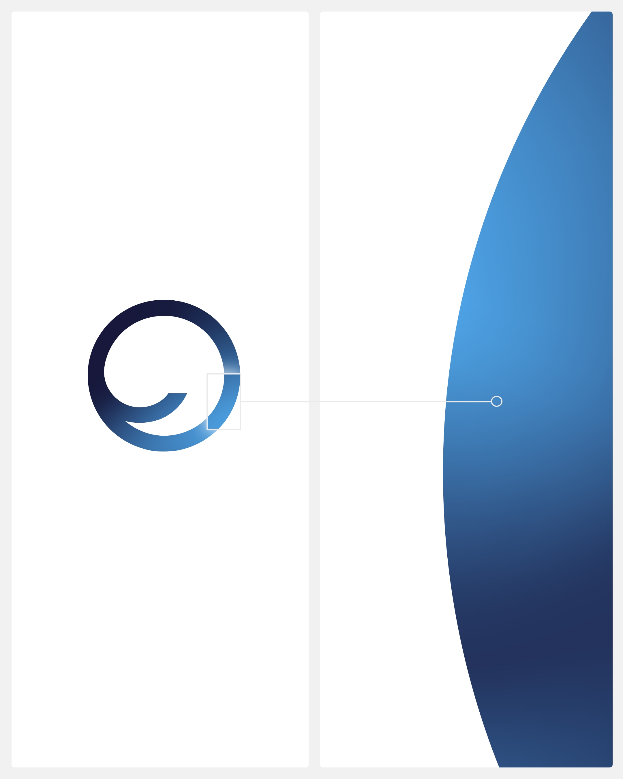
The color scheme was deliberately chosen to stand out clearly from the competition and create an independent, striking appearance. The color concept combines cool blue tones with purple and magenta gradients. The dynamic color gradients create a visual depth for the viewer.
The gentle blending of colors often creates a flowing impression that guides the eye through the design and conveys movement. The colors “Sapphire” and “Ruby” set lively accents.
The gentle blending of colors often creates a flowing impression that guides the eye through the design and conveys movement. The colors “Sapphire” and “Ruby” set lively accents.

(Employee voice)
"With Quartz Healthcare, we have rethought the brand design - clear, modern and professional. The new look appeals specifically to patients and strengthens the appeal of radiology partnerships."

Thi Lange
Art director
(brand identity)
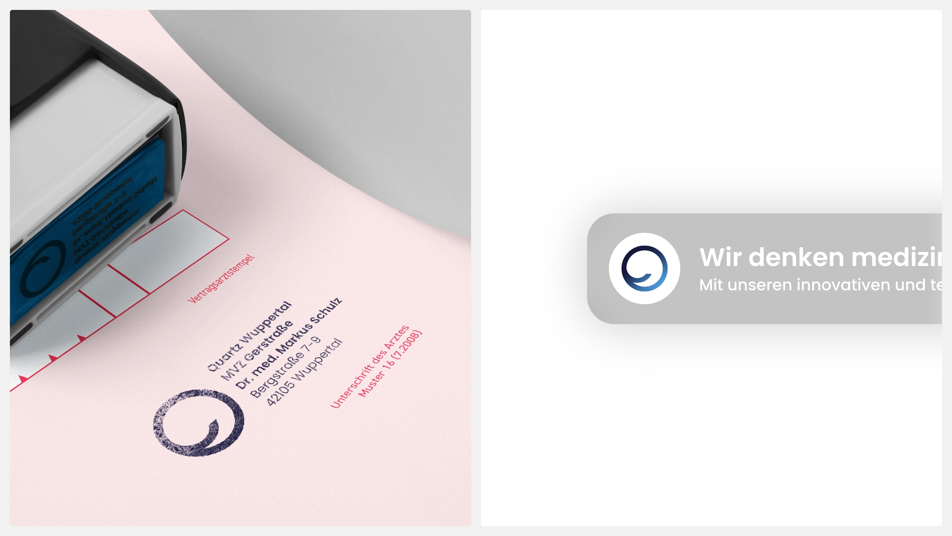
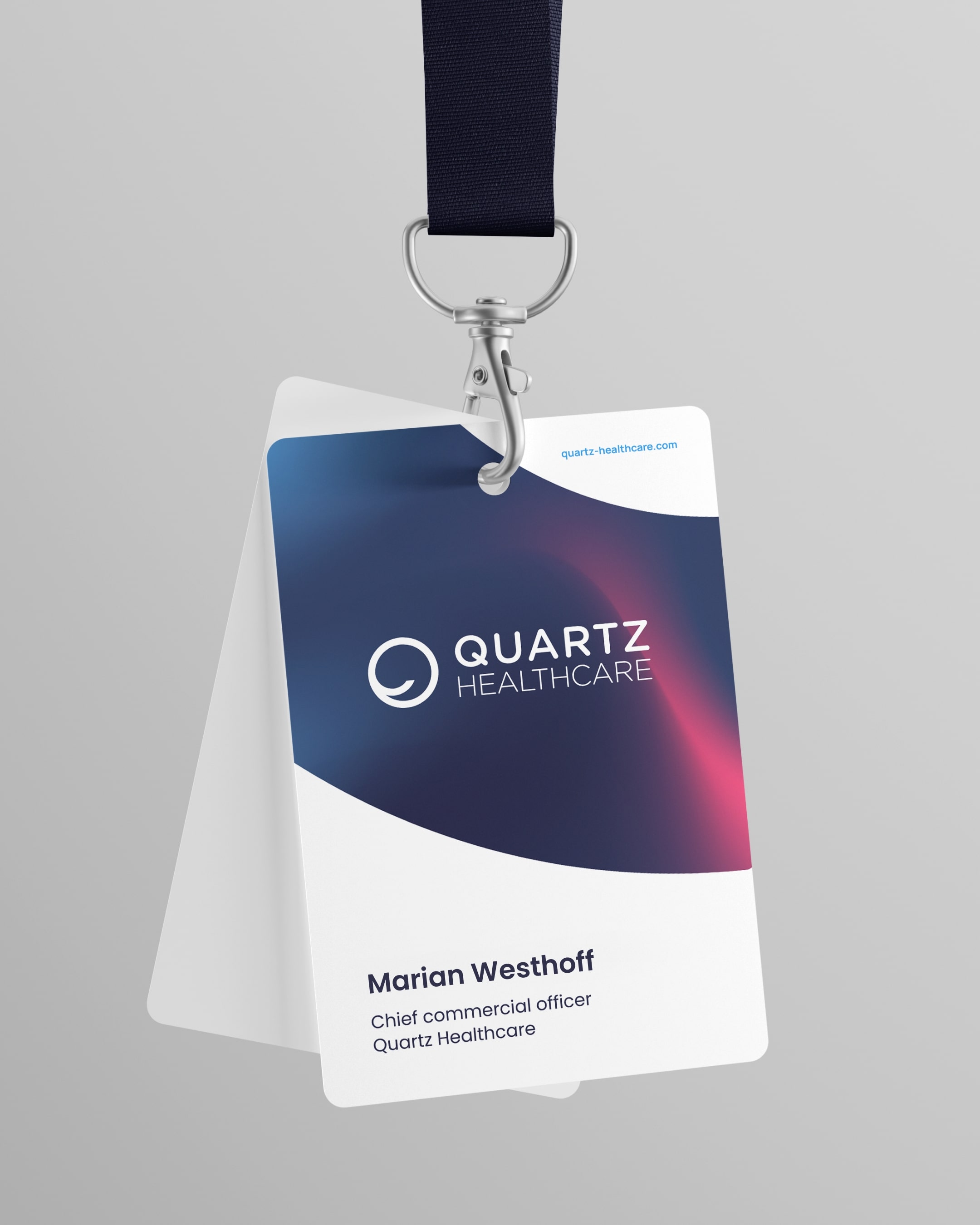
Clear identity at all touchpoints
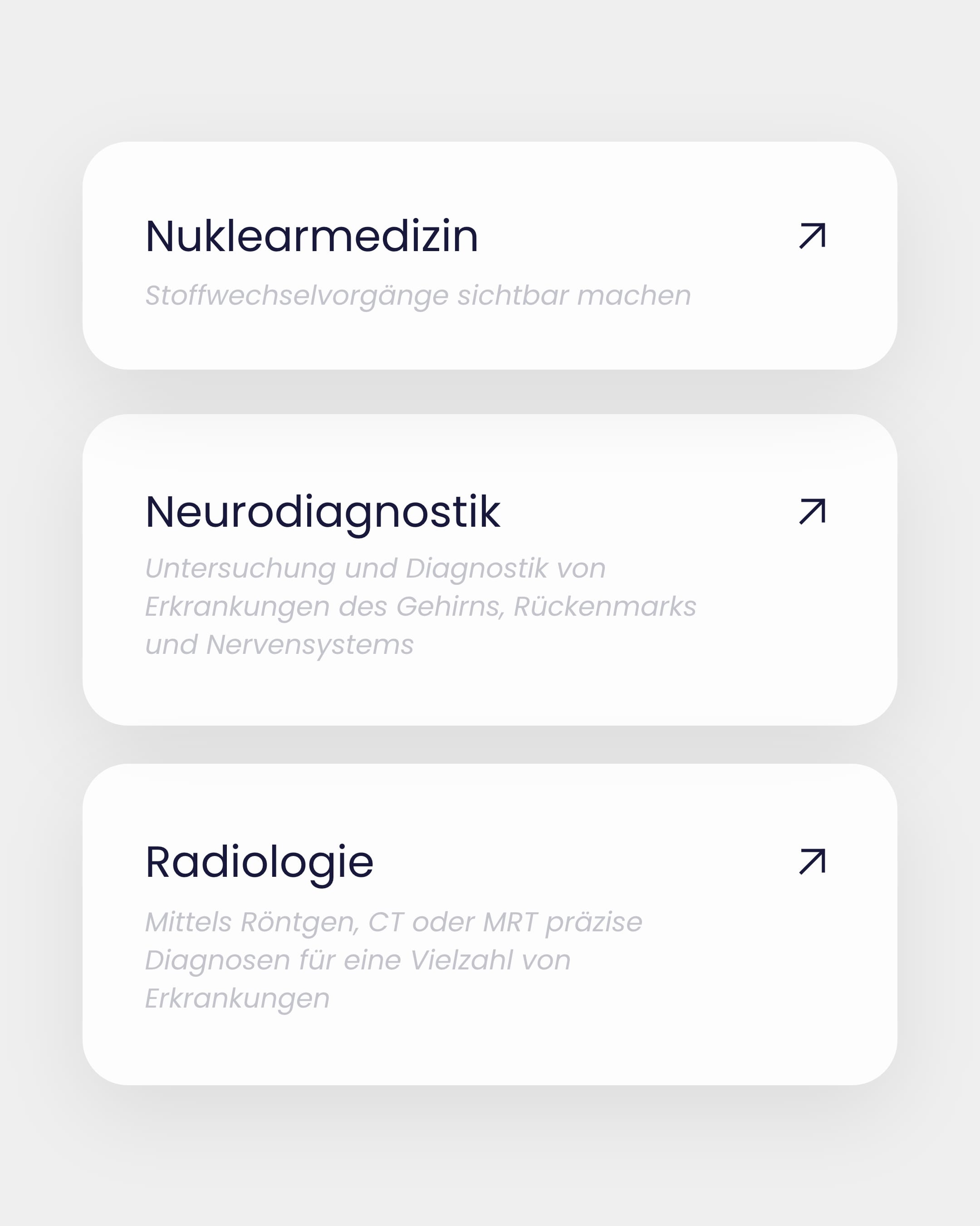
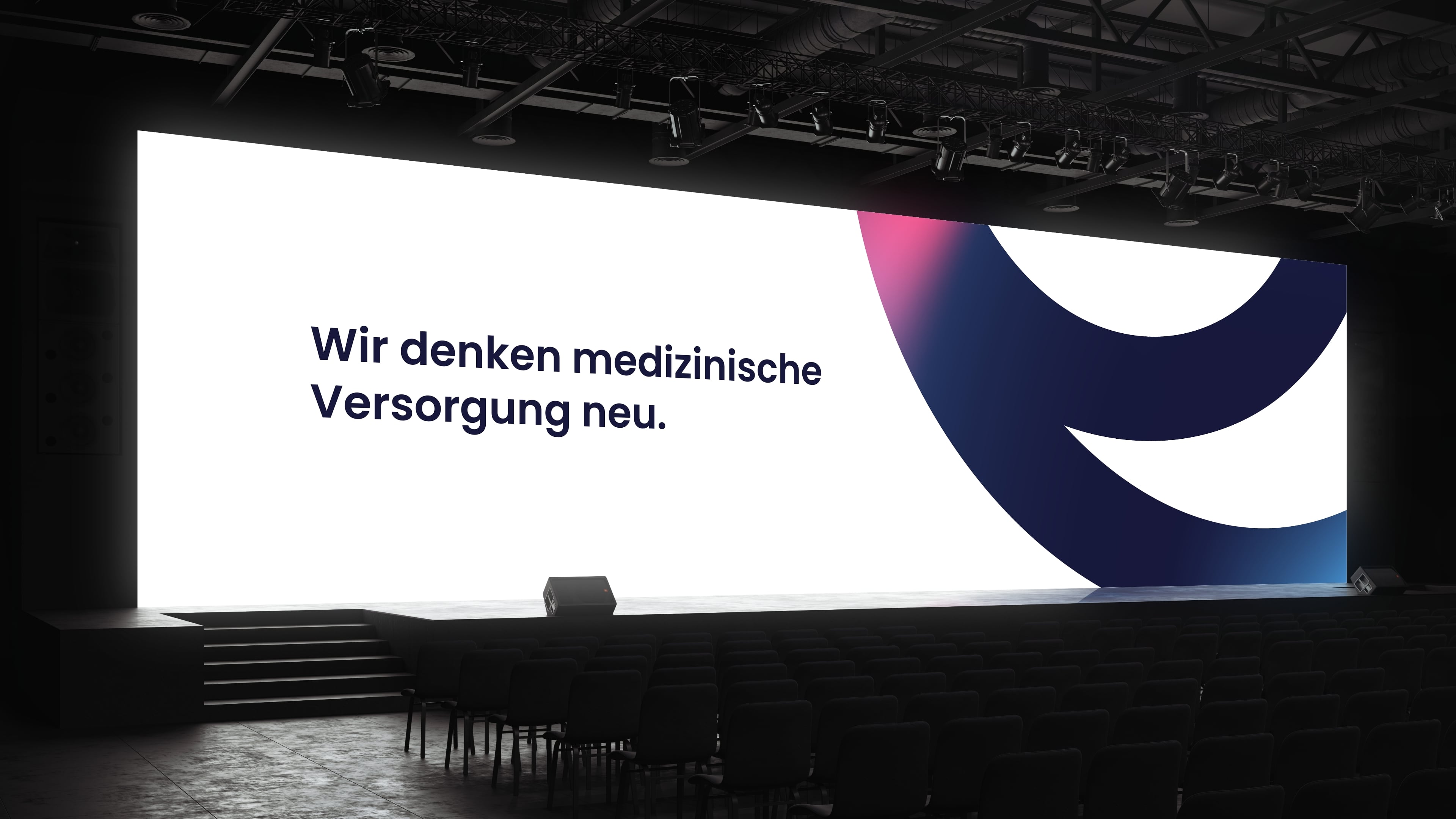
The figurative mark moves and reacts – it remains clearly recognizable as a symbol of the brand. The branding was designed so that it can be seamlessly applied to different user groups and touchpoints – from mobile appointment booking to employee communication.
(brand identity)
Design that creates depth and recognizability
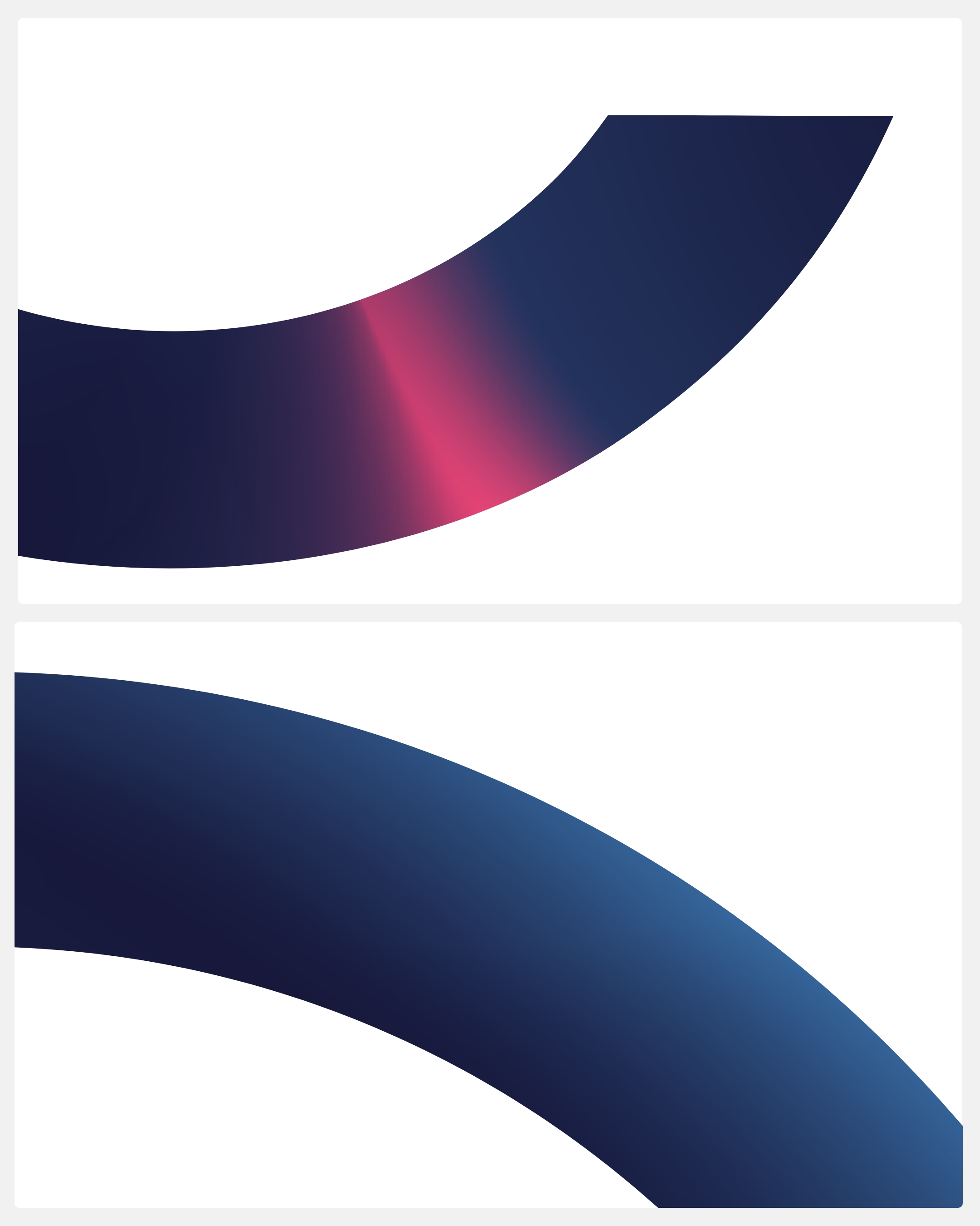
The abstract curved shapes derived from the Q function as an independent design element. They create recognizability – even where the logo itself is not present.
The gradients in violet, blue and magenta create a modern and deep atmosphere that works equally well in print and digital space.
The soft refraction of light within the colored surfaces gives the design a technological but not cold appearance.
The gradients in violet, blue and magenta create a modern and deep atmosphere that works equally well in print and digital space.
The soft refraction of light within the colored surfaces gives the design a technological but not cold appearance.
(Customer testimonial)
"We were particularly impressed by the close, trusting and highly flexible collaboration: Schwarz+Matt® understood our needs, translated them into strong branding and proved to be a reliable expert."
Hannah Windmüller
Online Marketing Manager
Quartz Healthcare
(New business)

Contact
André Schirmer
Founder & Managing Director