educaro
Global relaunch of the corporate design for an education tech start-up from Düsseldorf.

(Overview)
International rebranding
As part of the strong growth, the founders decided to relaunch the corporate design internationally.
Educaro is an edutech start-up that guides people from non-European countries into Western labor markets and study places. Educaro uses digital processes such as e-learning, apps and global networking.
Educaro is an edutech start-up that guides people from non-European countries into Western labor markets and study places. Educaro uses digital processes such as e-learning, apps and global networking.
(Company)
educaro
(industry)
Education
(year)
2019
(services)
(brand strategy)
Convincing across national borders
As a first step, the brand positioning was sharpened in terms of content and language and coordinated as the basis for further work. The central story in the communication is the “journey” from the country of origin to Germany.
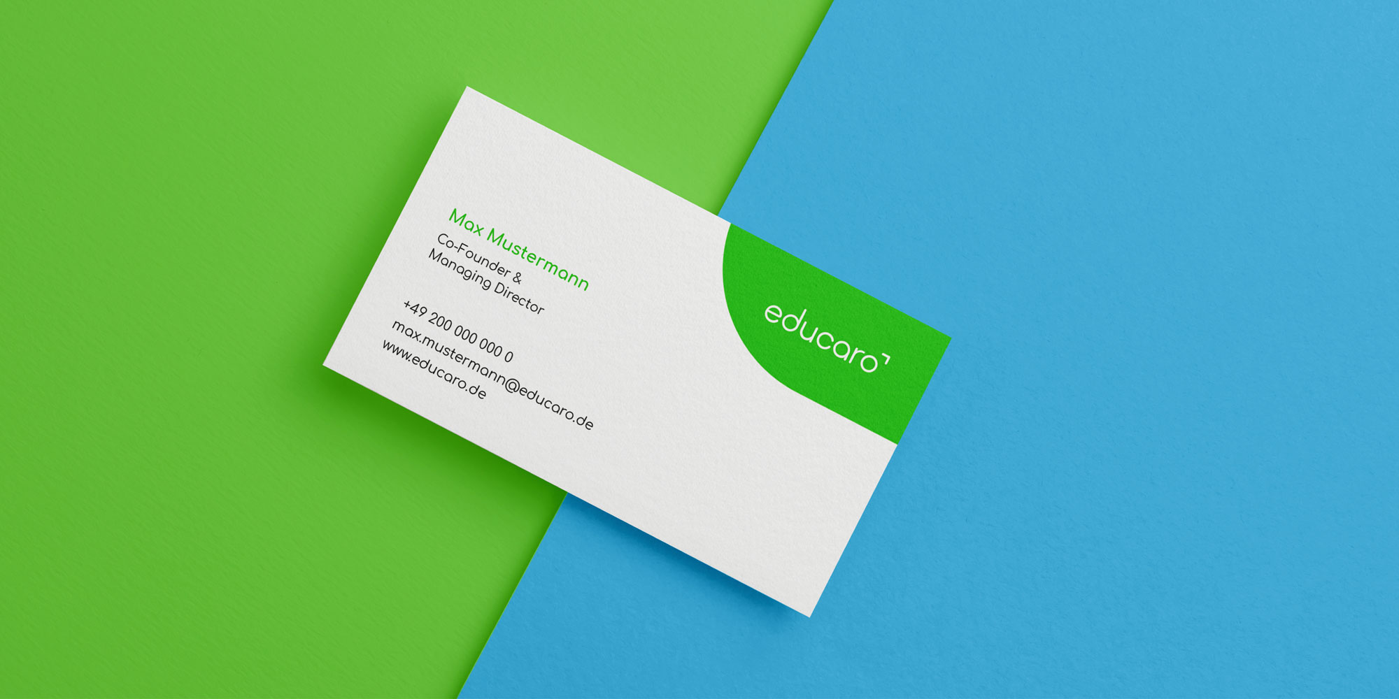
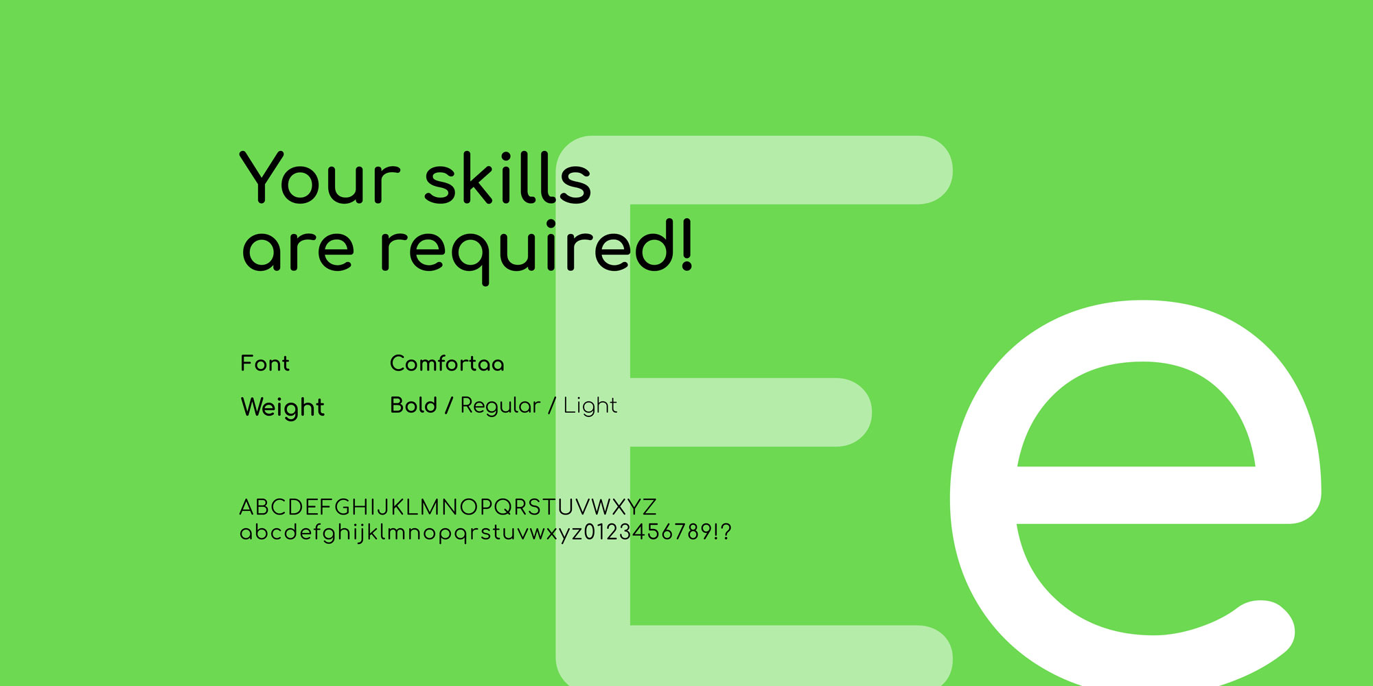
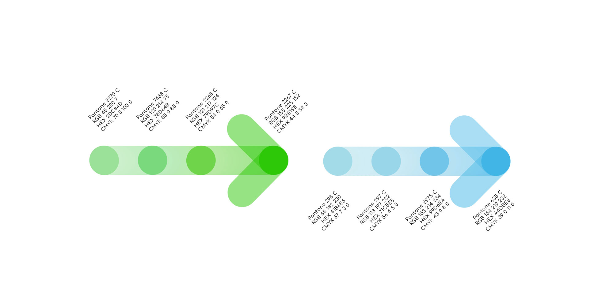
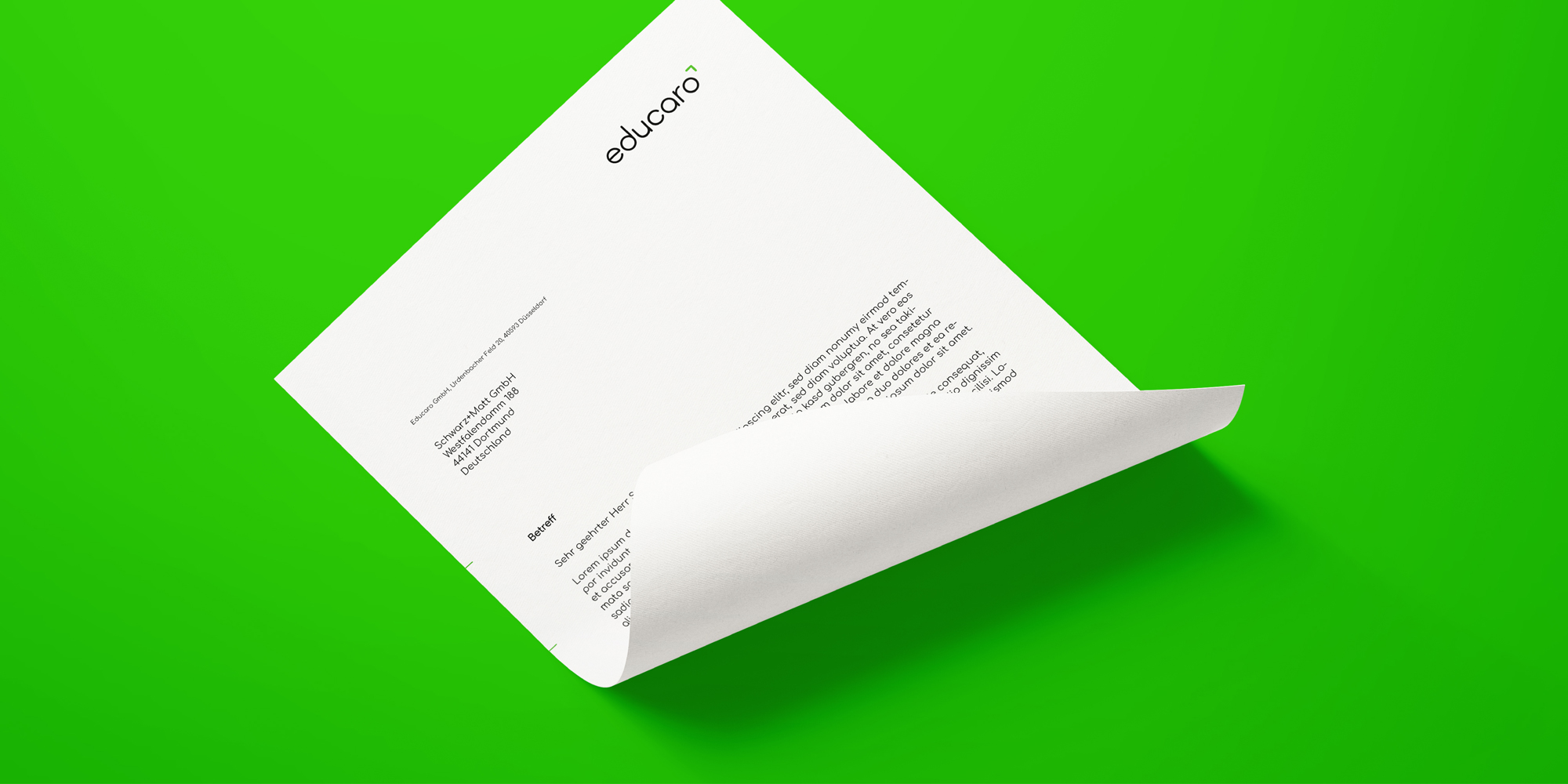
The existing visual was reinterpreted for the logo relaunch. The corporate design also includes the development of internationally understandable pictograms for analog and digital use. The new corporate design also describes a new color scheme for digital use.
The existing visual was reinterpreted for the logo relaunch. The corporate design also includes the development of internationally understandable pictograms for analog and digital use. The new corporate design also describes a new color scheme for digital use.
(brand experience)
Scalable
corporate design
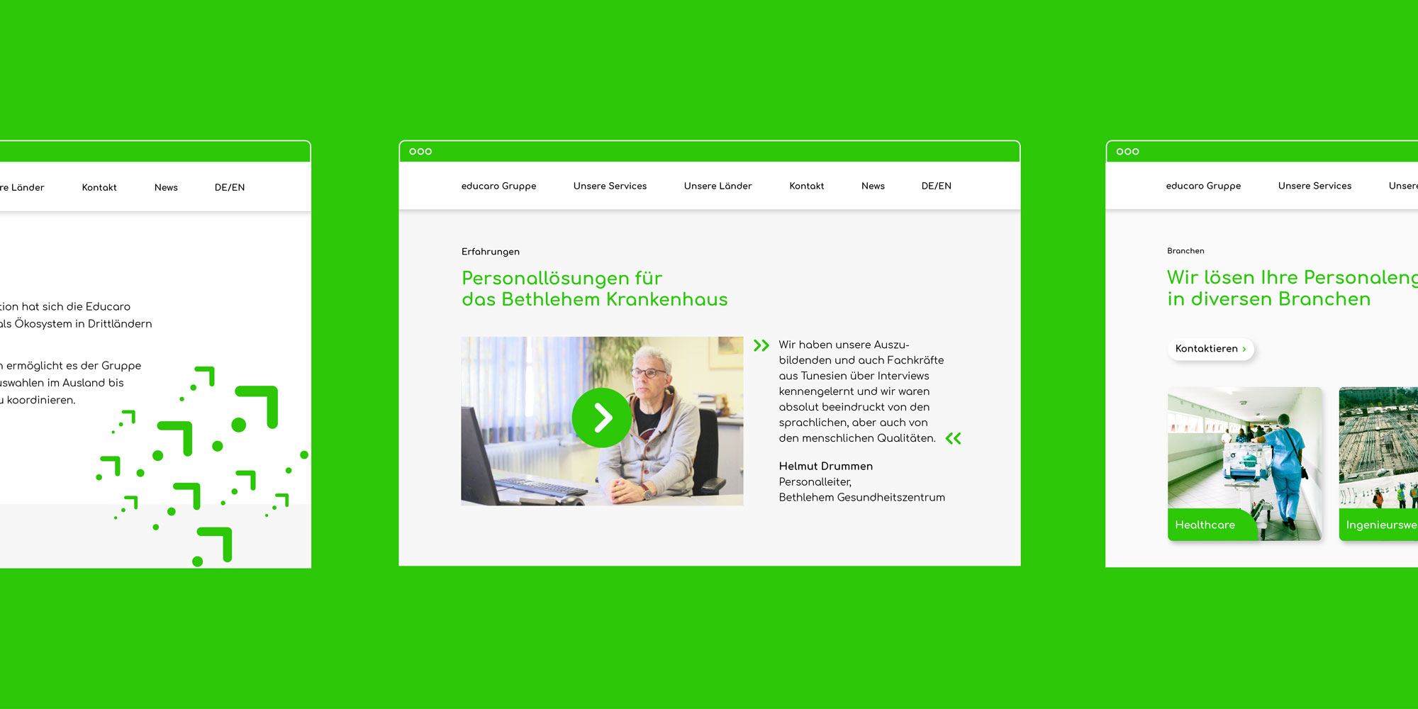
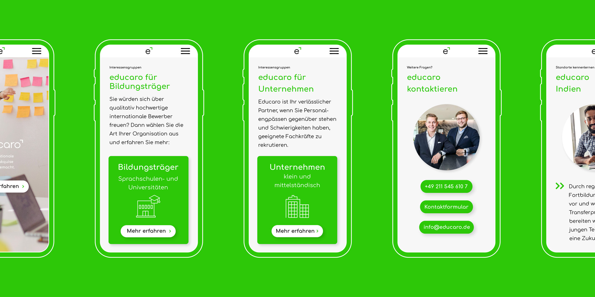
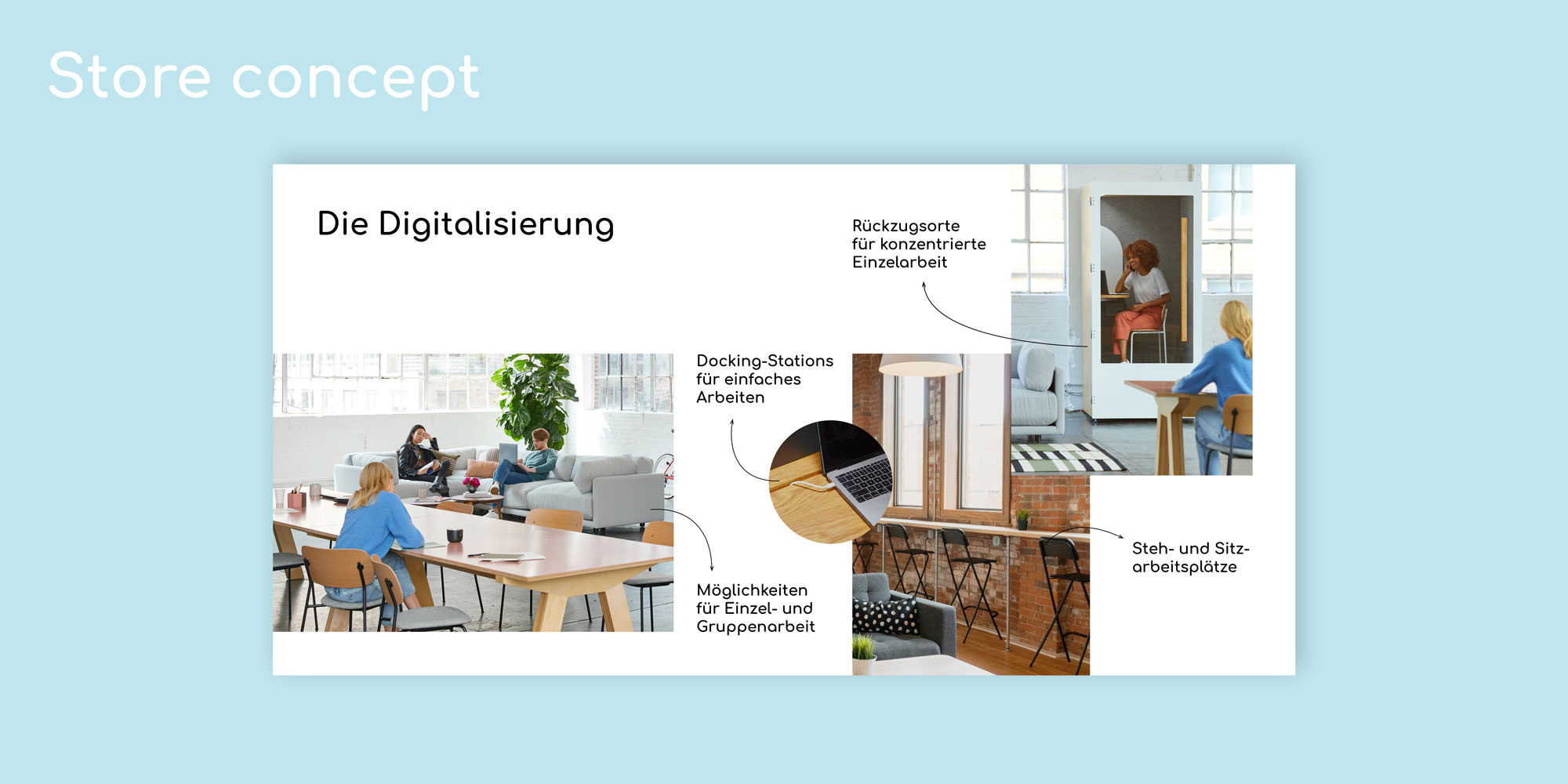
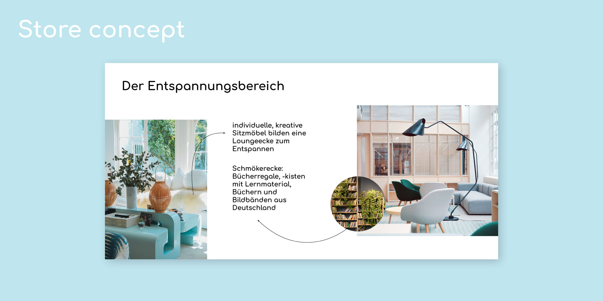
The screen design shows the use of the corporate design so that the international websites can be implemented on a country-specific basis. Even for the office and learning spaces in the countries of origin, a separate room design was created that integrates elements of the travel motif into the design and defines spaces within the new color scheme.
All features of the corporate design can be scaled indefinitely for new countries and professional fields. At the same time, Educaro can realize the implementations effectively and country-specifically independently and thus build a strong brand. Mission? Accomplished.
All features of the corporate design can be scaled indefinitely for new countries and professional fields. At the same time, Educaro can realize the implementations effectively and country-specifically independently and thus build a strong brand. Mission? Accomplished.

(New business)

Contact
André Schirmer
Founder & Managing Director