Rottendorf Pharma
Rebranding for a global pharmaceutical service provider from Ennigerloh, specializing in solid dosage forms.
(Overview)
Grown from tradition
Rottendorf Pharma is an international pharmaceutical contract development and manufacturing organization (CDMO). The company has been developing, producing and packaging solid dosage forms for customers worldwide for generations. As a CDMO, Rottendorf Pharma supports its partners along the entire value chain, from development to analytics and packaging.
This work is underpinned by a quality standard that has grown from tradition and is guided by a clear, consistent understanding of values. With the brand identity we have developed, we make this self-image visible and strengthen the positioning of a company that has borne responsibility for generations.
The brand process included several identity workshops with an interdisciplinary team from the company, in which we sharpened key concepts, values and perceptions. This qualitative exchange was supplemented by an employee survey with over 550 participants to validate the brand identity.
The results confirmed the guidelines and created clarity about the brand’s strengths and areas for development. On this basis, a brand identity was created that is strategically sound and enduring both internally and externally.
(Company)
Rottendorf Pharma
(industry)
Health
(year)
since 2024
(brand identity)
Doing the right thing for generations
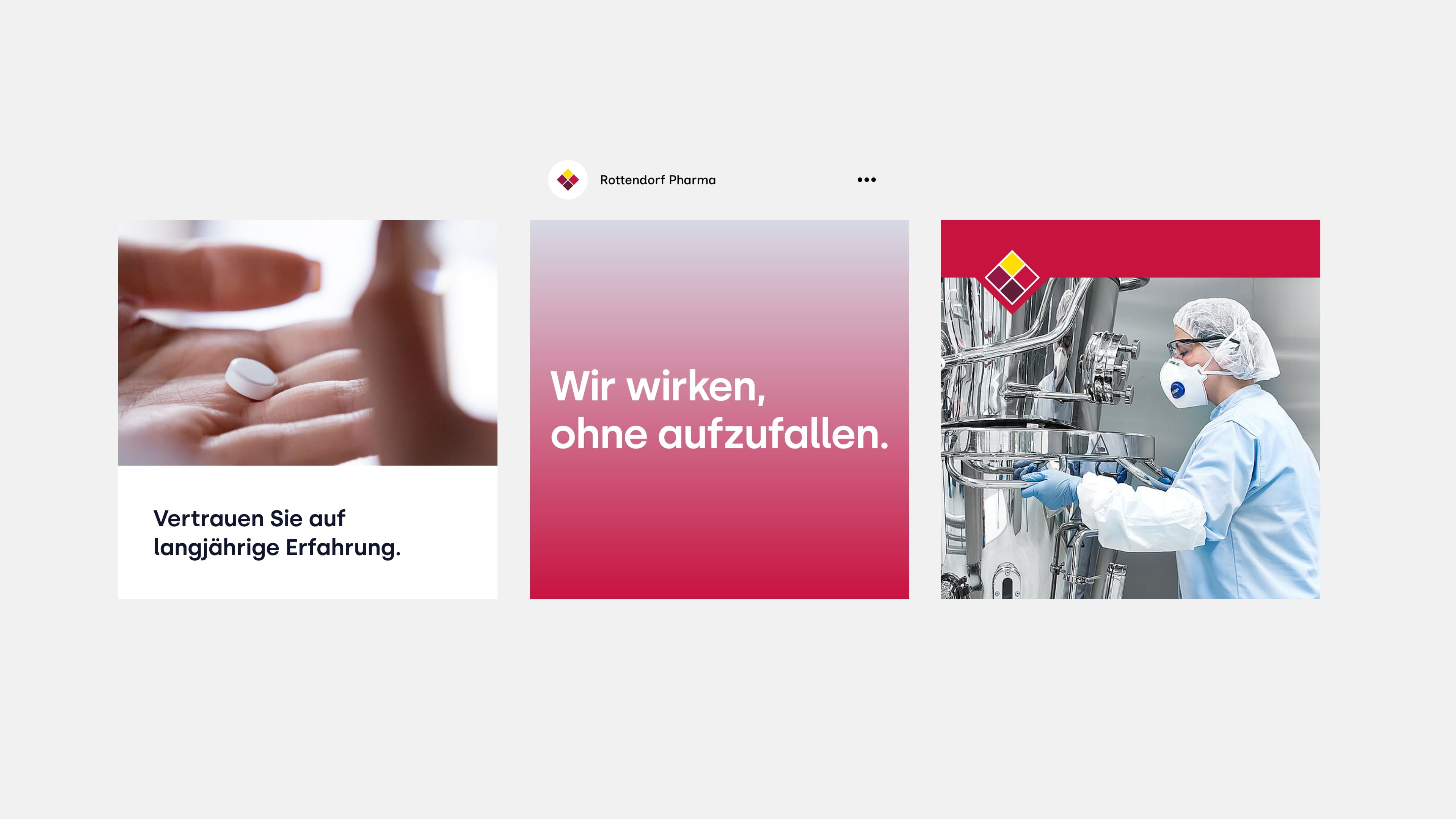
As part of the brand work, the identity and positioning of Rottendorf Pharma was sharpened and transformed into a consistent image. The starting point was the desire to combine the traditional self-image – down-to-earth, competent, social, reliable – with a contemporary brand image.
The result is a brand design that clearly communicates core values such as reliability, responsibility and partnership. The new brand structure strengthens the perception of a high-performance manufacturer that acts in the background and conveys the attitude of a company that has been doing the right thing for generations.
The result is a brand design that clearly communicates core values such as reliability, responsibility and partnership. The new brand structure strengthens the perception of a high-performance manufacturer that acts in the background and conveys the attitude of a company that has been doing the right thing for generations.
(brand identity)
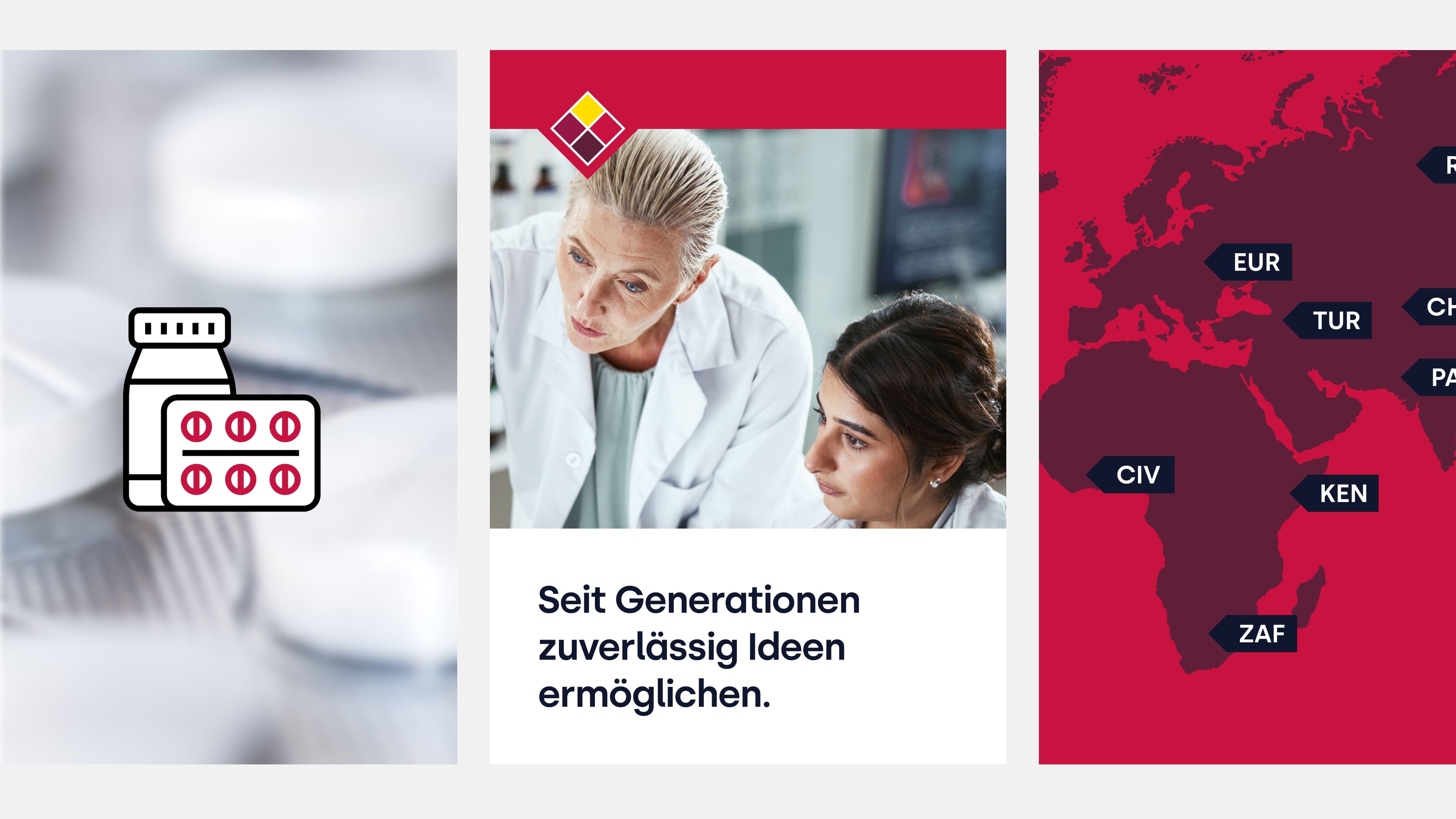
Reliably enabling ideas for generations
Rottendorf Pharma’s brand essence condenses a self-image that has grown over decades: reliably enabling ideas for generations. This is based on the conviction that meaningful ideas can only be effective if they are implemented consistently and responsibly. This is exactly what has characterized the company since day one.
Rottendorf Pharma works with customized, high-performance production chains that are geared towards manufacturing high-quality pharmaceutical products with a high degree of responsibility. In our view, this reflects a principle that guides the company throughout: Doing the right thing based on tradition – and thus actively shaping the quality of life of today and tomorrow.
Rottendorf Pharma works with customized, high-performance production chains that are geared towards manufacturing high-quality pharmaceutical products with a high degree of responsibility. In our view, this reflects a principle that guides the company throughout: Doing the right thing based on tradition – and thus actively shaping the quality of life of today and tomorrow.
(brand design)
A sign of diversity
The new figurative mark preserves the historical diamond and thus a central part of the corporate identity. At the same time, its design language has been fundamentally revised. Instead of a closed form, the logo now consists of four clearly defined elements. This modularity stands for diversity and for the fact that Rottendorf Pharma combines different competencies into a stable overall system.
The outline of the old logo was deliberately abandoned. What remains are four color areas, each with its own meaning: identity, professionalism, empathy and vitality. By eliminating additional contours, the logo appears more precise, modern and technically easier to reproduce – especially on images and digital applications.
The biggest change is in the word mark. Small caps have been discarded, spacing has been changed and the typeface has been reduced overall. This gives the wordmark a calmer, more balanced appearance and gives it the weight it needs in the overall structure. Together, the word and figurative mark form a system that remains familiar at its core, but has been brought into the present in terms of design.
(brand identity)
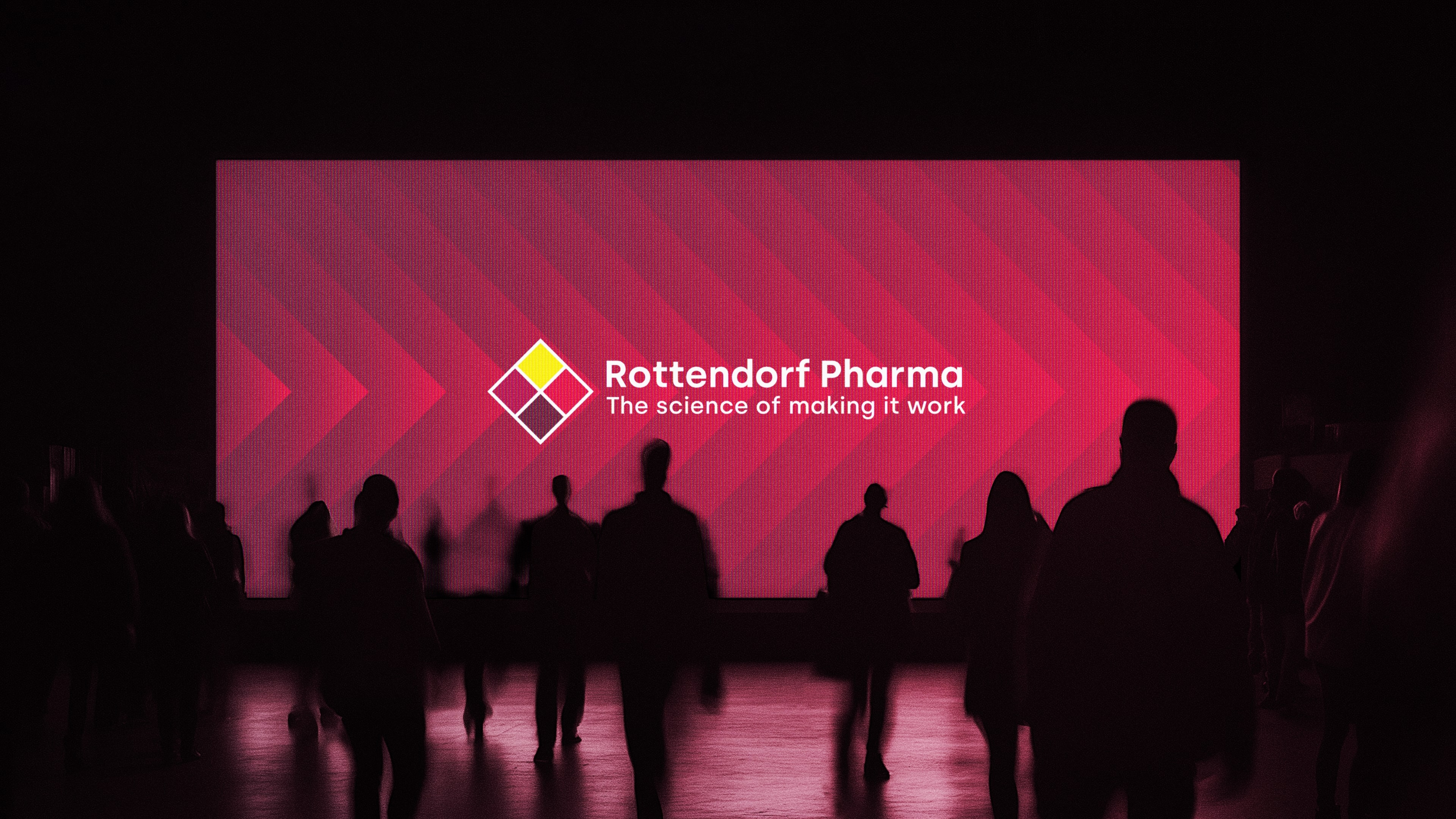
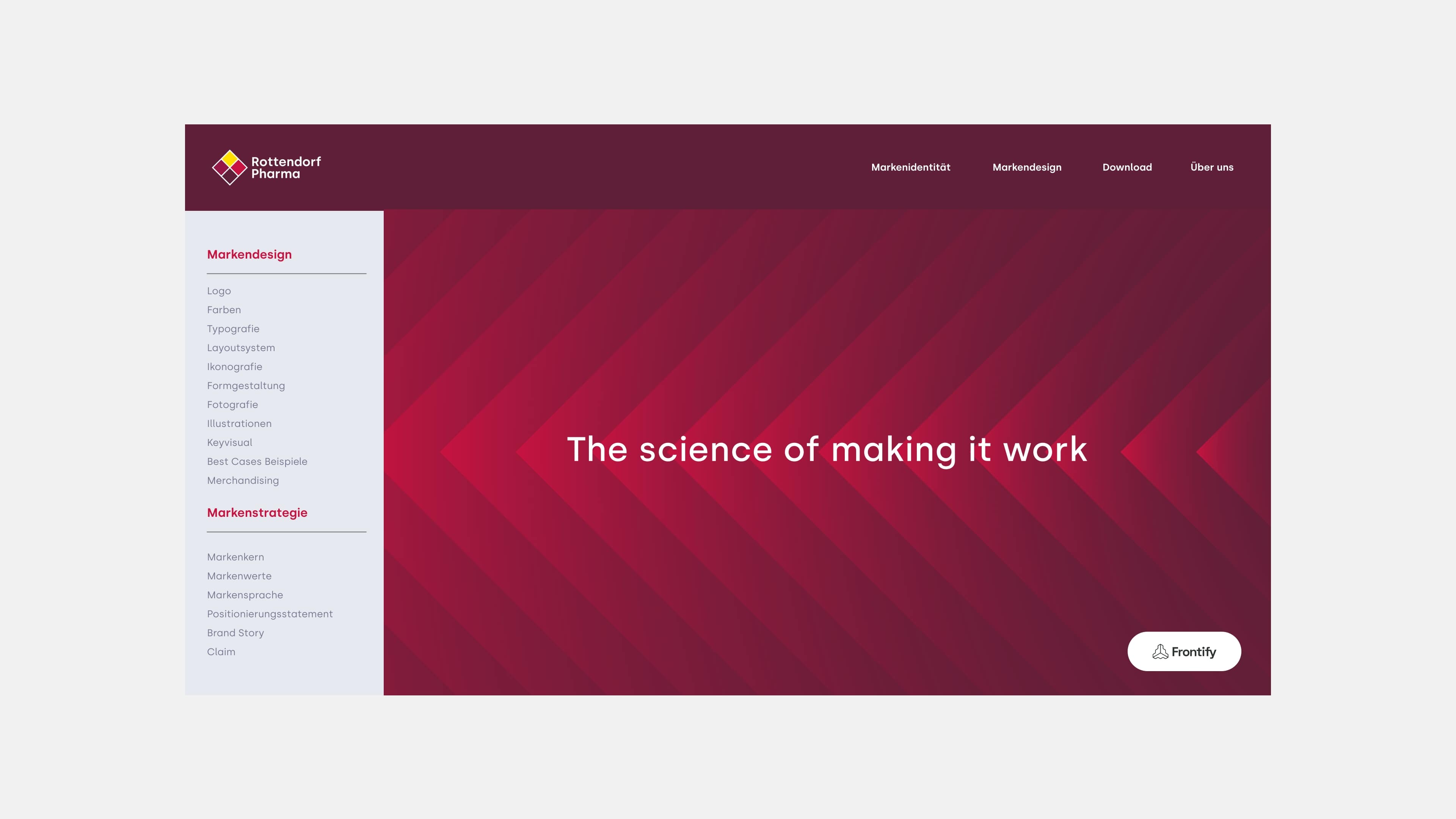
The science of making it work
“The science of making it work” describes precisely where Rottendorf Pharma’s particular strength lies: in the art of balancing complex production chains in such a way that a pharmaceutical product functions reliably. Establishing this optimal chain is indeed a science in itself, characterized by experience, technical expertise and a deep understanding of the mechanisms that make drugs effective.
The claim also opens up a second level of meaning. In an industry in which efficacy is the decisive criterion, Rottendorf Pharma makes a significant contribution: active ingredients only become effective when they can be produced in stable, reproducible quality and in large quantities. By being involved in development processes, Rottendorf Pharma ensures that products are not only manufactured, but also have the best effect for patients.
“The science of making it work” thus combines two aspects: the scientific expertise in the process and the effectiveness of the end product. A clear statement that sums up the performance of Rottendorf Pharma.
(brand identity)
Strong brand in the background
At its core, Rottendorf Pharma tells a story that is quieter than that of many other brands – and therefore has a stronger impact. The requirements in pharmaceutical production are increasing: higher quality standards, growing quantities, dynamic markets. For pharmaceutical companies, this creates additional pressure in an environment that leaves little room for deviation.
When we analyzed the brand, it quickly became clear that Rottendorf Pharma consciously takes on a role in this reality that is rarely visible but crucial. The question that guided us was: How can this positioning be sharpened so that it offers reliability without being loud? The answer lies in a positioning that places responsibility above visibility.
Early access to development processes, flexible production chains and a deep understanding of the challenges facing the industry form the framework for this. But what really defines Rottendorf Pharma goes beyond this. The company never puts itself at the center. What counts is the product and the quality of life of the people who depend on it.
We have formulated this attitude more precisely in our brand work. Rottendorf Pharma does not make itself more important than is necessary for the task at hand. They know what they are working for and that the best results are achieved when the partners can shine, not the producer.
(brand design)
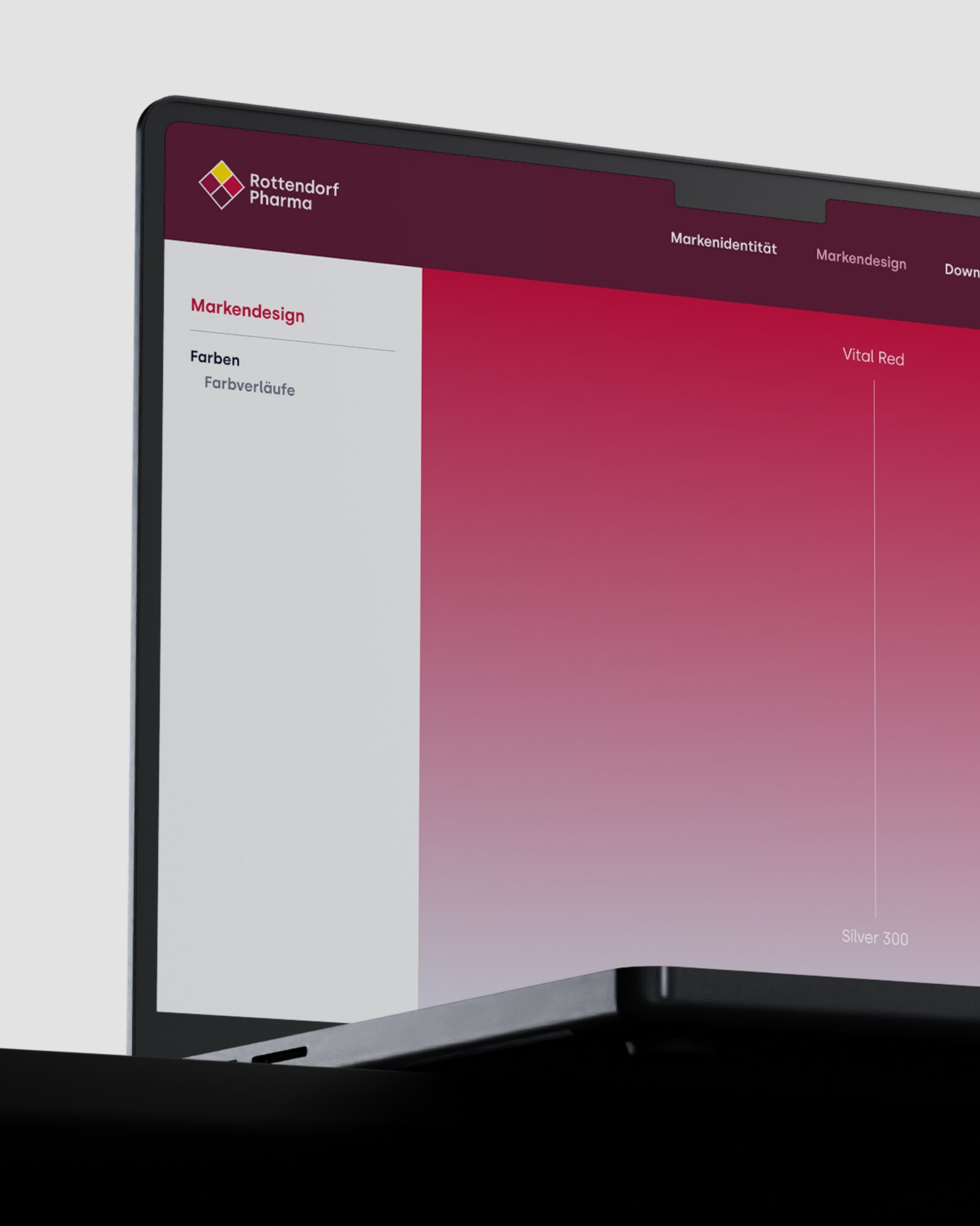
A new definition of color
The color scheme was one of the most sensitive aspects of the project. The aim was to develop a color palette that was more emotionally accessible and at the same time carried the brand values.
The new palette works with nuances of yellow and red, but in a restrained, redefined tonality. Each color has its own level of meaning and creates a warm, responsible and reliable atmosphere. The color areas are technically optimized and work consistently on images, in print and in digital interfaces.
The new palette works with nuances of yellow and red, but in a restrained, redefined tonality. Each color has its own level of meaning and creates a warm, responsible and reliable atmosphere. The color areas are technically optimized and work consistently on images, in print and in digital interfaces.
(Employee voice)
"For the new Rottendorf Pharma brand, we developed a design system that combines tradition and modern design standards. The core of the brand can be found in the iconic element - the logo - in the form of the newly designed diamond."

Jannis Falk
Head of Brand Design

(Frontify)
Brand Management
We have also transferred the joint project to Frontify. The company history, brand identity and the entire brand system – logo, color scheme, typography, visual language and application elements – are documented there as central sources and accessible to all employees and partners.
Frontify enables Rottendorf Pharma to apply the new design consistently and use templates efficiently in day-to-day work. The platform makes the brand safe to use and transfers the results of our brand work into a permanently consistent system.
Frontify enables Rottendorf Pharma to apply the new design consistently and use templates efficiently in day-to-day work. The platform makes the brand safe to use and transfers the results of our brand work into a permanently consistent system.
(Customer testimonial)
"The effective approach to the project was simply great and made the collaboration very pleasant."

Jonas Großerhode
Senior Marketing Manager
Rottendorf Pharma
(New business)

Contact
André Schirmer
Founder & Managing Director