hsp
Extensive rebranding for tax consulting and auditing. The firm helps you make informed and better decisions.
(Overview)
The decision-
enabler.
hsp provides honest advice with maximum transparency and reads between the numbers for individual, digital consulting solutions: The auditing and tax consultancy firm uses its wide-ranging expertise to help medium-sized companies and private individuals make informed and better decisions.
(Company)
hsp
(industry)
Tax advice
(year)
2024

(brand strategy)
Focus on people - a brand presence with attitude
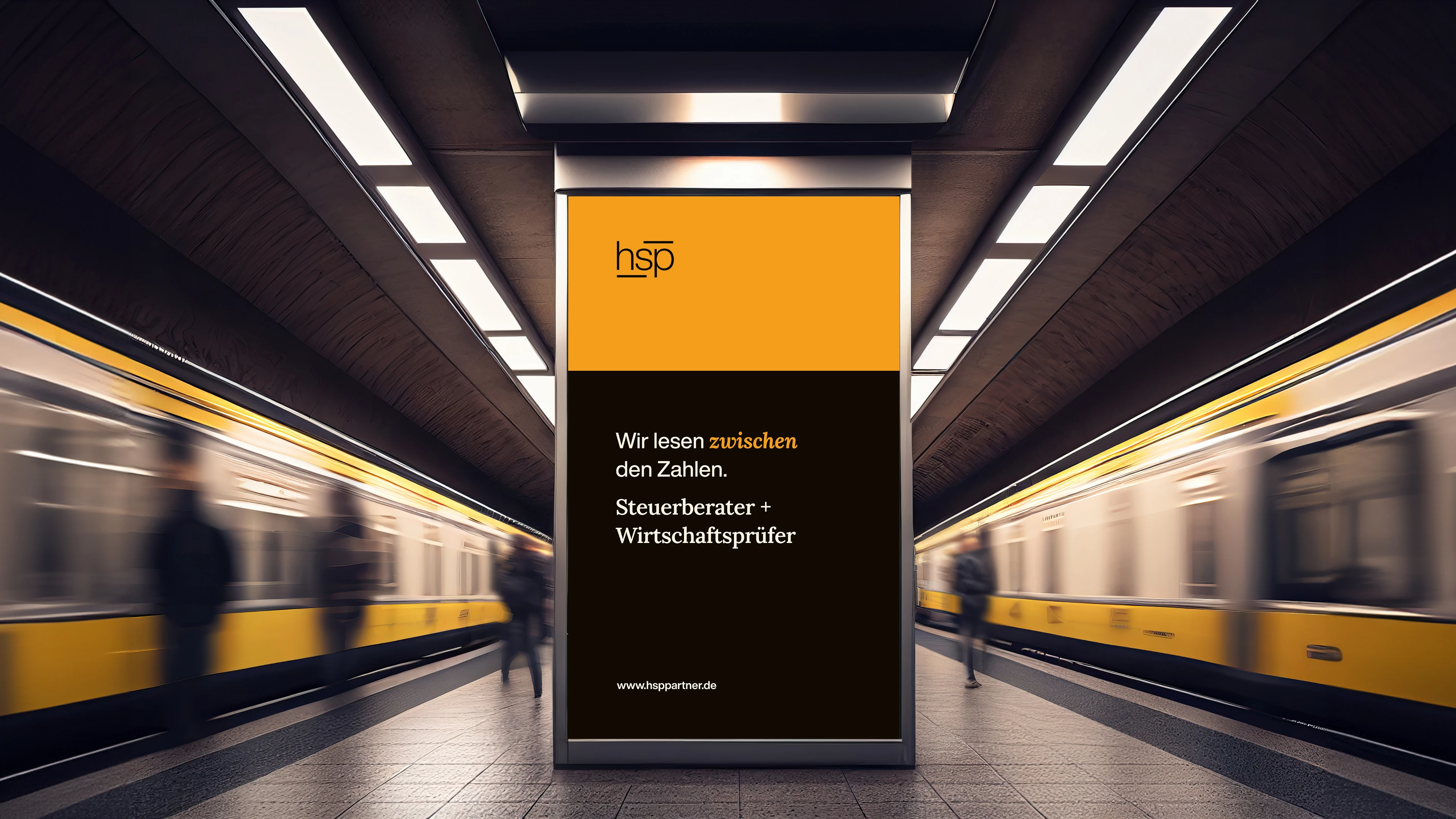
Whether employees or clients – the focus at hsp is on the individual. This important unique selling point served as the basis and orientation support for the branding and the associated website: an honest, authentic visual language and a timeless, modern design characterize the brand presence across all communication media.

(brand identity)
The consulting philosophy becomes the design language
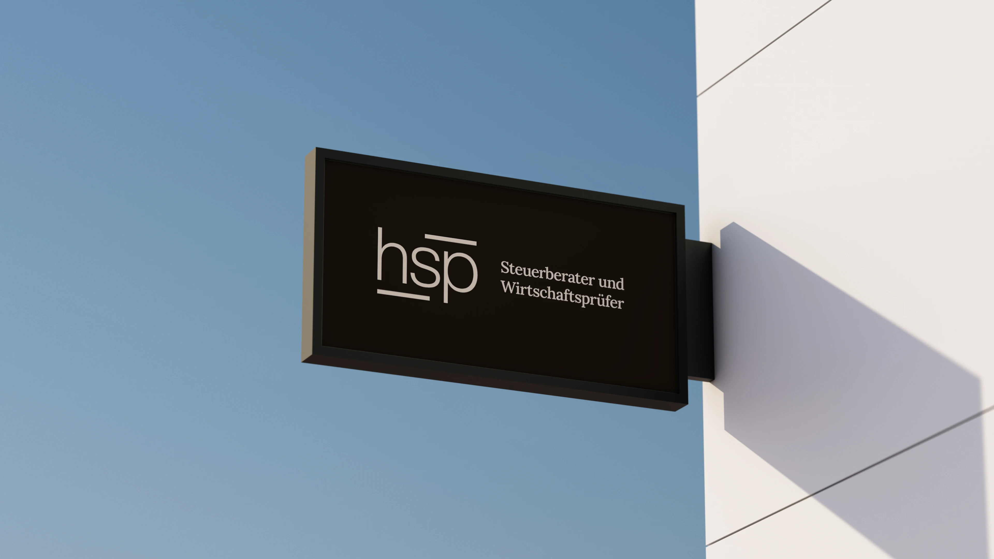
The concept of “reading between the numbers”, which characterizes hsp’s consulting approach, was specifically integrated into the design. The two horizontal lines above and below the word mark symbolize this idea and draw the eye to what is in between: hsp. The understated corporate design creates a timeless and clear brand identity.
(brand identity)
Between clarity and trust: hsp translated into typography
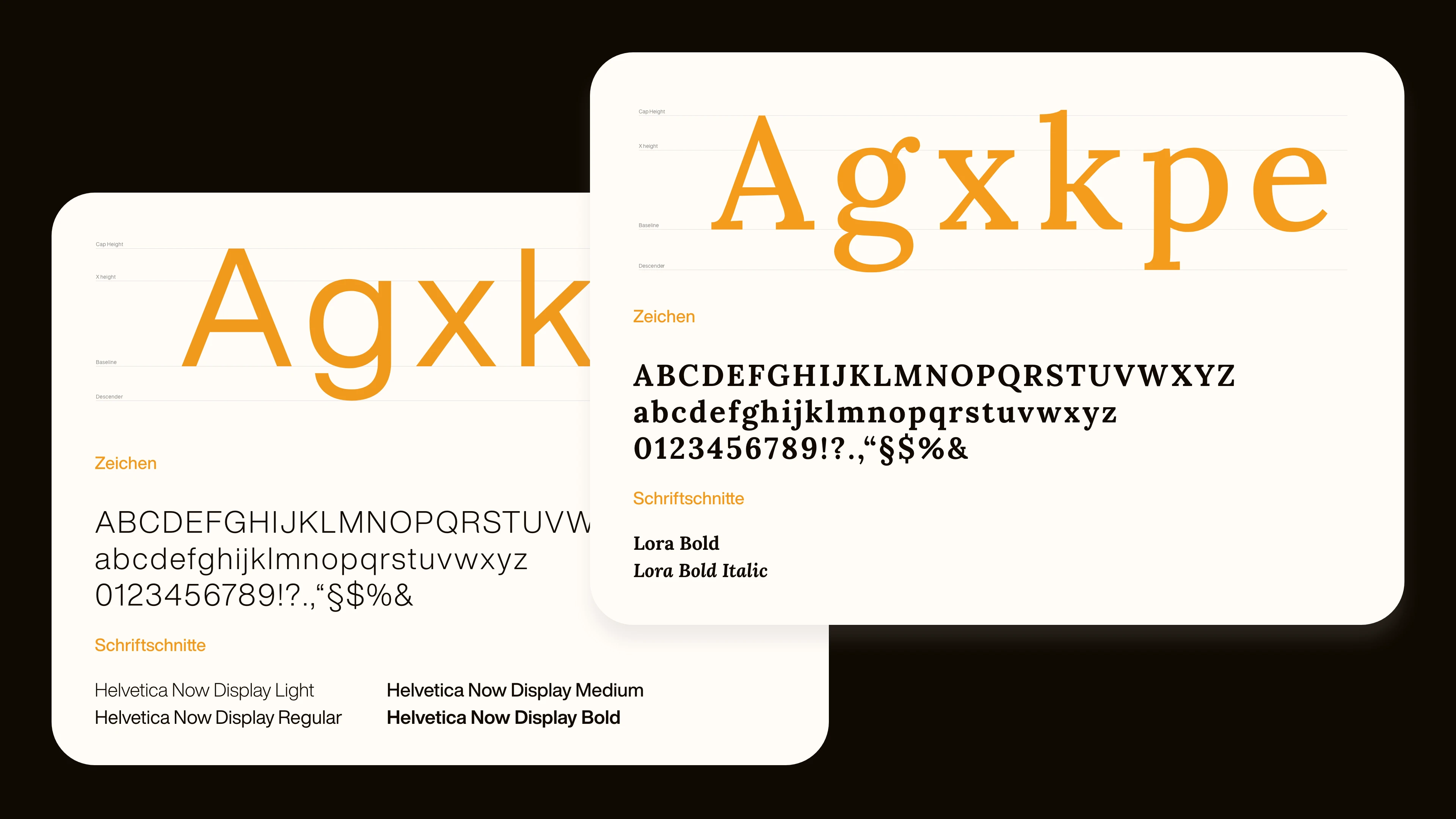
Modernity and tradition are elegantly combined in the company’s typography. The Helvetia Now font family serves as the corporate typeface, which impresses with its neutral and precise design and stands for the structured solutions that hsp offers its clients.
The serif font Lora is also used to set special accents. With its traditional and sedate appearance, Lora conveys consistency and reliability – qualities that are essential for an established company like hsp. At the same time, it brings a subtle elegance and a high-quality character to the design that underlines the high quality of the services.
The serif font Lora is also used to set special accents. With its traditional and sedate appearance, Lora conveys consistency and reliability – qualities that are essential for an established company like hsp. At the same time, it brings a subtle elegance and a high-quality character to the design that underlines the high quality of the services.
(Employee voice)
"With the new CI, we are positioning hsp as a personal tax consultant that [...] clearly differentiates itself from the competition."

Maximilian Kersten
Managing Director

(brand identity)
Color and image concept that makes trust visible
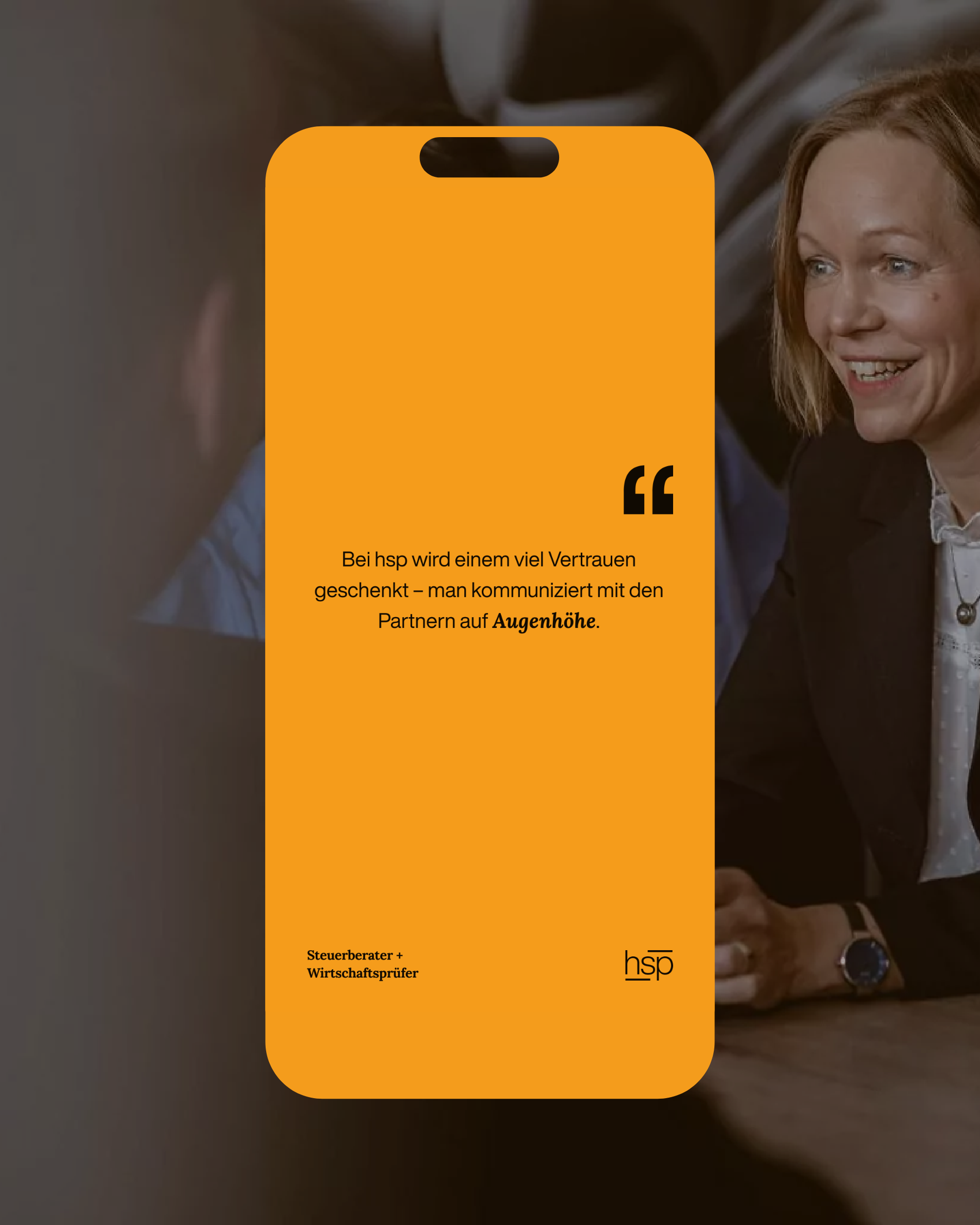
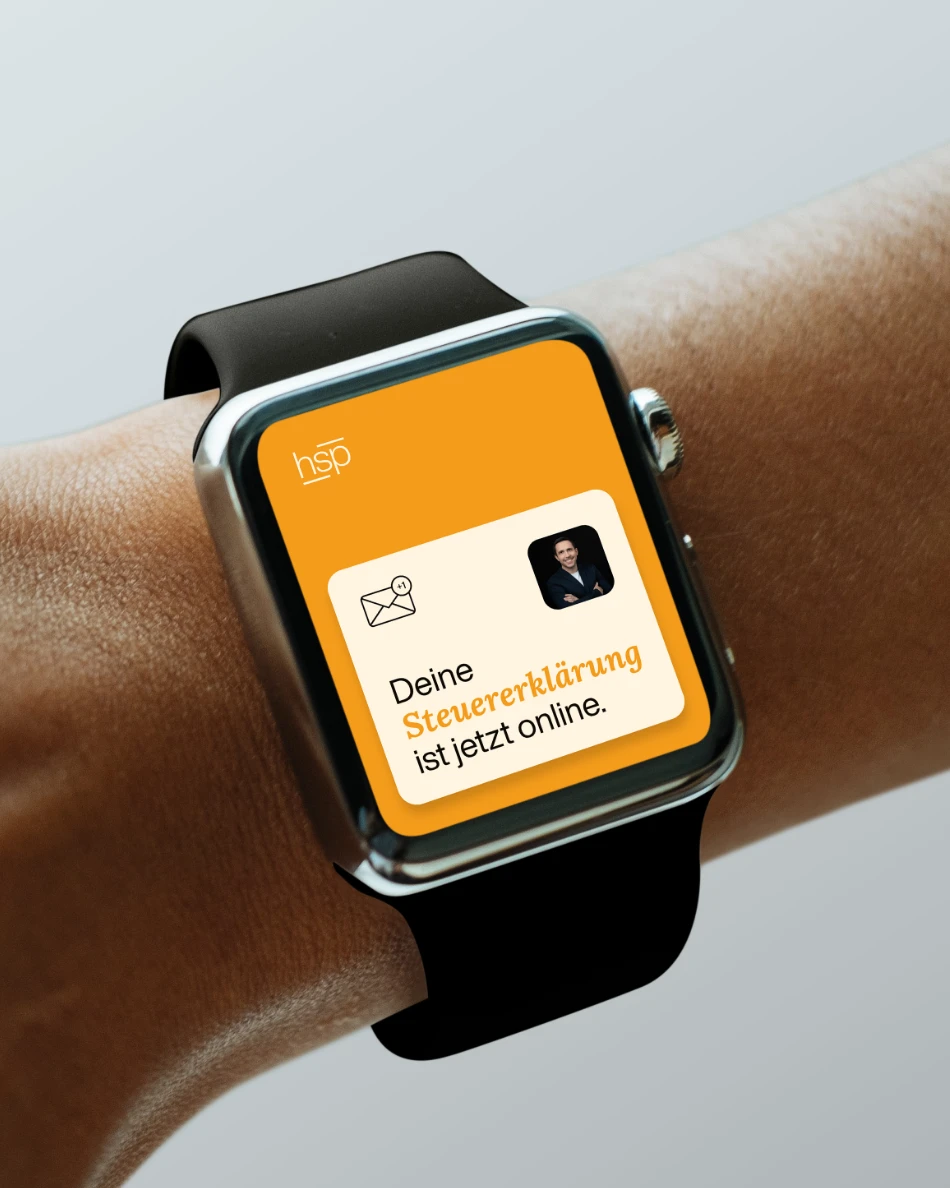
The visual language of hsp clearly focuses on people. Authentic portraits and scenes from everyday working life visualize the approachable and personal side of the company and emphasize the direct relationship to the individual.
Dark and earthy tones dominate the brand’s color scheme and stand for reliability, stability and trust. This subtle color scheme emphasizes the professionalism and seriousness of the law firm, while at the same time creating a harmonious overall impression. The image processing follows a modern, restrained style that emphasizes the authenticity and transparency of the brand image.
Dark and earthy tones dominate the brand’s color scheme and stand for reliability, stability and trust. This subtle color scheme emphasizes the professionalism and seriousness of the law firm, while at the same time creating a harmonious overall impression. The image processing follows a modern, restrained style that emphasizes the authenticity and transparency of the brand image.

(Customer testimonial)
"Schwarz+Matt® impressed us with their creativity, efficiency and professionalism [...]. The result speaks for itself: a strong project that fits our vision."
Thorsten Risse
Law firm manager
hsp
(New business)

Contact
André Schirmer
Founder & Managing Director