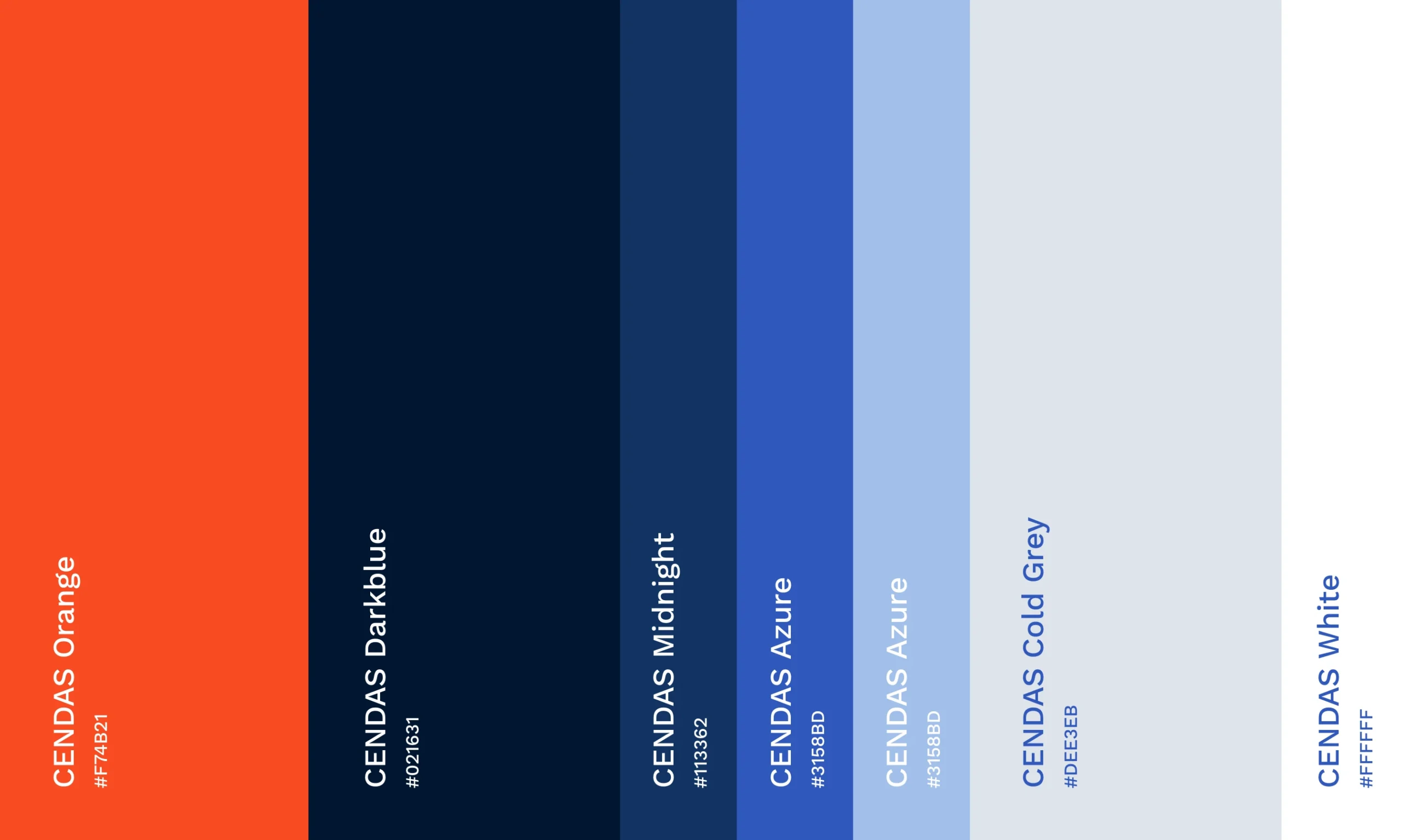
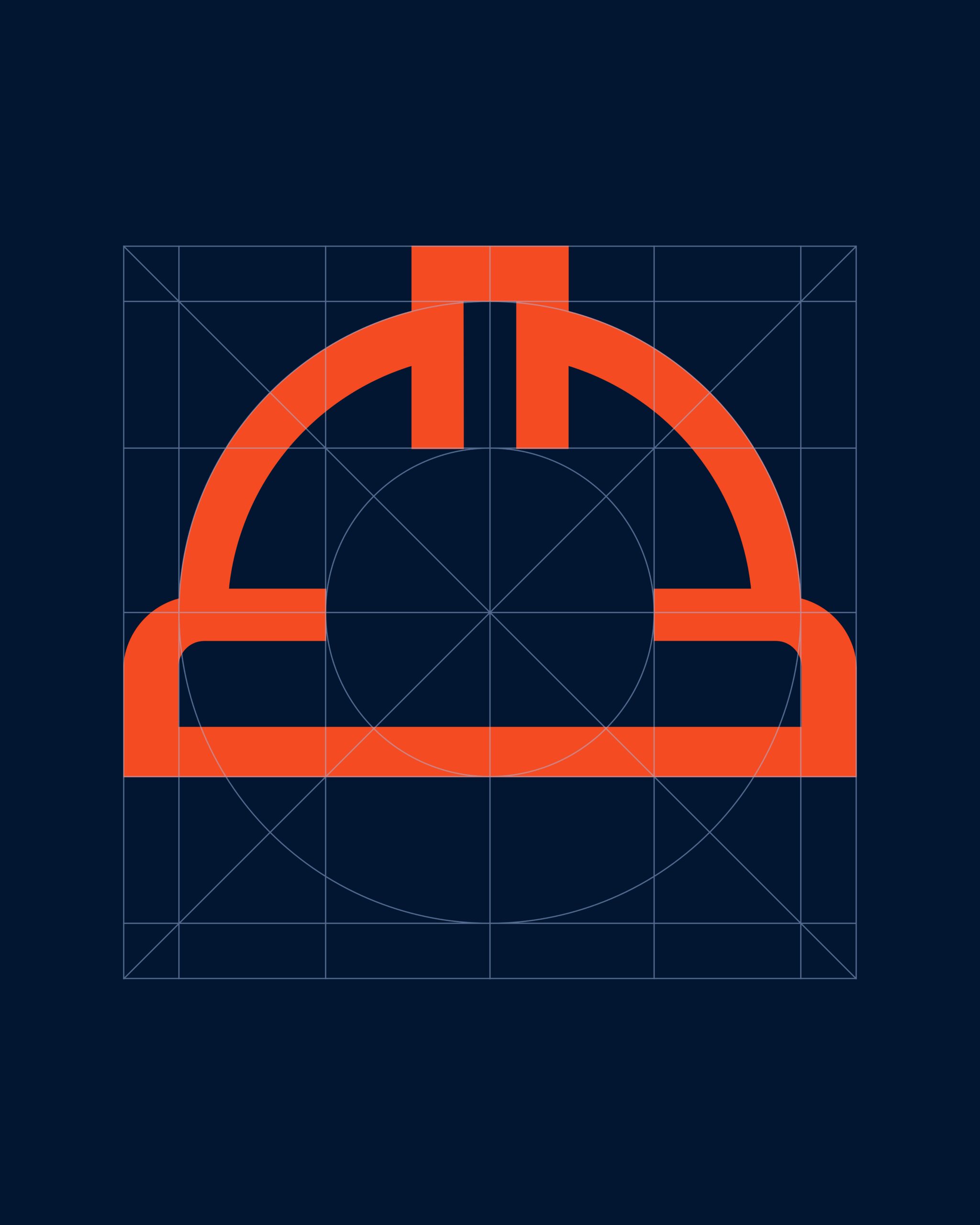
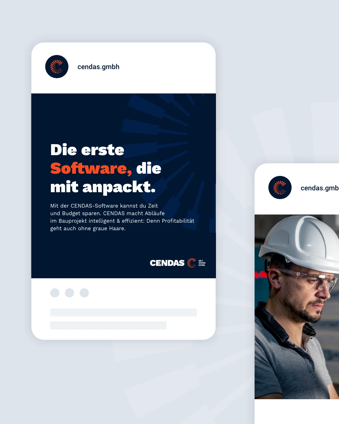
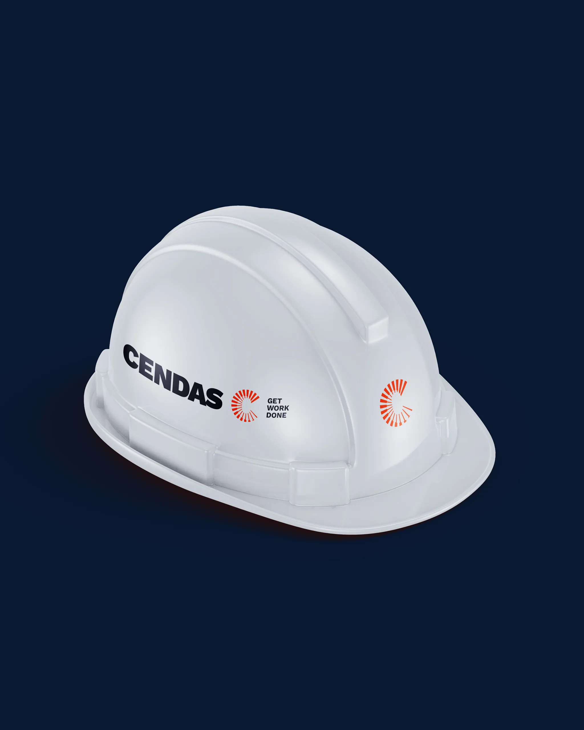
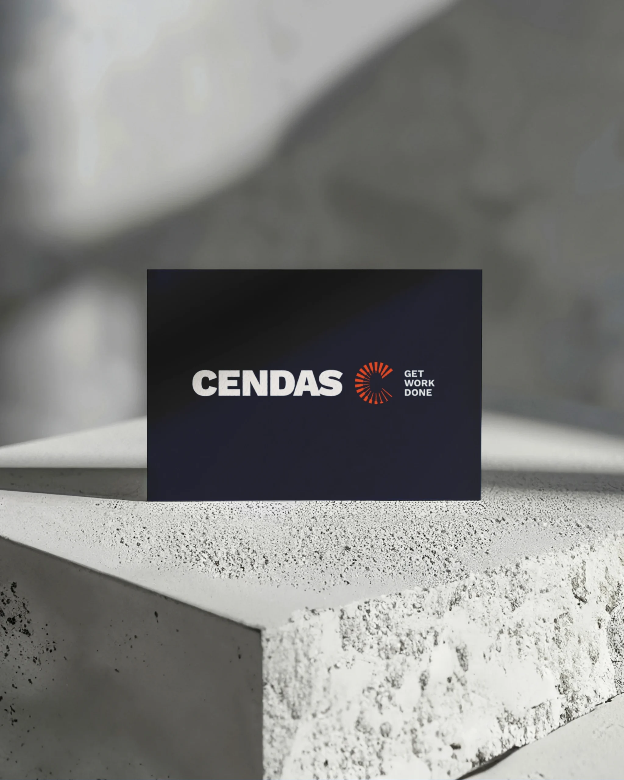
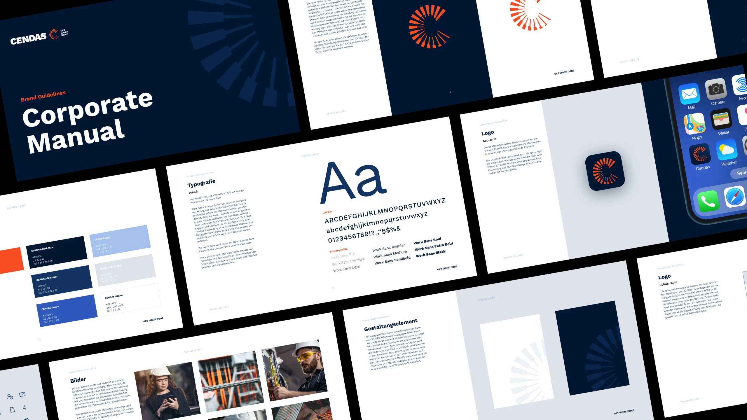
When choosing the colors, it was crucial to consider the different target groups such as building owners, project managers and craftsmen. In the color system, the blue tones serve as a neutral basis, while the orange color functions as an identity-creating brand color. Orange stands for digital technology, the construction industry and the energy and drive of the brand.
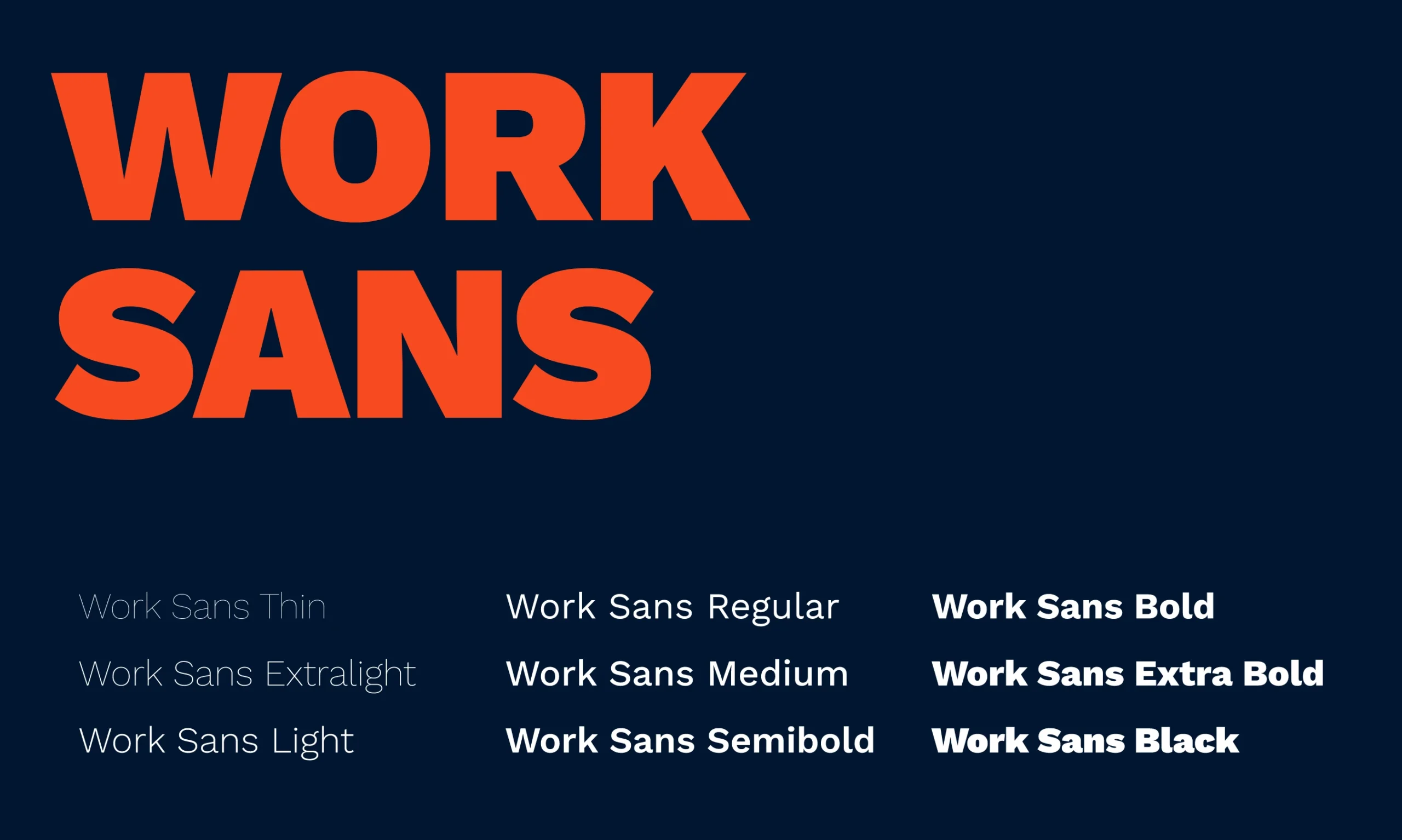
The choice of typography fell on the thematically appropriate “Work Sans”, which conveys a modern and open typeface with its contemporary character.