SYNQONY
Rebranding for the leading software provider in the circular economy sector.
(Overview)
Digital solutions
intelligently connected
SYNQONY combines leading software solutions for waste, environmental and recycling management under one roof. By bundling expertise from different specialist areas, a holistic ecosystem is created that intelligently networks processes along the entire value chain. The brand identity translates this system logic into a digital identity – both strategically and visually. In this way, we are positioning SYNQONY as a leading software provider that connects the circular economy and shapes its digital future.
(Company)
SYNQONY
(industry)
Software
(year)
2024
(brand identity)
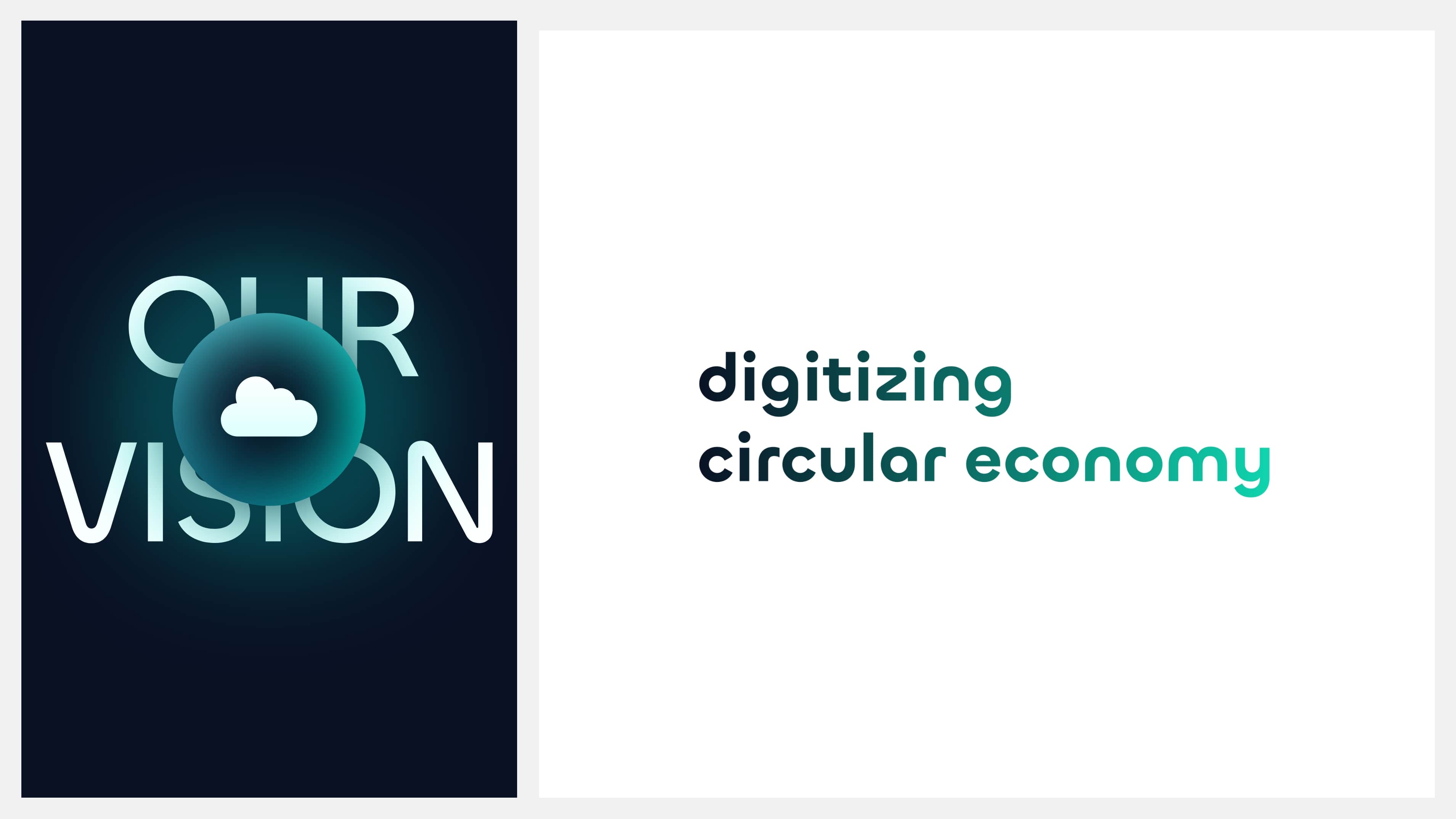
Digitizing circular economy
SYNQONY stands for the digital transformation of the circular economy and positions itself as the technological pacemaker of an industry in transition.
The new brand identity creates structure and trust in a complex environment in which data, processes and players are brought together. It translates SYNQONY’s vision – to understand waste as a resource – into a concise and technological appearance.
The brand identity combines technological precision with a sense of responsibility and progress. It comes across as modern and self-confident, as an expression of a brand that sees digitalization as the engine of a sustainable future.


(brand identity)
Trademark for networking and progress
The new figurative mark combines technological precision with symbolic depth. Its circular shape stands for the closed cycle, movement and dynamism of the industry. The abstract shape is reminiscent of the swirl of the cloud, which connects all players digitally.
The wordmark, individually designed by us for SYNQONY, translates the brand’s technological attitude into modern typography. Its precise geometry and technical echoes reflect the digital character and innovative strength of the company. Together, the word and figurative mark form a unit that unites networking and progress.
The wordmark, individually designed by us for SYNQONY, translates the brand’s technological attitude into modern typography. Its precise geometry and technical echoes reflect the digital character and innovative strength of the company. Together, the word and figurative mark form a unit that unites networking and progress.
(brand experience)
Between technology, change and humanity
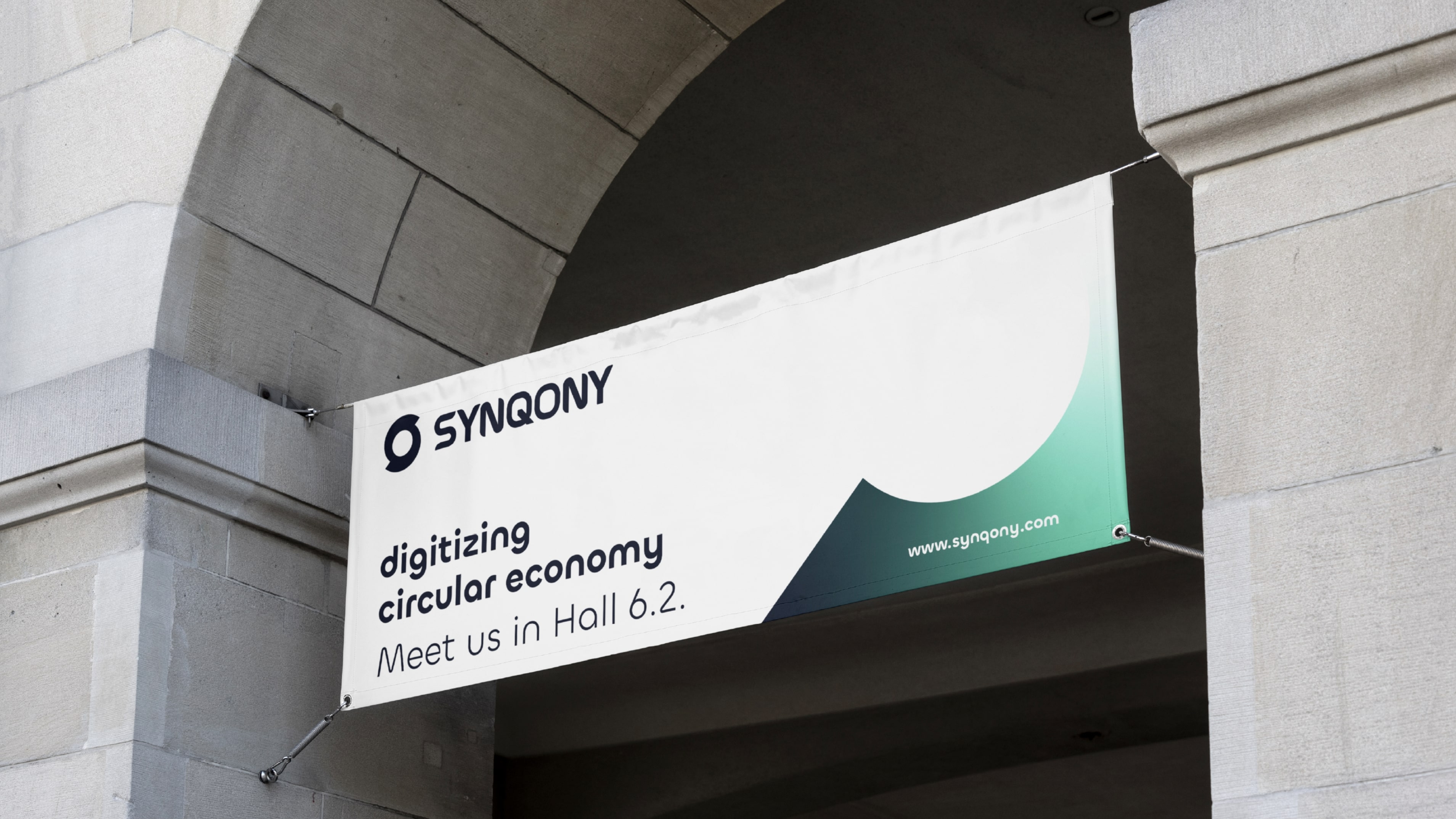
Deep blue stands for stability and trust, vibrant turquoise green for progress and sustainability. The core of the brand is reflected in the balance of neutrality and luminosity: technically sound, but humanly accessible.
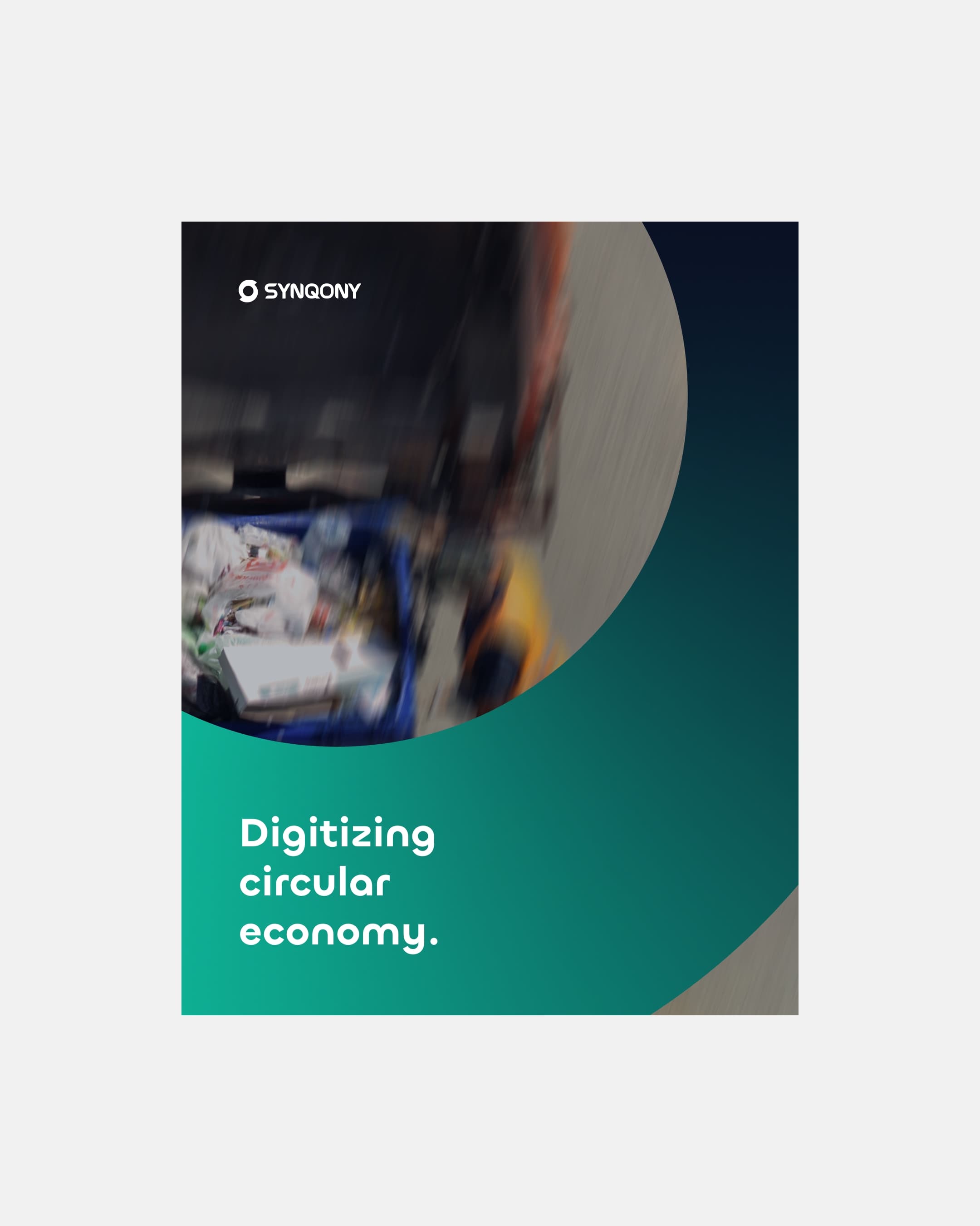
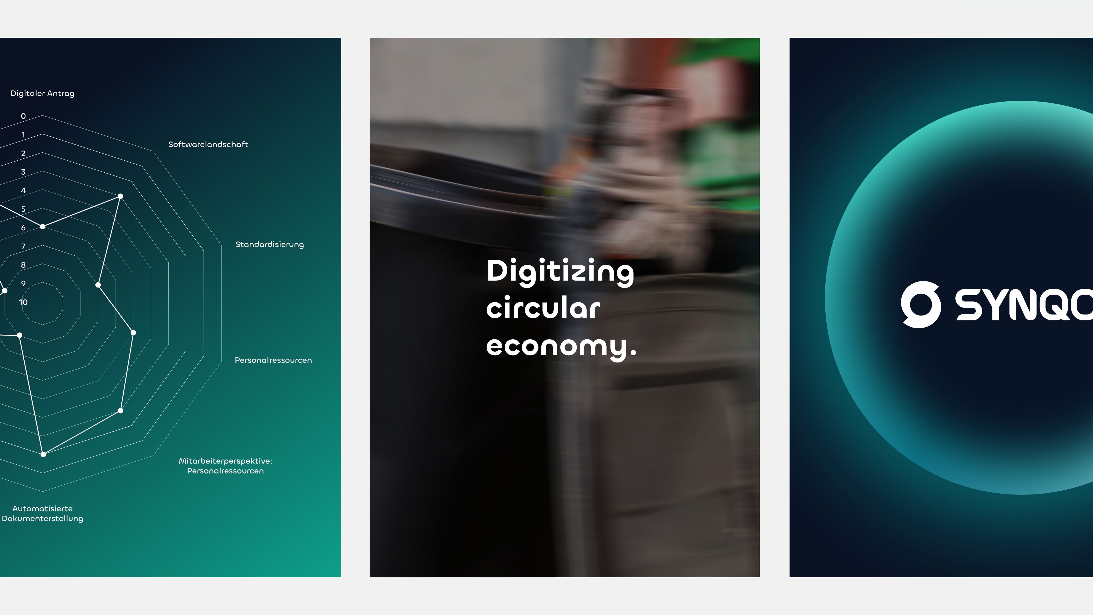
The imagery picks up on this attitude. It shows movement instead of stagnation and understands dynamism as a symbol of change. With the help of generative AI, motifs are created that are refined through targeted blurring – a visual image of the ongoing development and networking that characterizes SYNQONY.
The imagery picks up on this attitude. It shows movement instead of stagnation and understands dynamism as a symbol of change. With the help of generative AI, motifs are created that are refined through targeted blurring – a visual image of the ongoing development and networking that characterizes SYNQONY.
(brand experience)
Brand identity in the
digital space
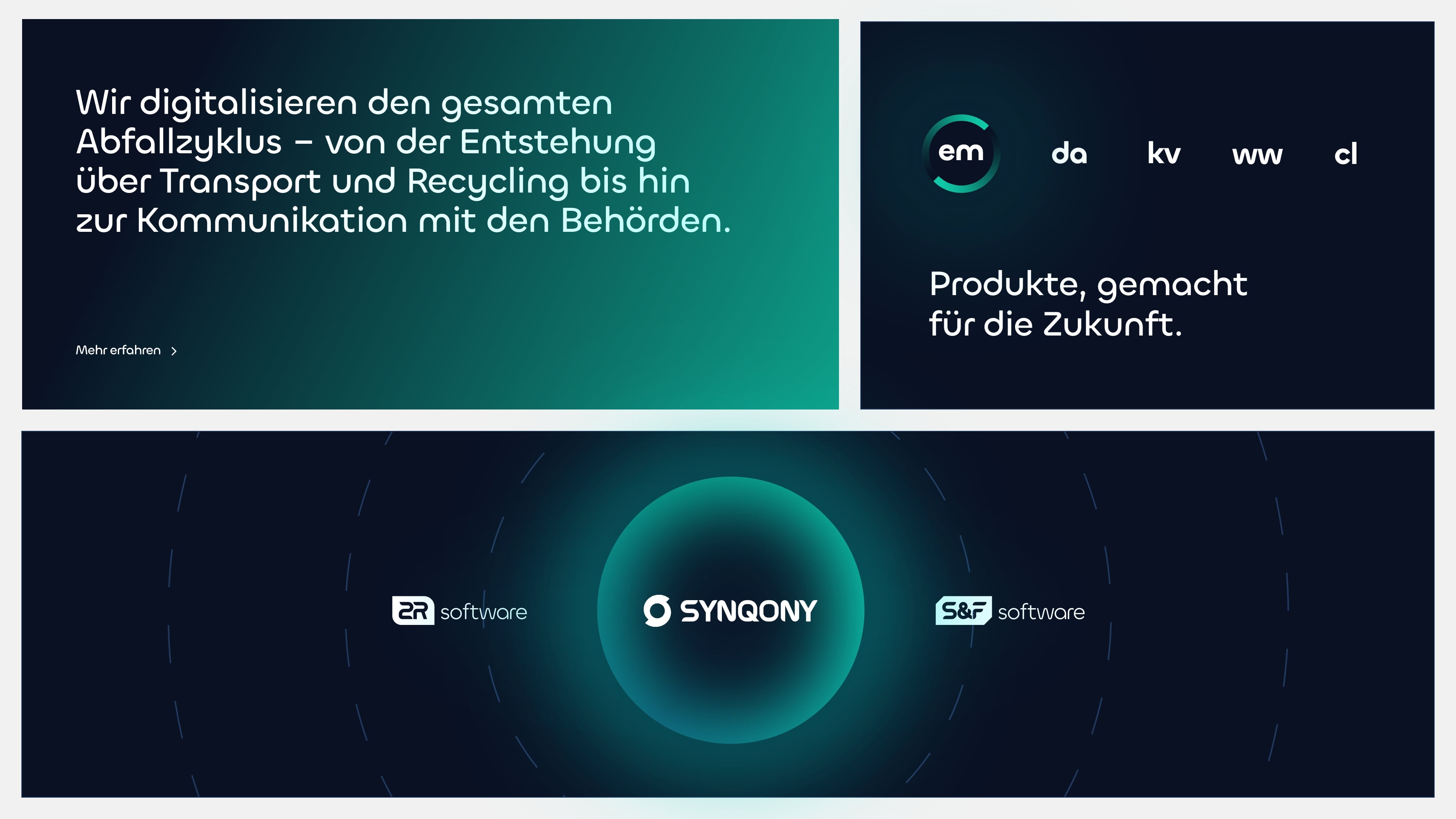
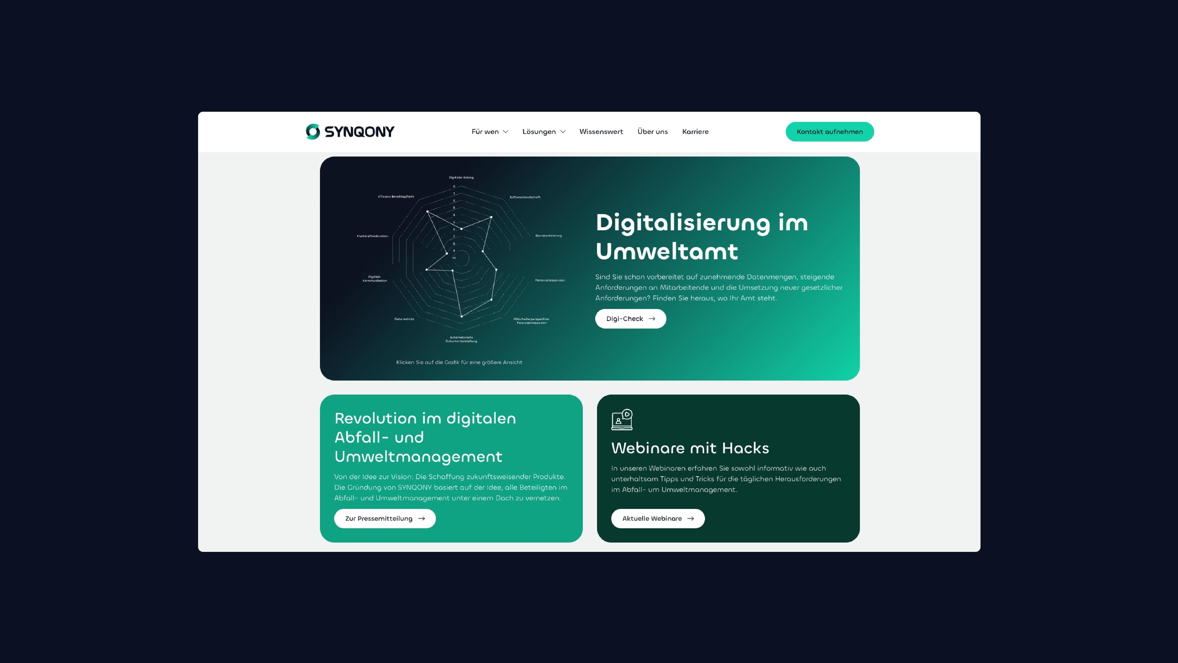
The website transfers the new corporate design into the digital space in a visually consistent way. Clear structures, dynamic transitions and a modular structure make the software provider’s digital networking tangible. Every detail – from the typography to the use of the gradient and the movement of the elements – conveys the self-image of a brand that is rethinking the circular economy and shaping it digitally.
This attitude is also reflected in SYNQONY’s mission: to seamlessly digitalize the entire life cycle of waste – from its generation, transport and recycling to communication with environmental authorities. The result is a digital system that makes efficiency visible and sustainability measurable.
This attitude is also reflected in SYNQONY’s mission: to seamlessly digitalize the entire life cycle of waste – from its generation, transport and recycling to communication with environmental authorities. The result is a digital system that makes efficiency visible and sustainability measurable.
(Customer testimonial)
"What excites me is that recurring 'wow' moment when they present a new idea. Their inexhaustible wealth of ideas coupled with a unique flair for not only understanding our visions, but creatively exceeding them."

Sandra Gemein
Head of Marketing
SYNQONY
(New business)

Contact
André Schirmer
Founder & Managing Director