UNIORG
Branding for one of the oldest SAP consulting firms in Germany.
(Overview)
Advice that pays off
As an experienced partner in the SAP environment, UNIORG supports both medium-sized and global companies worldwide in optimizing their SAP business processes, setting new standards in digital transformation.
The rebranding makes this expertise visible: a modern appearance for a brand that has been writing success stories since 1974.
The rebranding makes this expertise visible: a modern appearance for a brand that has been writing success stories since 1974.
(Company)
UNIORG
(industry)
IT services
(year)
2024
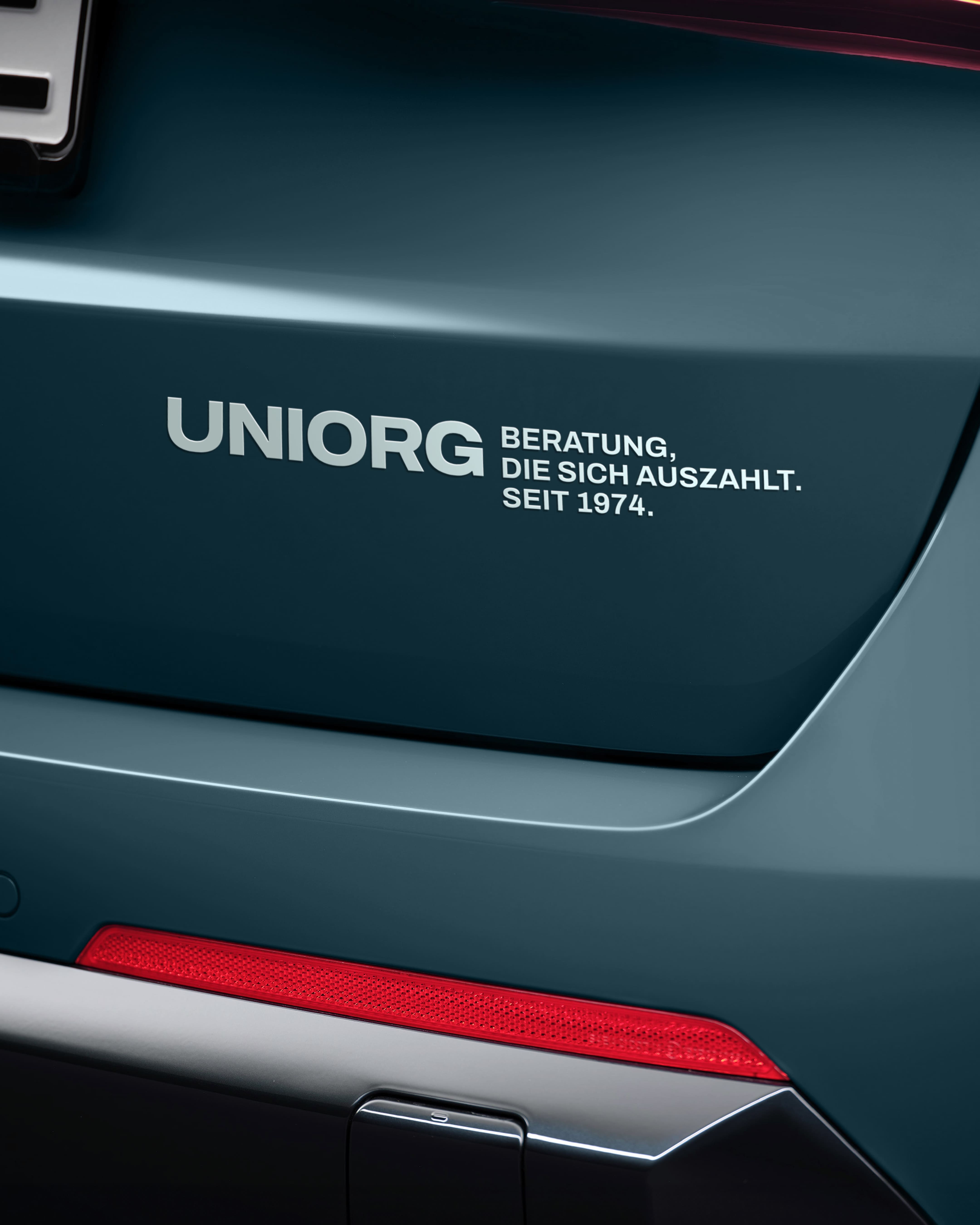

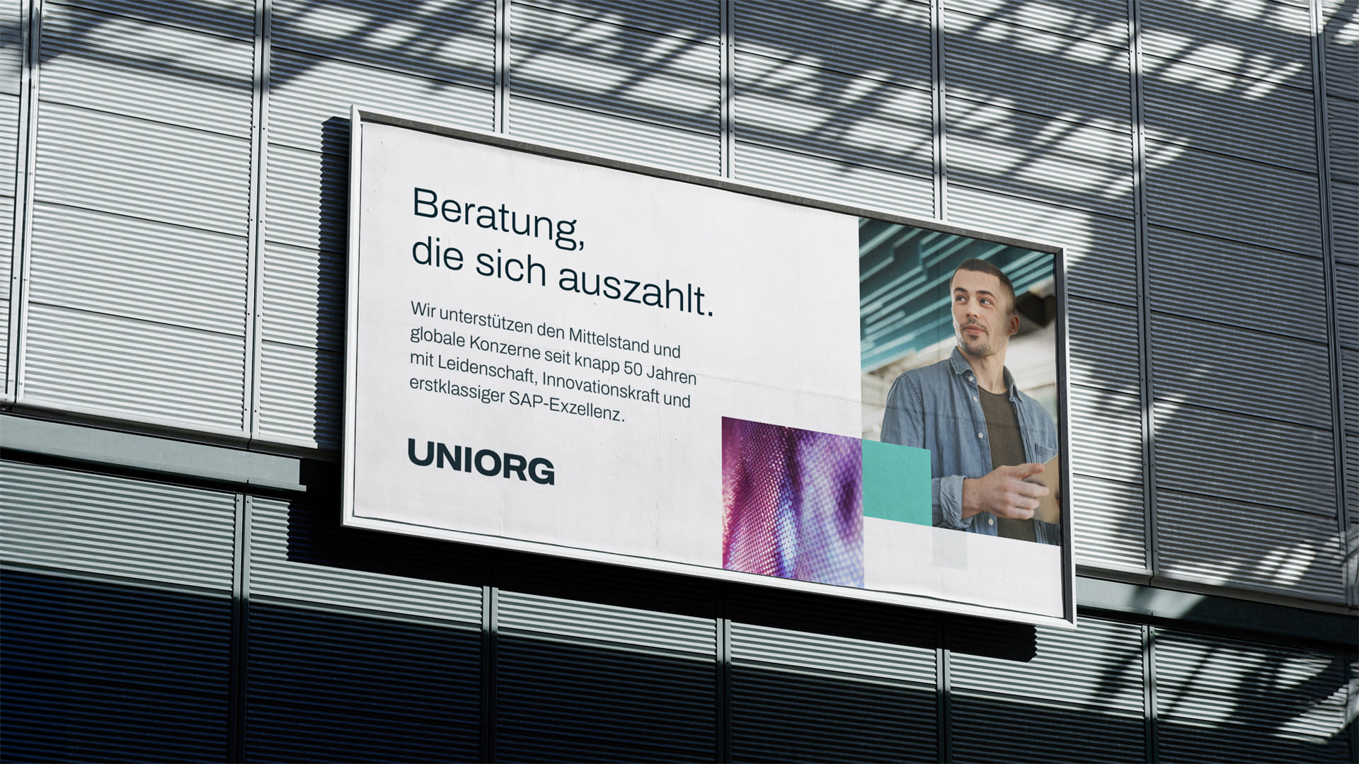
(brand identity)
Progress and partnership expertise brought to life visually
UNIORG was founded in 1974, just two years after SAP. Since then, the two companies have been following a common path in the world of business software. These many years of experience make UNIORG a true pioneer and trustworthy partner for SAP solutions.
The new brand presence embodies what UNIORG stands for: years of expertise, honest passion, customer-oriented reliability and a clear vision for the future – visible in a reduced color scheme that conveys seriousness, a modern typography for technological precision and a dynamic visual world that makes progress and partnership expertise visually tangible.
The new brand presence embodies what UNIORG stands for: years of expertise, honest passion, customer-oriented reliability and a clear vision for the future – visible in a reduced color scheme that conveys seriousness, a modern typography for technological precision and a dynamic visual world that makes progress and partnership expertise visually tangible.
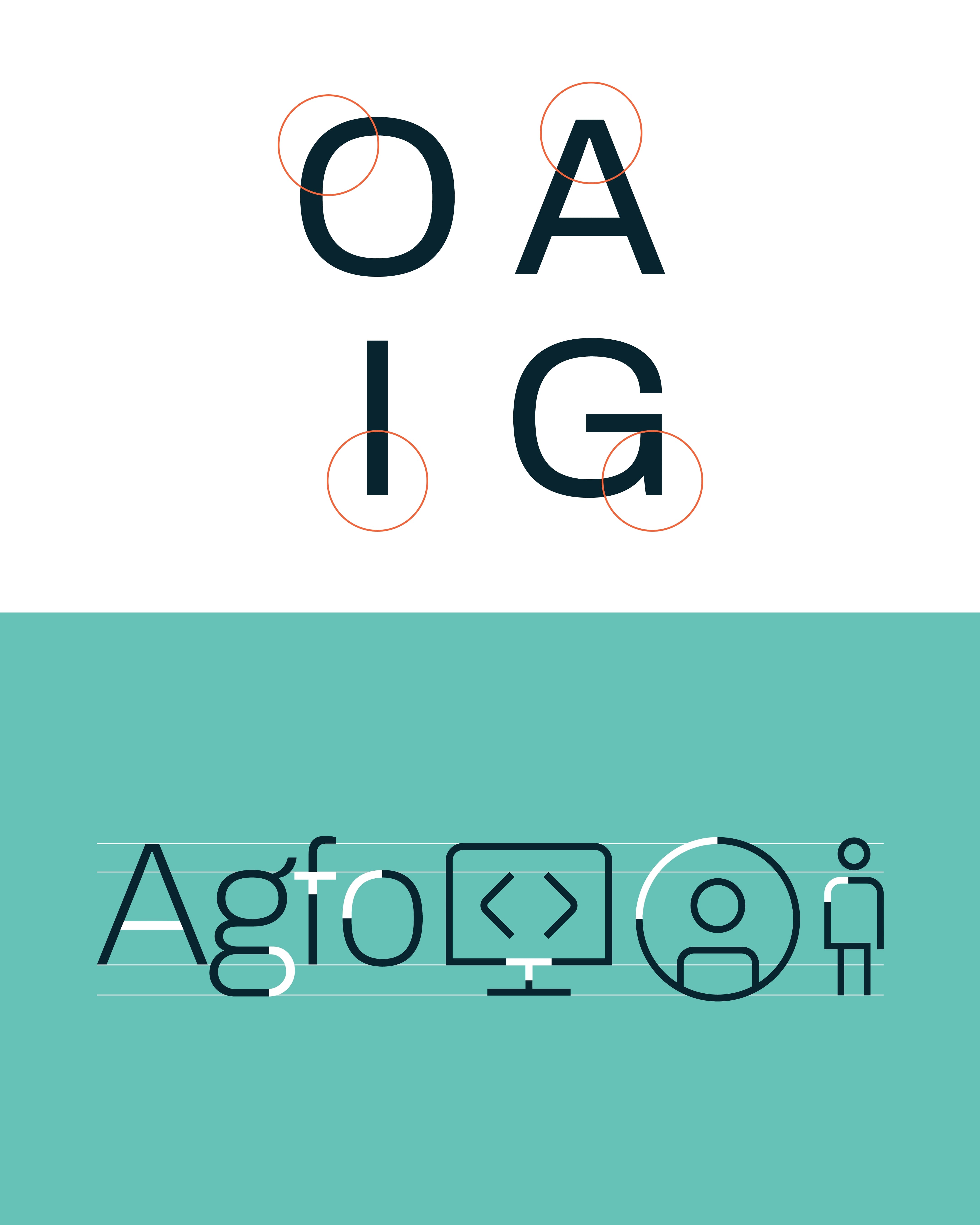

(brand identity)
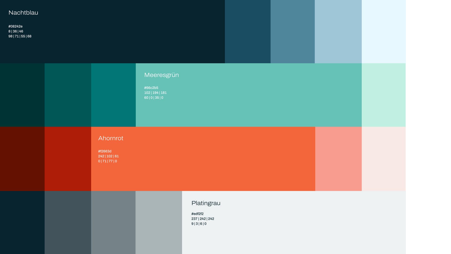
Identity-creating colorfulness
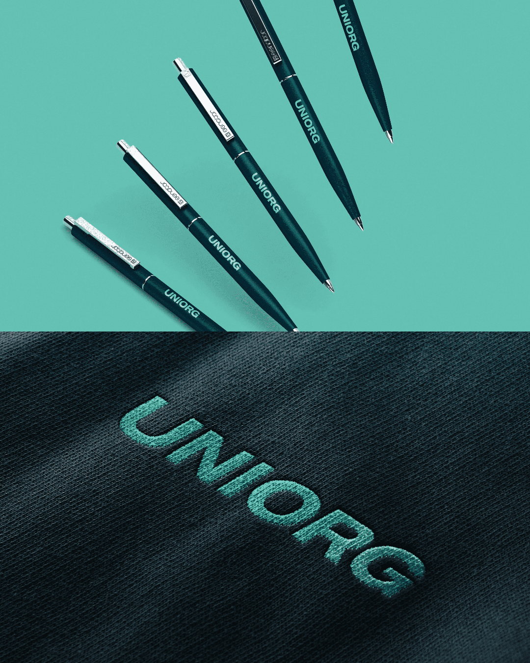
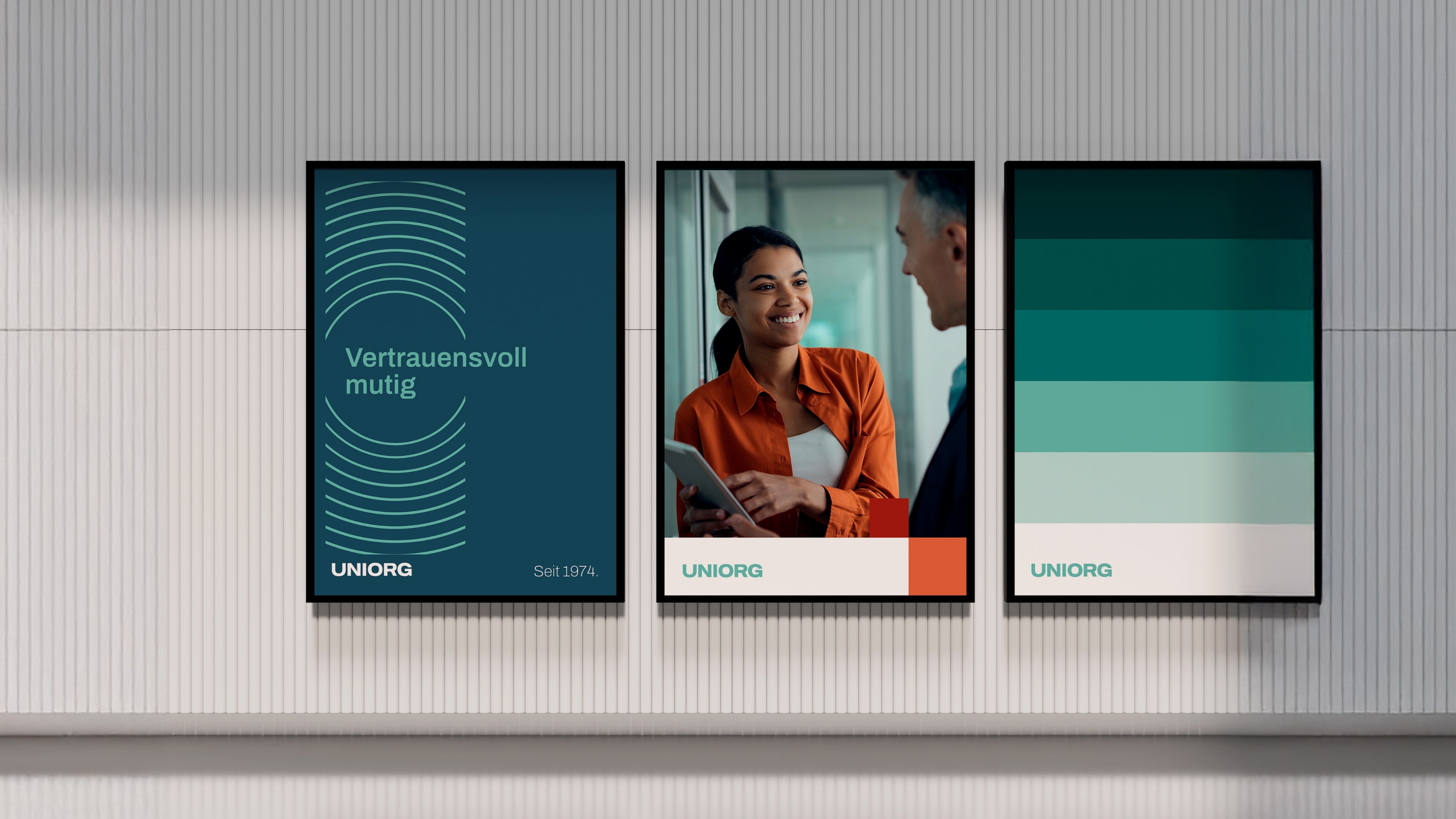
The combination of midnight blue and sea green creates a visual balance between seriousness and innovation.

(Employee voice)
"In the brand design, we have translated the clarity and core of the brand into a visual language that is both authentic and striking."

Maximilian Kersten
Managing Director
(brand strategy)
Direct, professional and approachable
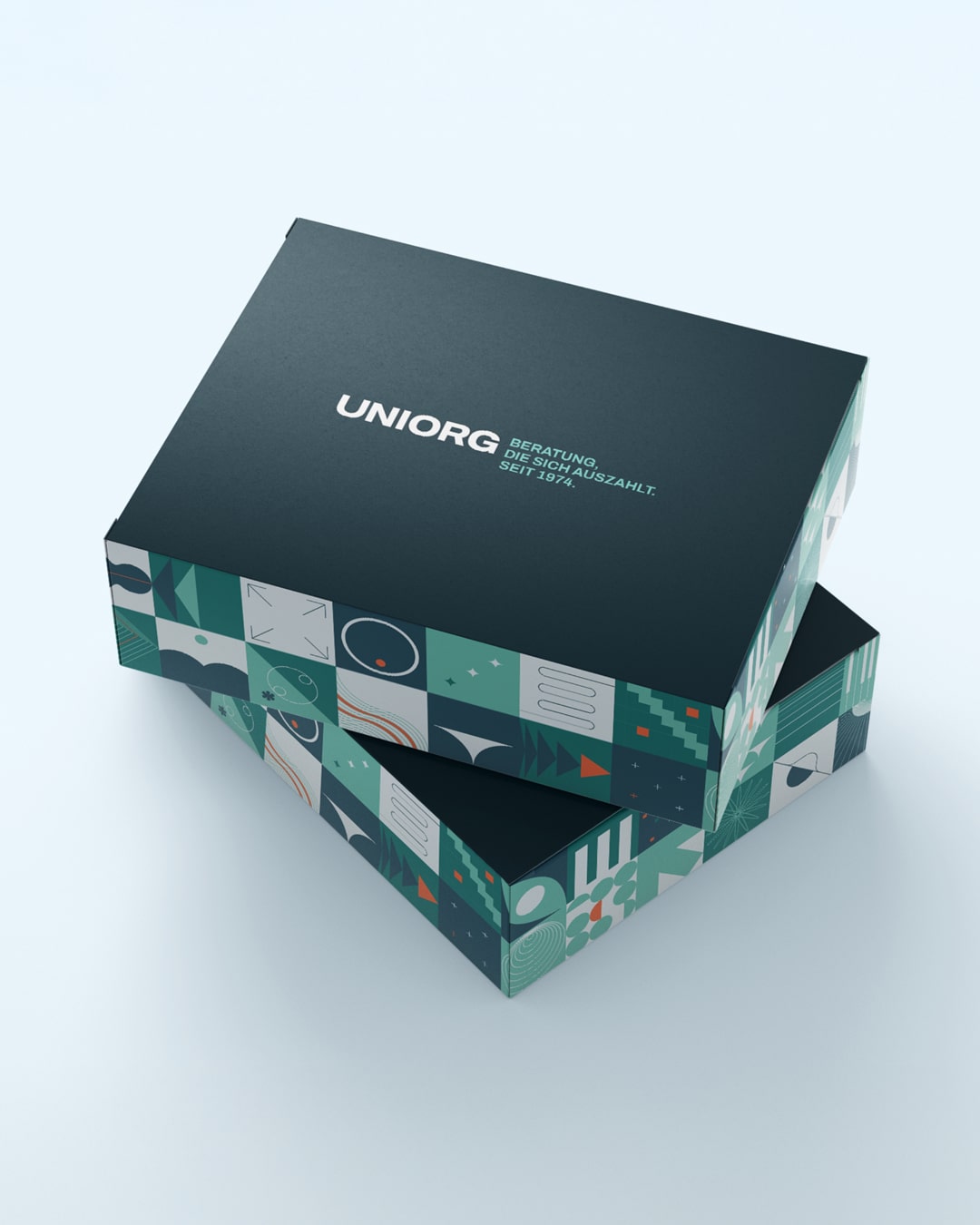
The claim focuses on the added value for the customer. The tone is direct and professional, but approachable – to make the internationally active company tangible as a reliable partner in the SAP world.

(brand experience)
Clear structures for complex content
Transparency and sound insights are essential for strategic decisions. The visual presentation of complex figures – clearly structured, presented in a modern way – makes complex business processes comprehensible at a glance. A design language that combines substance with aesthetics.
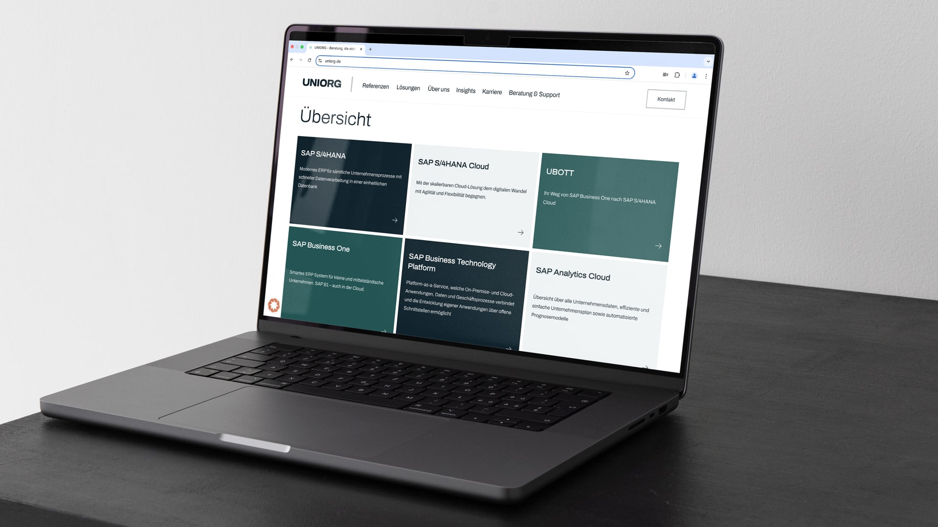
The website was developed from scratch as a central means of communication and impresses with intuitive user guidance, a reduced yet expressive color scheme and a clear typographic hierarchy. The design elements, consisting of precisely placed lines and modular forms, reflect the structure and clarity that UNIORG embodies in its services.
The website was developed from scratch as a central means of communication and impresses with intuitive user guidance, a reduced yet expressive color scheme and a clear typographic hierarchy. The design elements, consisting of precisely placed lines and modular forms, reflect the structure and clarity that UNIORG embodies in its services.
(Customer testimonial)
"For our rebranding, we wanted a regional partner that [...] suits us. With Schwarz+Matt we had [...] a great feeling - modern, approachable and uncomplicated. [...] The collaboration is running [...] on a really good, personal level."
Mandy Obst
Marketing Manager
UNIORG
(New business)

Contact
André Schirmer
Founder & Managing Director