pickshare
Branding for a sustainable logistics start-up.
(Overview)
Visual system for an emission-free delivery future
pickshare stands for a sustainable logistics revolution on the last mile – data-driven, CO₂-reduced and smartly networked. The platform acts as an interface between retailers, shoppers and urban infrastructure – with the aim of making emission-free delivery a reality.
Our task was to transform the existing brand identity into a visual system that is as vibrant and agile as the brand itself. From the digital space to the physical world, we gave pickshare a new visual brand presence.
Our task was to transform the existing brand identity into a visual system that is as vibrant and agile as the brand itself. From the digital space to the physical world, we gave pickshare a new visual brand presence.
(Company)
pickshare
(industry)
Logistics
(year)
2023
(services)

(brand identity)
A sign of change
on the last mile
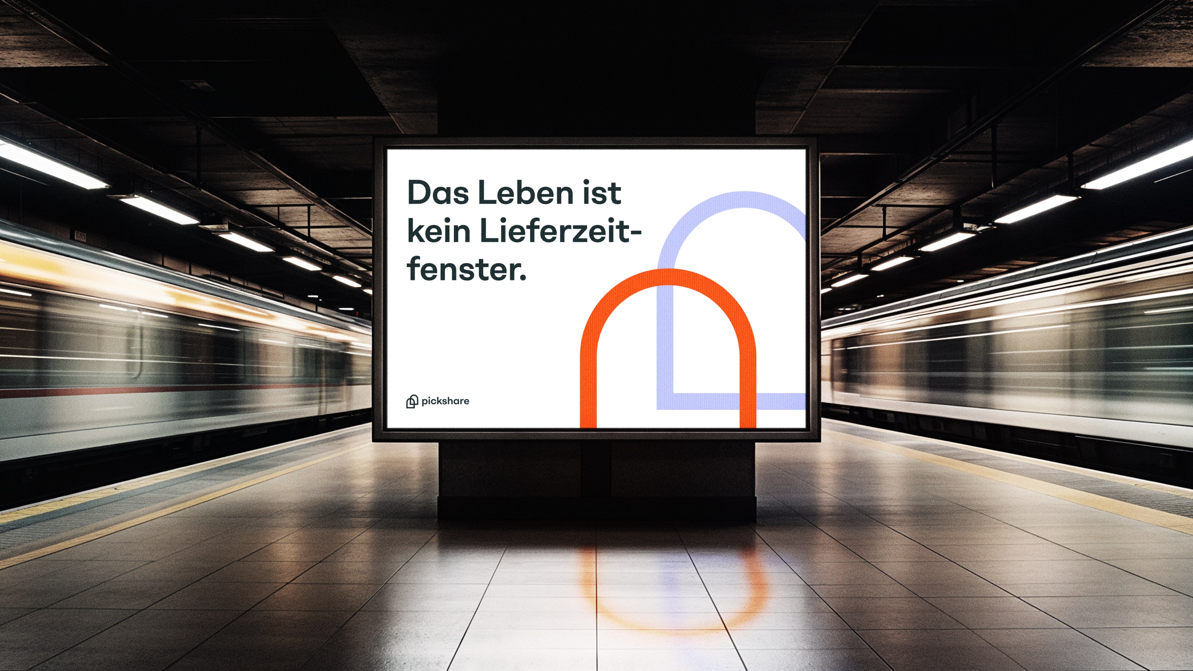
The new figurative mark arises from the archway motif – doors that overlap and form a connection. This graphic element reflects Pickshare’s task: the interface between retailers and end consumers.
In the figurative mark, brand vision meets clarity – and makes Pickshare the visual gateway to sustainable delivery.
In the figurative mark, brand vision meets clarity – and makes Pickshare the visual gateway to sustainable delivery.

(brand identity)
A visual guiding element with recognition value
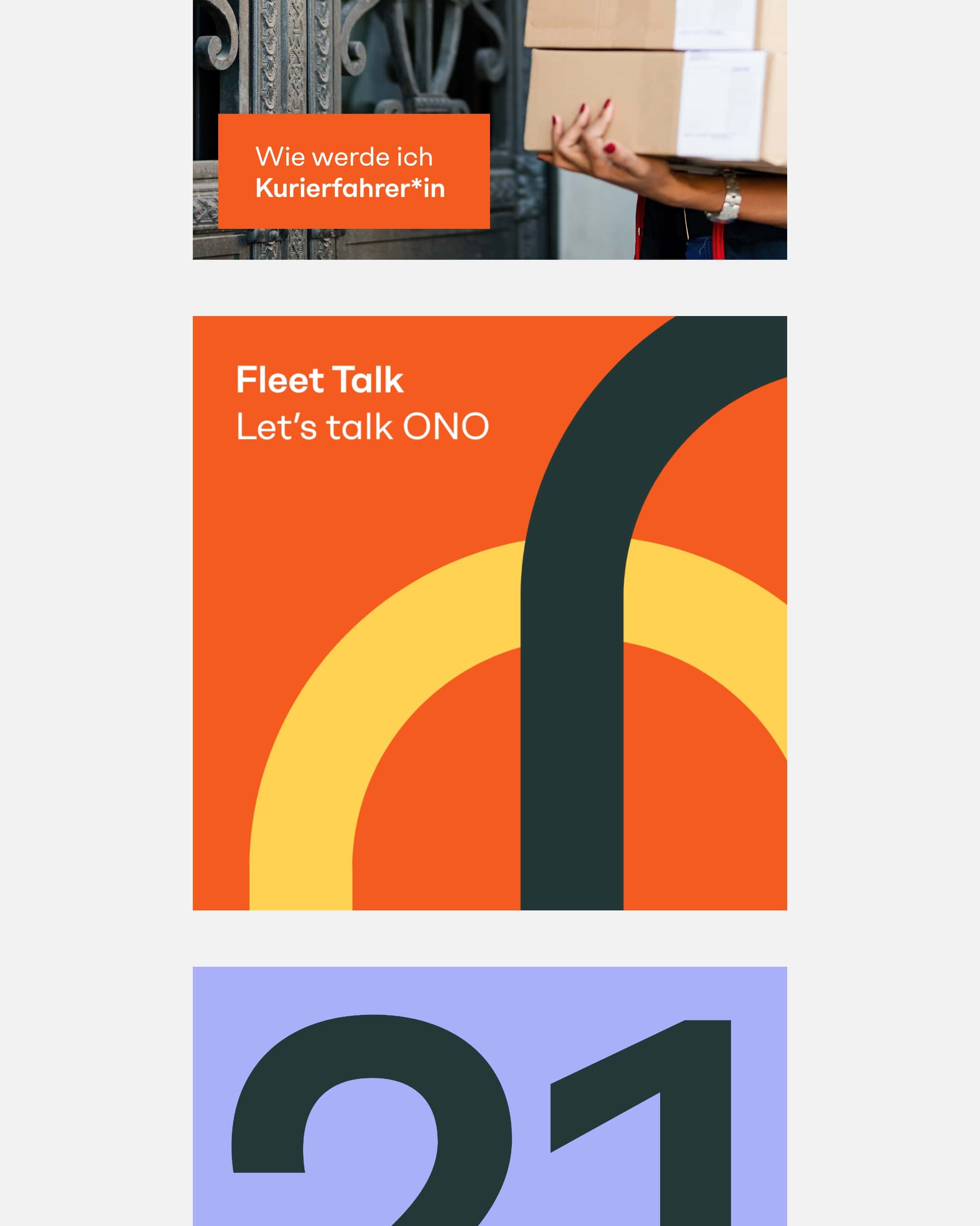
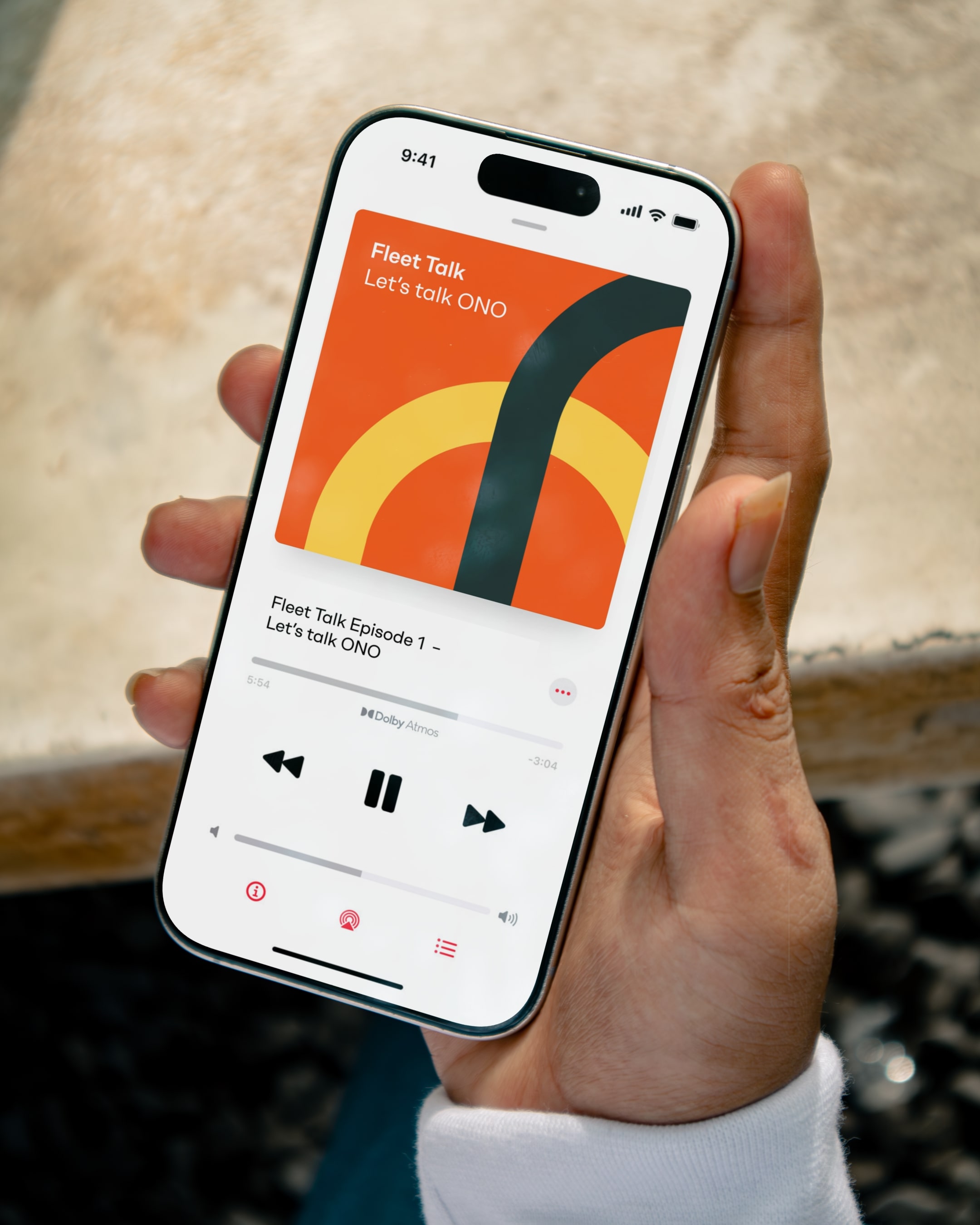
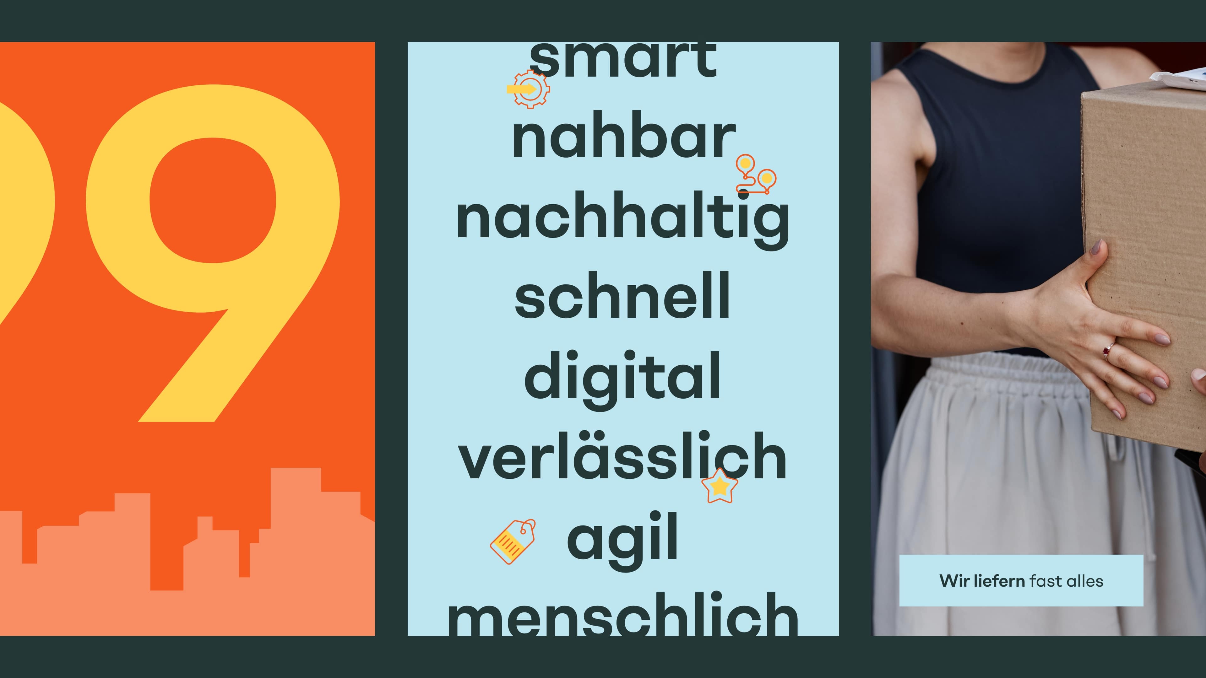
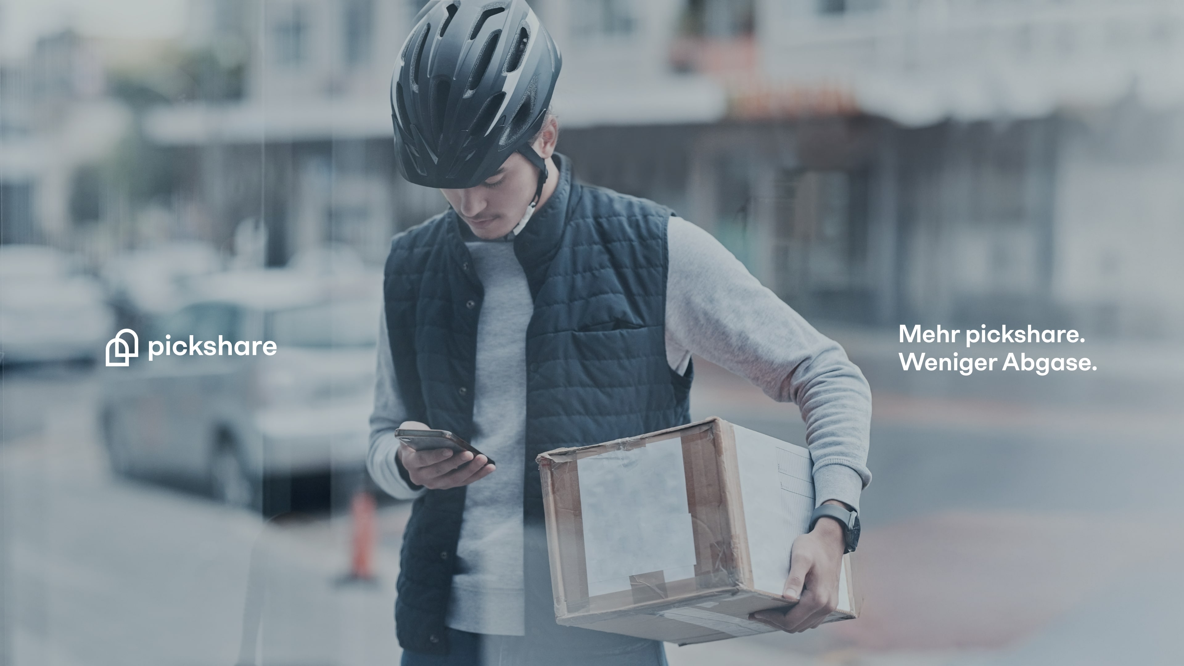
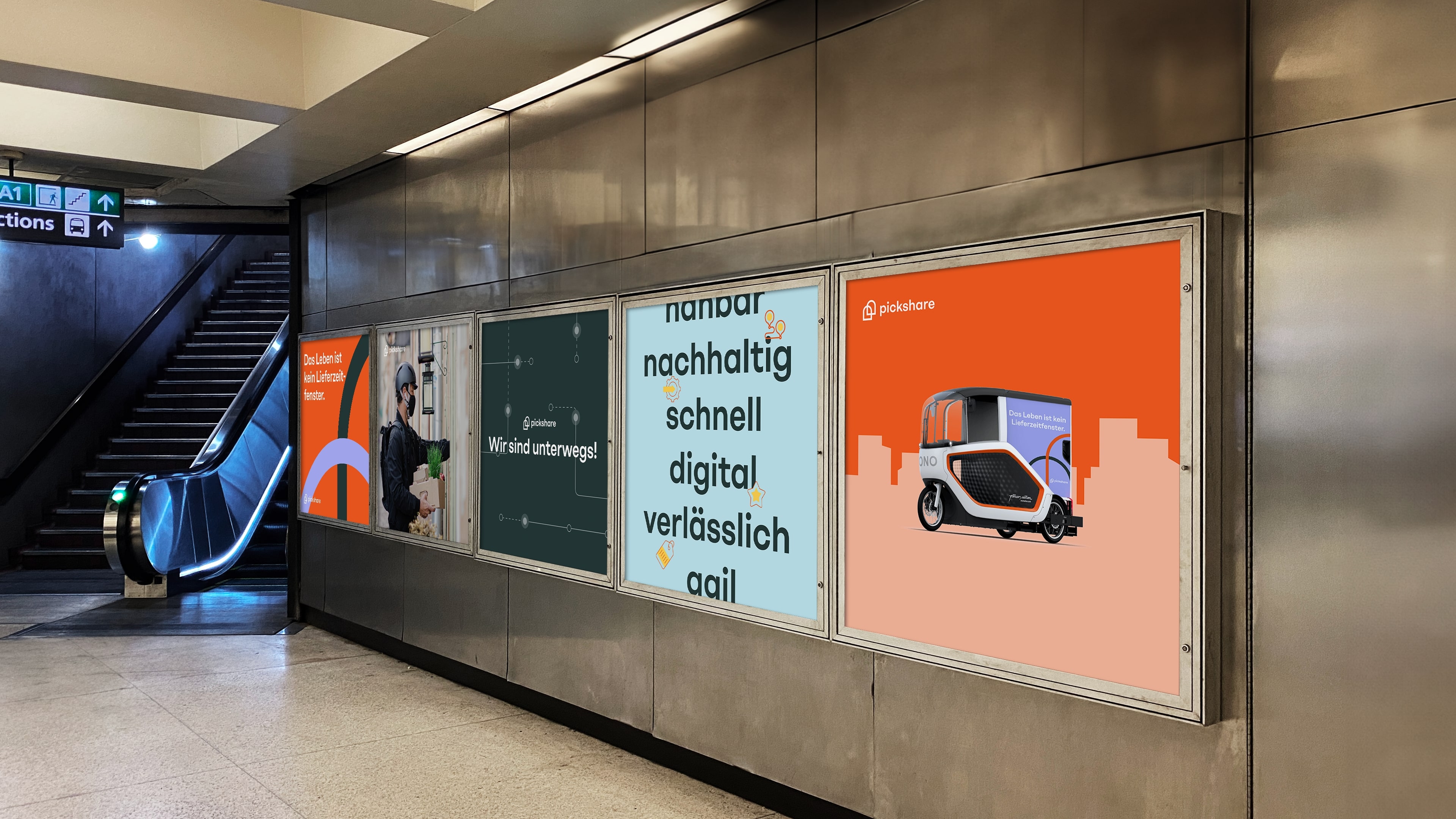
The archway acts as a visual bracket – flexible, modular and omnipresent. Whether on the website, at the trade fair stand, on shirts or the e-bike – it is a recurring guiding element. This creates an independent, consistent brand experience.
(brand identity)
Urban clarity
in color and image
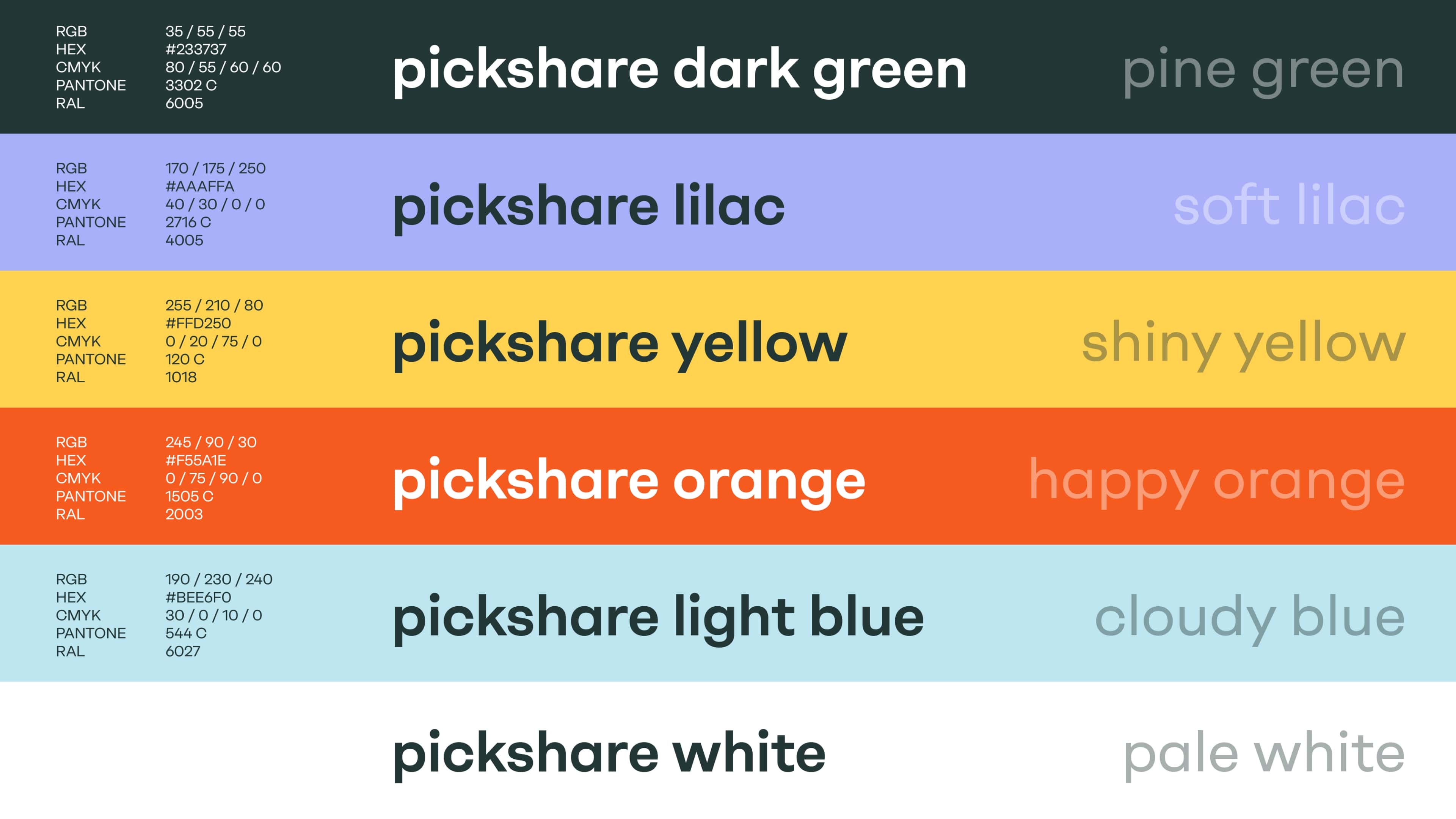
The visual world of Pickshare is clear and urban – with a strong focus on sustainability and technology. Pine Green serves as a basic tone and a haven of peace – as a supporting surface. Shiny Yellow and Happy Orange accentuate and draw attention to the essentials – for example in interactive elements. Cloudy Blue supports technical components, while Soft Lilac adds warmth and approachability at certain points.
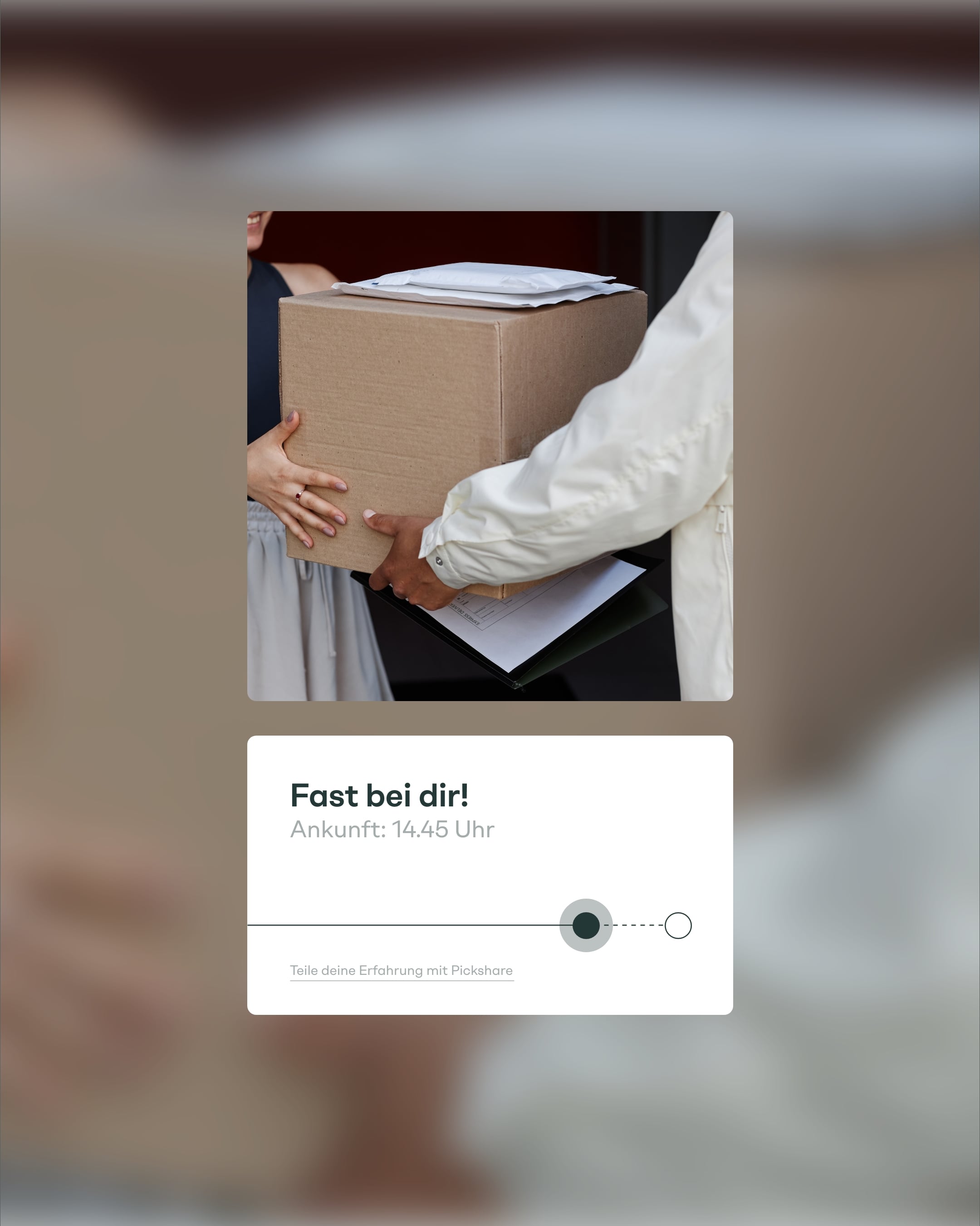
The imagery is strictly based on the real urban context: e-cargo bikes on cobblestones, delivery staff in front of front doors, snapshots of deliveries with clearly noticeable sustainability DNA. The imagery is authentic, approachable and solution-oriented – without a lot of staging and with a focus on everyday life.
The imagery is strictly based on the real urban context: e-cargo bikes on cobblestones, delivery staff in front of front doors, snapshots of deliveries with clearly noticeable sustainability DNA. The imagery is authentic, approachable and solution-oriented – without a lot of staging and with a focus on everyday life.

(Employee voice)
"Refreshingly different: pickshare combines sustainability with a young, dynamic team."

Thi Lange
Art director
(brand experience)
Experiencing sustainability digitally - the website as a platform
Visual clarity meets functional simplicity – with a modular structure that makes content easy to grasp and leaves room for scaling. Key visuals such as the archway create recognition, animated transitions ensure ease. Colors and typography guide users intuitively through the interface without overloading them. The result is a digital platform that provides orientation – and makes Pickshare visible as a technology-driven, sustainable logistics company.
(Customer testimonial)
"The new brand identity means much more than just a fresh design - it makes visible what we stand for with pickshare: Cities in which logistics is not a nuisance, but a benefit."

Matthias Weber
Managing Director
pickshare
(New business)

Contact
André Schirmer
Founder & Managing Director