AHW

An independent visual identity for an interdisciplinary corporate law firm that conveys its diverse areas of expertise to the outside world.

(Überblick)

Paving the way for sustainable success in the SME sector

For over 60 years, AHW has been supporting SMEs with an eye for the big picture – from a tax, legal and commercial perspective and always at eye level.

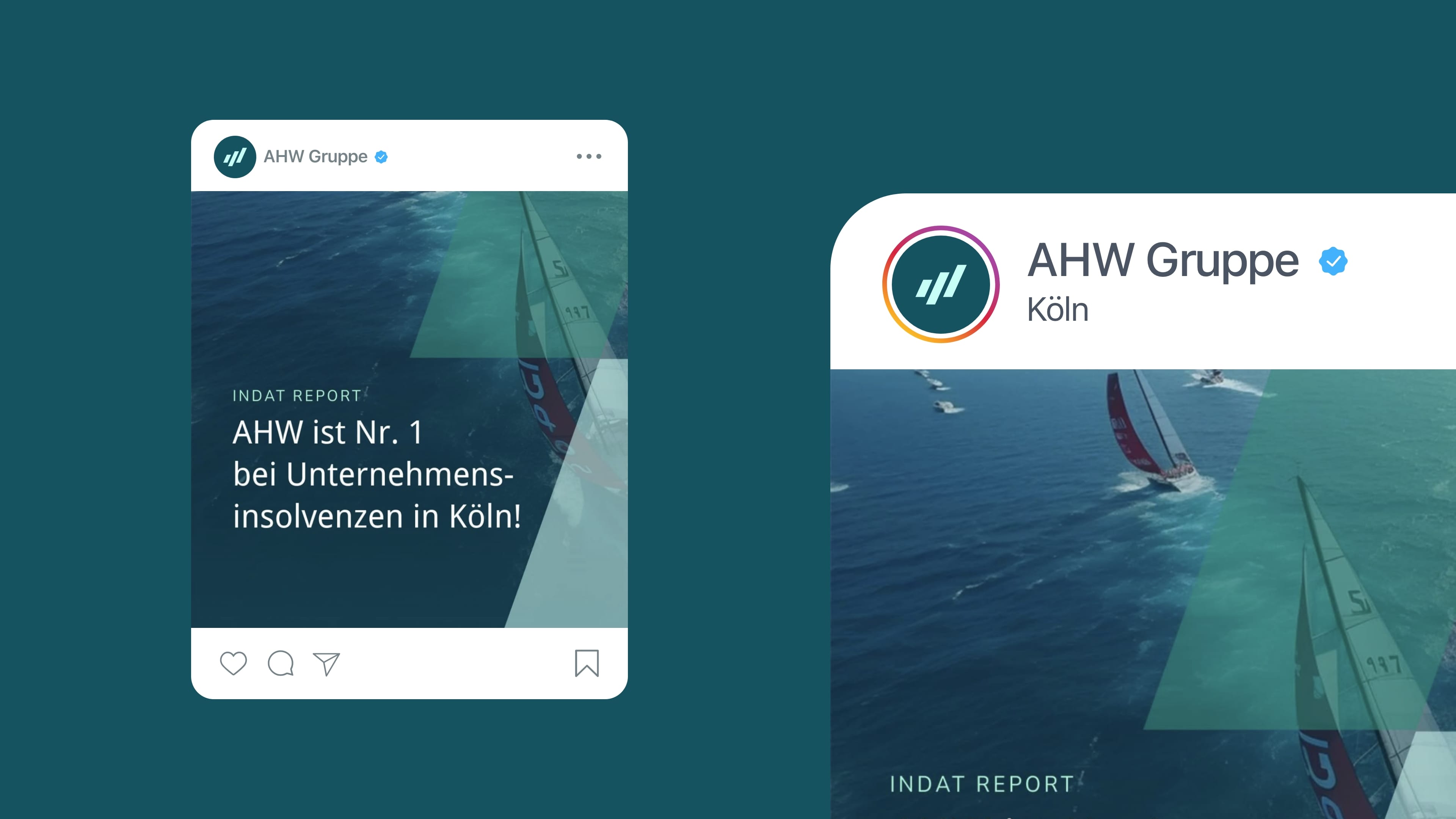
We were able to rethink the existing brand image for the AHW group of companies: from the visual realignment to the implementation of modern, scalable websites, we created a strong basis for the digital presence of the entrepreneurial law firm.
(Firma)
AHW
(Branche)
Consulting
(Jahr)
2024

(brand identity)

Clarity and precision for AHW's clients

The AHW logo is the visual foundation of the law firm. It embodies the clarity with which AHW thinks about complex issues in an interdisciplinary way and the quality with which clients are advised. Precisely designed, with a clearly defined protective space and a modular structure, the logo can be flexibly applied to all areas of the company.

(brand identity)

Highest functionality in font and color

From the choice of colors to the typography and user guidance – everything follows the principle of clarity and consistency. There are no distractions, but instead a clear structure that leads the user directly to the essential content. A more integrated design reflects the desire to be both functional and honest.

(brand experience)

Focus on interdisciplinary consulting approach

The new website for AHW translates the firm’s interdisciplinary consulting approach into a user-centered and confident digital experience. The structure, navigation and content have been designed so that clients can easily access information and quickly find their way around – regardless of whether they are looking for tax, legal or business advice.

(Employee voice)

"In close collaboration, we created a visual identity for AHW that translates the corporate attitude [...] - digital, bold and groundbreaking [...]."

Katharina Nolte
Web Designer

(brand experience)

Layout system and design language

AHW’s figurative mark flows into the layouts and shows how its design language can be used as a basis – flexible, variable and adaptable across all media. This creates a visual identity that has an impact beyond the logo.

The system also offers scope in terms of color: in addition to the blue and green tones typical of the brand, targeted accent colors – including purple in the career area – provide differentiated visual highlights.

(Kundenstimme)

"In Schwarz+Matt, we have found a partner who translates our diverse consulting services into a clear, modern design. [...] We particularly appreciate the quick, uncomplicated agreements."

Katrin Stoklosa
Senior Marketing Manager & Brand Strategy Consultant
AHW

(New business)

Contact

André Schirmer
Founder & Managing Director