Flixcheck
More leads through website relaunch.
(Überblick)
The special
all-in-one solution
The customer service assistant Flixcheck turned to us with the task of optimizing the web design for the purpose of targeting and, above all, lead-optimizing.
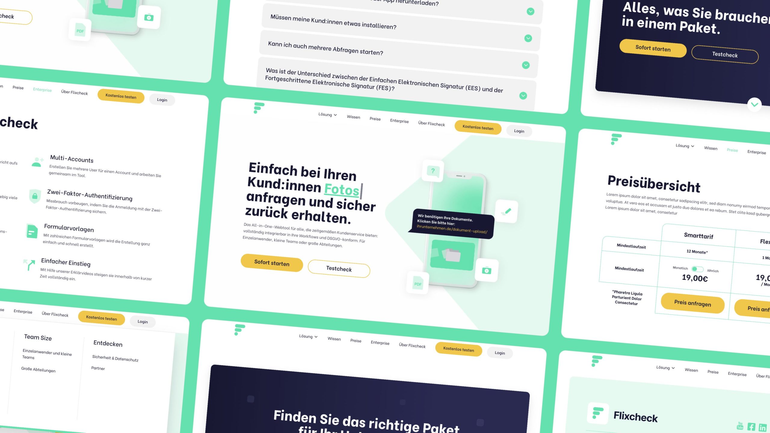
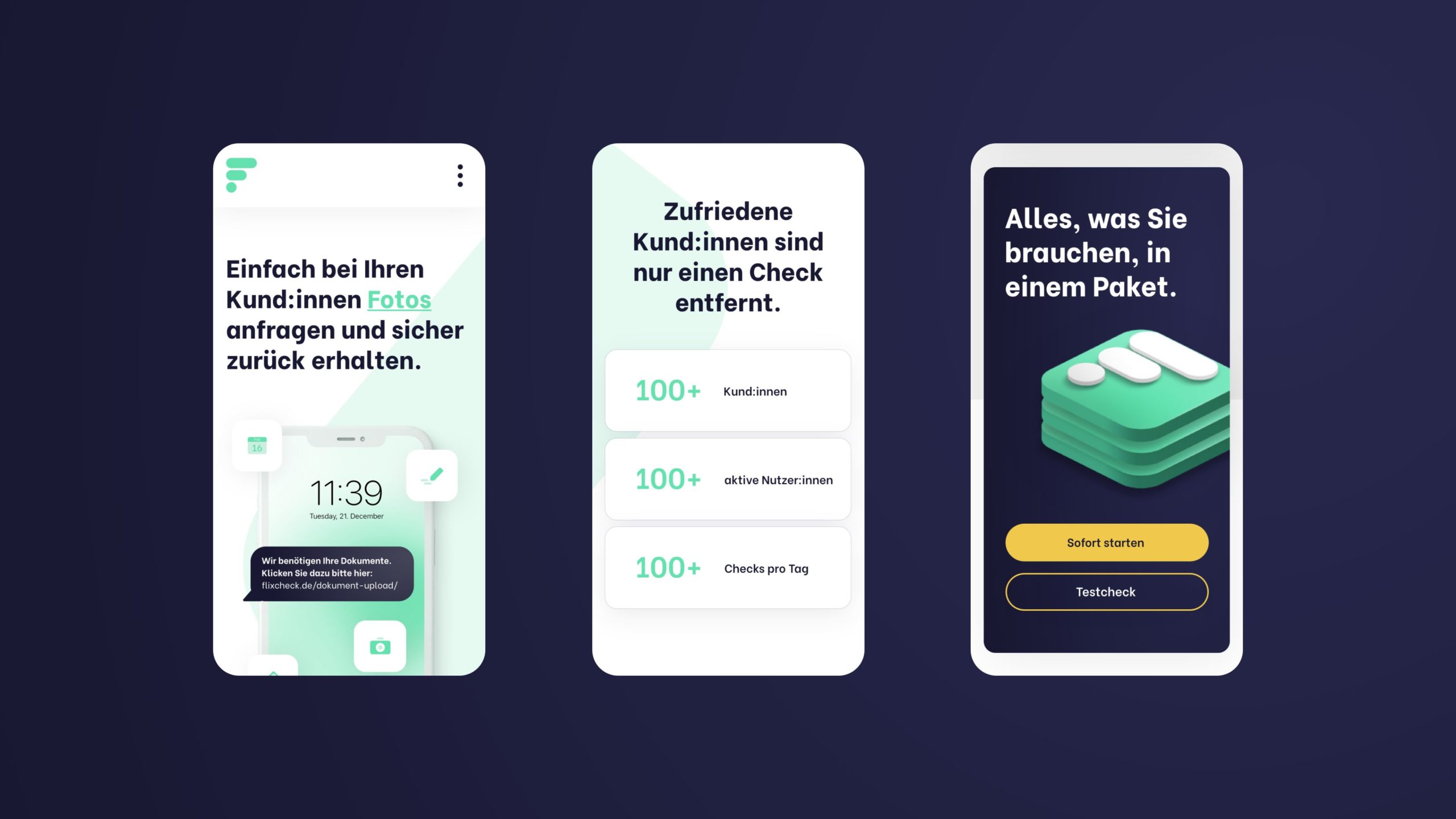
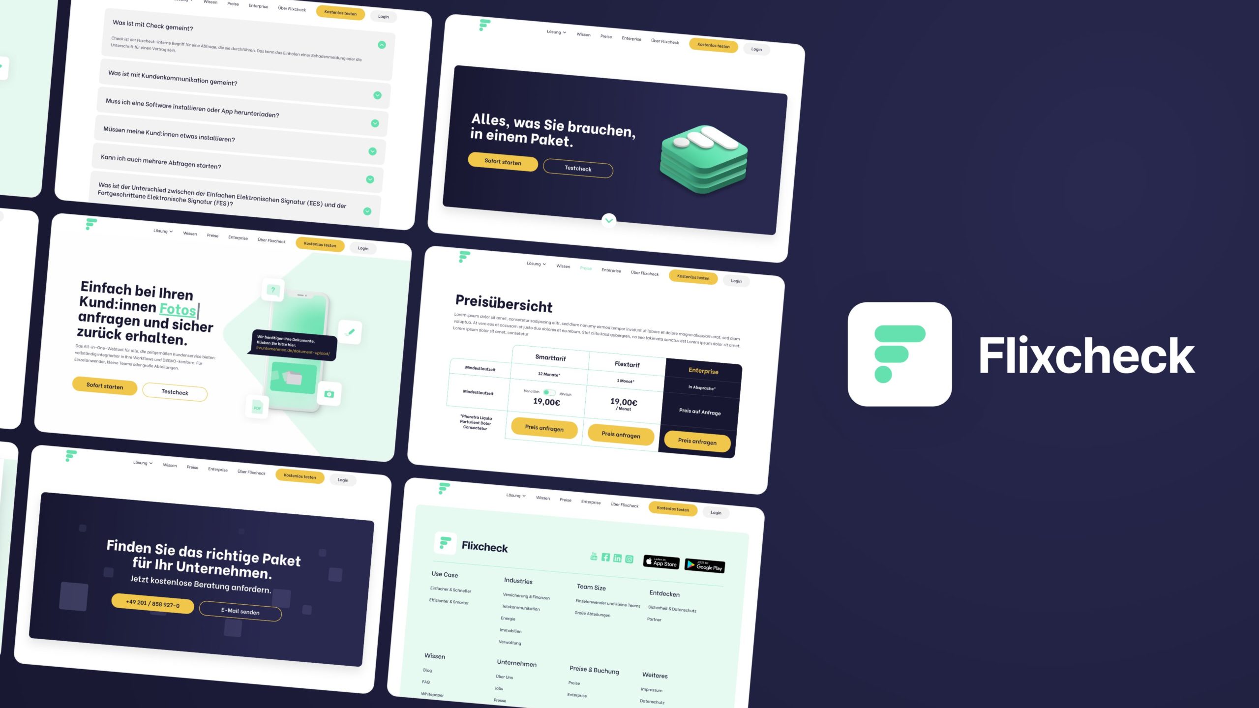
Flixcheck facilitates dialog and data exchange between companies and their customers and can therefore be seen as a kind of digital customer service touchpoint. For example, documents and contracts can be easily uploaded and signed via smartphone – and even legally secure.
The special all-in-one solution for smart data exchange thus enables contemporary interaction between companies and their respective customers. Customer feedback can also be obtained regularly in this way: This ensures more transparency and ultimately more customer satisfaction.
(Firma)
Flixcheck
(Branche)
IT
(Jahr)
2022
(Leistungen)
(brand experience)
New design language and optimized user experience
We also wanted to reflect this innovative and absolutely smart approach visually and in the user experience.
We eradicated the previously rather angular shapes, the rather meaningless stock photos and the conservative look, including the generic-looking subpages, and opted for a design language that is much more modern, harmonious and coherent thanks to the rounded shapes and new color scheme.
We also designed a mega menu that structures the number of subpages in a meaningful way so that potential Customers get an ideal overview of all services and know exactly how Flixcheck can help them.
(Kundenstimme)
"The collaboration was clearly structured and always flexible enough to respond to our needs. The result is a conceptually and visually powerful website [...]."
Mathias Staar
Founder & CEO
Flixcheck
(New business)

Contact
André Schirmer
Founder & Managing Director